
Checking the weather has become a relatively easy process since modern smartphones have come into existence. You can now simply open an app and access the weather information of your city or another from anywhere on the planet. iOS 15 makes knowing the weather around much easier to understand and interpret as it not only notifies you about upcoming weather conditions but also gives you a glimpse of what to expect throughout the day in terms of temperature.
If you’re wondering why you’re using seeing bars colored in yellow, red, blue, or green inside the Weather app, we’ll help you understand what they are, what those colors mean individually, and more in the post below.
Why do you see Yellow, Red, Blue, and Green lines on the Weather app/widget?
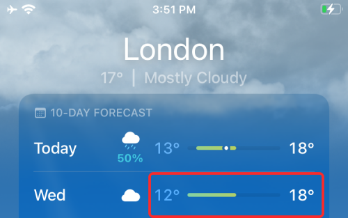
iOS 15 brings a whole new redesign to the Weather app and the latest update to the service has brought a new visual way to show you the temperature of the place you’re in. If you’re seeing a bar next to today’s weather colored in yellow, red, blue, or green lines, it essentially tells you the temperature range for the day.

You should also be able to see similar bars corresponding to tomorrow’s weather info and a few subsequent days by checking out the 10-day weather forecast and the 4×4 Weather widget.
This is a welcome change to iPhone users who can now get an idea of the whole day’s forecast instead of just being shown the highest and lowest temperatures for the day.

Related: iOS 15: How To Print to PDF on your iPhone and iPad
What does every color mean?
In case you’re wondering what is the temperature range for a particular day in your region, you need to first understand what range each of the colors indicated inside the Weather app corresponds to.
- Dark Blue: Extremely Cold (less than 0°C)
- Light Blue: Cold (0°C to 15°C)
- Green: Slightly Cold (15°C to 20°C)
- Yellow: Slightly Warm(20°C to 25°C)
- Orange: Warm(25°C to 30°C)
- Red: Extremely Hot (30°C and above)
An overview of these color codes will also appear when you open a location’s Temperature Index. Here’s what it looks like:

Why do I see different colors in the same line?
Depending on the weather in your region, you may see a single-colored or multi-colored line adjacent to a particular day inside the weather app.
If you only see a single line, you can expect the temperature range to remain the same throughout the day.
If you see multiple colors in the same bar, then you can expect the temperature to vary significantly between the start and end of the day. When you see multiple colors, they will be stacked in the same manner as they’re listed above.
For example, if you live in a moderately warm region but expect rainfall, you may see today’s weather show you a line with a combination of Orange/Yellow/Green colors.
Related: iOS 15: How To Drag and Drop Pictures, Files, Texts, Links, and More Between Apps
Why are some colored lines shorter than others?
If you’re looking at the temperature range of your region for the next few days, you may notice that some colored lines are longer or shorter than the rest of them. Some lines may cover the whole length of the bar while some will have empty spaces on the left or right sides. Why is that, you ask?
The colored bars do not only show you various temperate ranges but also indicate the minimum and maximum temperatures for a particular day. To help you understand what the weather is going to be like for the upcoming days, the Weather app shows the minimum and maximum temperatures on the left and right sides of the colored bar respectively for the next 10 days.
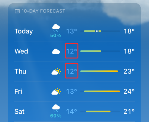
If a day’s minimum temperature matches with the 10-day forecast’s minimum value, then its bar will start from the extreme left.
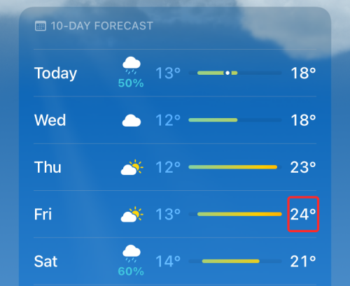
If a day’s maximum temperature matches with the 10-day forecast’s maximum temperature, then its bar will end on the extreme right side.
For days where the temperature range is shorter than the range expected for the next 10 days, their bars will be shorter.
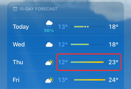
For example, let’s take a look at Copenhagen’s 10-day forecast.
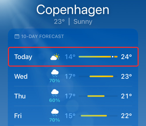
As you can see from Today’s forecast above, the colored bar changes from green to yellow to orange to indicate the transition from 14°C to 24°C throughout the day. You will also notice that Today’s forecast occupies the whole bar leaving no empty space behind. This means the maximum and minimum temperatures for the day are the same as what’s expected in the next 10 days.
When you compare today’s forecast to that of Thursday, you will notice that the colored bar is shorter than the one shown for today. That’s because, the minimum temperature for Thursday is 16°C, which is 2°C higher than today; that’s why the temperature bar shift slightly (2/10 portion; since 14-24°C is the total size of the bar) to the right side.

Similarly, Thursday’s maximum temperature (21°C) is also lower than the maximum value (24°C) for the 10-day forecast and that’s why its temperature bar ends 3 spaces shorter the whole size of the bar.
Depending on the weather in your region, you may see different-sized bars for different days if you’re expecting significant changes in the climate.
How do you get it?
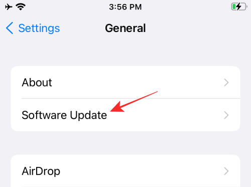
The new temperature bars are a default feature in the new Weather app in iOS 15. You simply need to update your device to iOS 15 and the new app will be automatically installed for you. You can then access it to get the new temperature bars and even add a widget to your home screen for easy access. You can update your device to iOS 15 by going to Settings > General > Software Update and then installing the latest version that’s available.
The new temperature bars are an exclusive feature on iOS 15 only, so if you’re running iOS 14 or an older operating system, you will need to wait till this fall when Apple releases the stable version of iOS 15 to the public.
Where can you see colored temperature bars?
The colored bars that indicate the temperature range for a particular day can be seen in two different ways:
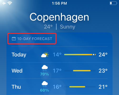
- Inside the Weather app: You can see the temperature range for today and all subsequent days under the ’10-Day Forecast’ section when you view a weather card after opening the Weather app.
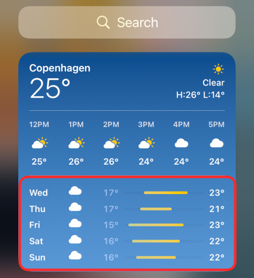
- Inside the Weather app’s 4×4 widget: Temperature range bars are also available when you use the ‘Large’ size Weather widget. However, instead of a 10-day forecast, you will only see the colored bars for the next 5 days. You won’t see the temperature range in a line for today’s forecast as well. Instead, you will be greeted with a periodic layout of estimated temperature for the next few hours.
That’s all there is to know about colored lines/bars in the Weather app on iOS 15.
RELATED
21 responses to “What Do Yellow, Red, Blue, and Green Lines Mean on the iPhone Weather App or Widget?”
Thank you!!! What about the white dot that sometimes shows up within the line?
The white dot is your current temp.
The white dot is your current temp.
It appears to be the most retarded part of iOS.
Not only is that information worthless to an average person, it eats up quite a chunk of space that could’ve shown something else.
100% completely useless to anyone and everyone. no more information is given to you that a glance at the 10 day min and max wouldn’t already give you.
yeah, useless but looks cute 🙂
100% also agree. This is the best explanation I’ve read, btw, thank you, but so much real estate for very little value to most of us.
I like how the person who wrote this starts off by saying “This is a welcome change” and then “iOS 15 makes knowing the weather around much easier to understand and interpret”, and then proceeds to write about a whole novel trying to explain how to read this new “welcome change” that, “makes knowing the weather much easier to understand and interpret”, when you can still literally see the low and high for the day on the sides. All this is, is just more clutter and unnecessary fluff to apps that didnt need to be touched in the first place, the best part is, I’ve already read this and I’ve already forgotten this guys novel of a story on how to understand this “welcome change”.
Typical apple fanboy talk, that just generalizes everyones opinion into his own.
This is the same type of person who probably thinks the light for the microphone or literally any, of apples changes in the past decade have been worthwhile and not counterintuitive in the slightest.
What makes this even better is that the person who wrote this is using celsius to try to explain how it works, when, celsius is just about as stupid as this update.
Your maps here read 14-22C in a ten day timeframe.
This is Celsius to me, basically, take our unit, farenheit, and just throw half of those numbers right in the trash. So, 0-100?
Nah, lets just make it 0-32.
So that way its so inaccurate to actually figure out, that a simple number, could literally mean its anytime of the year anywhere, a simple tick up or down, could mean the biggest changes outside.
17C, that could literally mean its winter, its summer, its anything. 16 or 18 C? That might mean suddenly its winter and its a snowstorm, or its summer and the world is ending, and yet this is how a large portion of the world still thinks.
Just because the majority might think so, doesnt mean its right, or less counterintuitive than something else that already exists.
Almost as if they’re trying to explain to me that using celsius is still somehow more relevant than just measuring things in fahrenheit. Celsius, was probably worthwhile until the day farenheit got invented, just like every other unit of measurement you people still use.
Like weighing people in kilograms or stone, and or using meters as height.
When they all could not be less counterintuitive and outdated than what already exists.
Agree. Totally useless use of space.
OK, this made me laugh out loud: “17C, that could literally mean its winter, its summer, its anything. 16 or 18 C? That might mean suddenly its winter and its a snowstorm, or its summer and the world is ending, and yet this is how a large portion of the world still thinks.” Yes, no one in the world ever has a clue what to wear in the morning, because who knows what those numbers mean?
“They take OUR unit and throw it in the trash…” What—the unit that the US, Myanmar, and Liberia uses? Yeah, those countries have definitely got something figured out that the rest of the world just isn’t bright enough to understand.
Metric couldn’t make more sense. Everything is based on multiples of ten. Freezing is 0, water boils at 100. That’s why precision manufacturing, research, science, etc., in the US all use metric.
5,280 feet in a mile…much more intuitive.
Since Brexit, Britain will be going back to p’s and q’s…Pints and quarts.
Finally some sense in the world! So why are we using metrics and celsius????
Now if only I could understand what i just read in this useless article………. and did I miss the part explaining a dot showing up on the stupid line???
Oh how I wish I could go back in time…to the Weather app that made sense. This was a ridiculous “upgrade” that makes absolutely no sense. A weather app that requires explanation in articles is clearly missing the boat.
wow. i thought it had something to do with probability of precipitation. it never occurred to me that we needed a visual representation of the temperature numbers that were already there. in case the actual temperature number is confusing i guess. I imagine soon the numbers will disappear because everyone knows numbers and words are much less understandable than esoteric pictorial representations
I’d give anything for the option of reverting back to the original version. This new version is overly complicated with huge areas of wasted space. Most weather apps (ncluding Apple’s original) place the high temp before the low, but this one has it reversed. The bars are useless since there is already an hourly forecast above it. I also hate that the hourly temps are now inside a box. It was so much easier when it went to the edge of the screen. Now you have to make a conscious effort to place your finger inside the box. Swiping left from the edge will now take you to the next city you have saved. They “fixed” it so bad it’s unusable.
thanks for taking the time to write about the new functions within the app.
This new system is horrible!
Very confusing!
How do I find when it’s going to rain/snow during a day?
Morning?
Evening?
No where to be found. (By me!)
Thanks for the explanation of the bars as I’ve been trying to figure these out for a while.
Thank you for explaining the bars on the new Weather App! I checked out 5 other sites/videos before I found yours ⭐️
I’m sorry, but this is just really bad design. It shouldn’t require any explanation.
But how does this work for US cities?
Thank you NerdsChalk for your very clear communication to answer the original question asked and for adding some more tidbits of information along with it. I appreciate it!