It’s that time of the month again when Google rolls out its next Android 12 Developer Preview (DP). With the third and final DP recently rolled out, we’ve finally come to the end of the developer preview stage of Android 12. There are a host of design and UI changes that will be hated by some and welcomed by others, depending on who you ask.
One of the key features of DP2 was the redesigned Widget picker screen, which was definitely a welcome change to the tired old Widget picker that we’ve had for years now. And now, Android 12 DP3 brings further changes to the widget picker design, providing easy accessibility to your widgets in a new format.
Here are all the changes made to the Widget picker screen, including the addition of a new search bar and recommended widgets section on Android 12.
Related: How To Add Widgets on Android 12
Search Widgets on Android 12
The widget-picker screen overhaul of DP2 was a refreshing change. The widgets were neatly organized by apps that made them easier to find. But for all the simplicity of the redesign, one couldn’t search for a widget as there was no search function.
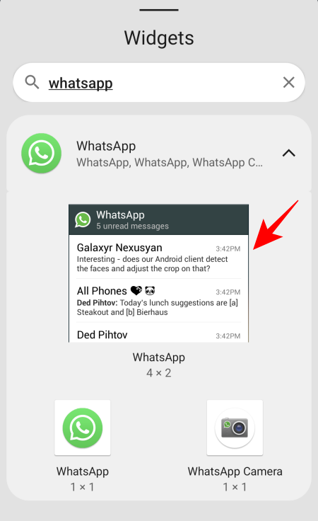
Fortunately, this has been addressed in the third DP. The widget picker screen on Android 12 DP3 will now contain a search bar at the top to easily search for widgets. To access it, long-press on the home screen and select Widgets.
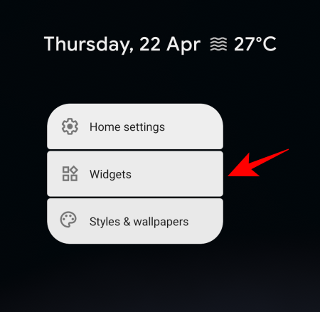
This will bring up the Widget picker screen. Here, you will find the search bar just under ‘Widgets’.
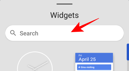
One need only type in the name of the app in the search bar, tap on the downward arrow to expand the widget selection window…
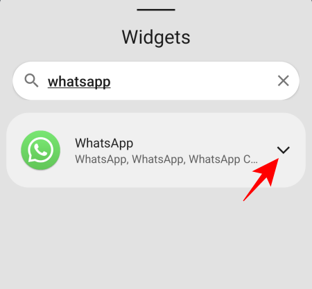
… and select from the available widgets that one wants to add to the home screen.
Find Recommended Widgets on Android 12
Other than the all-important search bar, the Widget picker screen also a section (right under the search bar) for a few selected widgets that you may want to pick from.
If you’re using Android 12 DP3, you can find recommended widgets from the widget picker screen itself. This section is just below the Search bar.
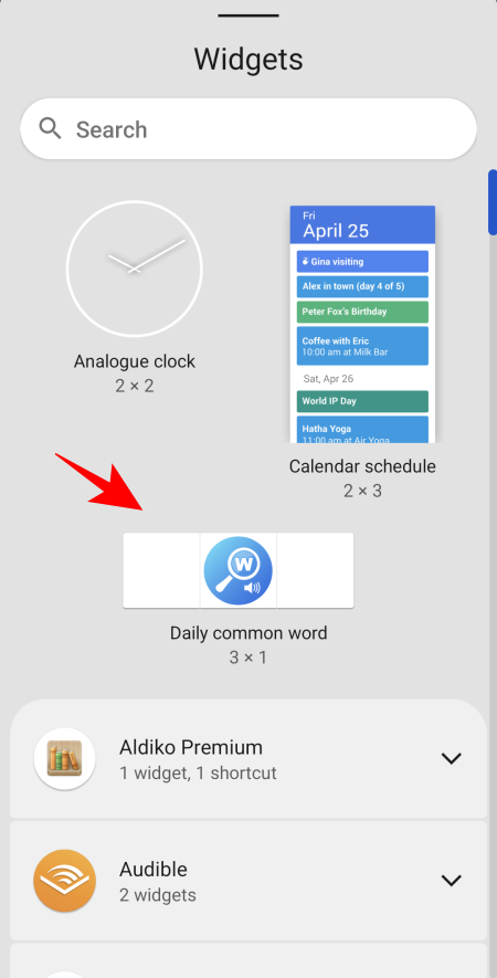
Although there is little information as to how this section gets updated, it is possible that the widgets are recommended based on your prior widget activity. We had used the ‘WordWeb’ widget before, and the same was recommended to us in this ‘recommended widget’ section too.
Android 12 Developer Preview 3 also gives us a peek at some other changes that Google may be planning to run with, such as the One-UI-like Settings menu (live on DP3 by default) and a UI design change that rounds the corners and makes the icons a tad bigger.
Only time will tell whether or not Google releases Android 12 in a similar avatar. We’ll have more information as we get closer to the Beta releases and the Final release later in the year.
RELATED
- Android 12: What’s New in Settings, Options and Visuals
- Android 12: How To Use Google Camera Split Screen
- How to enable One-handed mode in Android 12
- How To Snooze Notifications on Android 12
- Android 12: How To Enable Swipe Down To Pull Down Notifications Shade Anywhere
- What are Conversation Widgets in Android 12?


