The second developer preview of Android 12 has brought a ton of changes. But the visual and thematic changes are the most obvious. On top of these, there are a few extra settings options that improve functionalibity for the stock Android experience. Let’s see how all these change the look and feel of the upcoming Android 12.
Greyish ‘Light’ and ‘Dark’ themes
Right off the bat, the first main change that users will notice on Developer Preview 2 is a greyish tint to both light and dark themes. Developer Preview 1 brought a blue tint for most Settings options and it is good to see Google abandoning it.
Let’s take a look at the light theme first. It is not completely white, as it was before. Although many won’t necessarily like this tweak, it does help distinguish the full white ‘search’ bars…

… and app-whites from the background.

This greyish tint is also reflected in app folders. However, certain areas, such as the notification shade, retain the all-white shade.

Folder options also get a slight change in dimensions, with the folders being slightly wider and easier to easy on the eyes.

Google is also ditching the beloved ‘Amoled black’ dark theme for the grey tint. In its stead, the grey tint makes the dark theme a tad lighter. But the grey dark theme will still save battery life and is quite easy on the eyes.

However, even with the dark theme on, the WiFi sharing page is still all white.

Perhaps this is to ensure that the WiFi sharing QR code is visible and can be recognized easily.
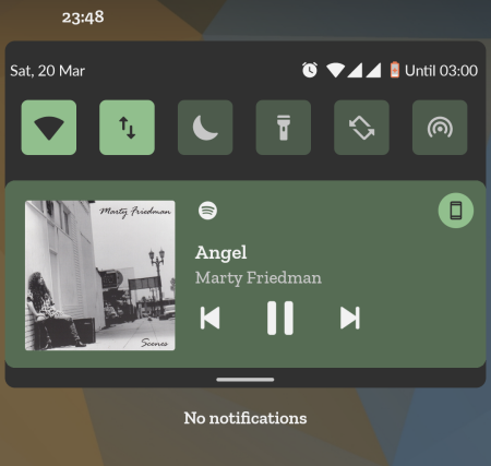
System accent color determines Media Player UI
In previous Android iterations, as well as Android 12 DP1, the Media Player UI colors on the lock screen and the notification shade were determined by the album art of the song. But these tended to stick out, especially when the album arts were in stark contrast to the system accent colors. But Google has addressed this eyesore by matching the Media Player UI color to the system accent color.

This is applicable both in the lock screen as well as the notification shade.
Screen lock changes
The other visual change that DP2 has brought is found on the lockscreen. There are slight, but appreciable changes made that differentiate Android 12 from previous versions.
PIN
If you use a PIN to unlock your phone, you will see that the keypad numbers are smaller and taller. Also, the line between the lockscreen and the keypad is no longer there. On top of that, the Emergency call button has a different dimension and fill color, while the same for the ‘Input’ button is removed, nor is there a circle around it. These changes are ever so slight so there are no real functionality changes to them.

Pattern
If you’re using a lockscreen Pattern, the only major change is that you will see thicker trail lines when drawing your pattern to unlock the phone. These ensure that you can see exactly the pattern that you are drawing to avoid any lockouts.

With DP2, we also get a cleaner, more categorized Accessibility menu. Even though you may not use the Accesibility menu as much as some other Settings options, some of the more important features are found under this page. Previously, all accessibility options were clubbed together under the same hood. But now, options that go together are categorized together. For instance, the ‘Audio and On-screen text’ has been divided into two separate ‘Captions’ and ‘Audio’ categories.

A new ‘Turn screen Darker’ Settings page
The other change in the Accessibilty menu is found inside the “Text and Display” Settings page. There’s a new ‘Reduce Brigthness‘ page that will let you reduce brighter colors. Other options like contrast, size and theme are also amalgamated under a single banner.
This ‘Reduce Brightness’ page can be accessed by going to Settings and tapping on Accessibility.

Then Text and Display.

Then Turn screen darker.

Then tapping on Reduce Brightness.

This option will let you reduce brightness and change the intensity of brightness reduction, among other options.

New Battery options
There are a few new options inside the Battery settings as well. For starters, you can see your battery usage with the new ‘View battery usage’ option.

Previously, one had to tap on the three-dot menu option to view the same option. But that menu is now done away with. So, it takes one tap less to get to the same ‘View battery usage’ option.
Additionally, there’s a new Battery Saver button that will let you toggle it on or off.

Before, this option was available within the Battery Saver option. So with this new optioncan potentially save you yet another tap. Android 12 DP 2 is, on the whole, easier to use, shaving off a few seconds.
New Toggle design
The new toggle design – that includes a tick sign when a feature is turned on – is now found in more settings pages than before.
Although the design hasn’t been implemented system wide, there are a few settings pages that do get this new toggle design, the likes of which include ‘Adaptive Battery’

‘Use Dark Theme’

‘Use Night Light’

‘Use Adaptive Brigthness’

and ‘Use Do Not Disturb’ options.

All these visual changes and additional settings options do more than just prop up the Android experience. They make it much easier to view and access options and save time. They may seem little at first, and some of them may not be all that welcome (such as the grey dark theme), but they do improve functionability.
These changes are far from complete and we may yet see some more of them arrive before the stable release is out.

