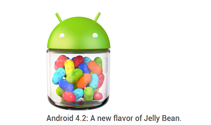
Google may not have been able to host their event earlier today because of Hurricane Sandy, but who said announcements could only be made at a live event? A few minutes ago, Google announced four new Nexus devices over its official blog, including availability details as well as pricing. Take that, Sandy! Both, the Nexus 4 and the Nexus 10, would be shipping with the latest flavor of Jelly Bean, Android 4.2 (Yes. It won’t be Key Lime Pie as some enthusiasts had speculated earlier).
There has already been a fair amount of awareness of what to expect from Android 4.2, thanks to various leaks over the past few days. But here it is now, right from the horse’s mouth. So without further ado, let’s jump right in to check out all the new stuff that’s coming with Android 4.2 – the new flavor of Jelly Bean.
Gesture Typing
Bye, Bye Swype, and say goodbye to Swiftkey Flow which hasn’t even been released yet. The latest version of Android comes with swipey-style typing pre-integrated. You just slide your finger across the letters in a word and the keyboard figures out what you’re trying to type. making one-handed typing a lot easier. Plus the system auto-predicts the next likely word in the sentence, and you can finish off a sentence by just selecting suggested words, and a lot less typing. Talk about efficiency in texting, eh? We are quite happy with this new feature, but can’t say the same for Swype and SwiftKey.
Also improved, is the Android Speech-to-text engine. With updated dictionaries, voice typing on Android will now be more accurate, and speedier because it works even without a data connection. No more lag, give your fingers a well deserved rest.
Multi-User Support
Android 4.2 comes with inbuilt multi-user support. This means that just like on your computer, different users will be able to login and use the tablet. Moreover, each user can have his own customized homescreen layout, wallpaper, preferred widgets, apps and games. The system will even store individual game save data or high score data separately for each user. Another really cool bonus is user-switching – just like the way you do on a Windows machine, without having to log out! Now how cool is that? Android uses its native multi-tasking super power to keep things running smoothly in the background, while you switch to a different user and come back.
This is a powerful feature that is going to be very useful in the small business space, especially those who are looking for a more cost-effective and portable solution for the business.
Photo Sphere Camera
As the name suggests, your camera will allow you to capture 360° spherical views, or to be clearer, a 360° panoramic image. If you have used the Street View plugin for Google Maps, the result of a Photo Sphere Camera capture would result in something right out of Street View, except you put it there. You can share these spheres or spherical photos with your friends and family members on Google+. or if you want to make sure a wider audience sees them, just share them on Google Maps. Check out a few example photo spheres on Google Maps to know what I’m talking about.
Miracast Wireless Display Support
Android 4.2 will come with support for Miracast, an industry-standard Wi-Fi display sharing protocol that allows you to stream practically anything that’s on your device screen to an HDTV connected to a wireless display adapter or Miracast box. This means you can wirelessly stream videos you have captured, or an image slideshow, or even movies or Youtube video right from your device to your TV screen. Carmageddon is coming soon to Android, and crushing those pedestrians on a large screen is going to be a whole lot of fun.
Daydream
Daydream is a screensaver-like feature that kicks in when your device is idle or docked. Daydream will let your device show off useful, but random information, in a manner similar to Google Now, but with a lot more variety like photo albums, news from Google Currents, calendar reminders and more. Android 4.2 continues to entertain you or be useful, even when the device is idle.
Actionable Notifications
Android 4.1 reinvented the Android Notifications system, with expandable notifications. Android 4.2 takes that one step further, and lets you not only expand notifications, but also to take appropriate actions directly from the notifications pane. While we don’t have the nitty gritty on what kind of actions would be possible directly from the notifications pane, Google has given examples of returning missed calls or snoozing a reminder and emailing guests. Knowing Google, we are sure we’ll be seeing a lot more than just that.
Improvements to Google Now
Google Now has more cards added, and can give you information on flights, restaurant reservations, hotel confirmations and shipping details. It will also be able to pull data from Gmail to get ideas for new cards. It can help track packages, find movie information like nearby theatres or showtimes, and even help you find great spots for photo-shoots depending on your location. In all, a newer, more improved Google Now is coming.
Improved Accessibility Options
Triple-tap to zoom in on really small text, or whatever it is that you want to get a real close look at, and even type and interact with the device while zoomed in. Also included is Gesture mode for blind users, which uses touch and swipe gestures combined with speech output to make it possible to navigate without having to actually see the screen.
Magical Widgets
Personalizing your home screen with widgets is going to get a lot easier, and magical. When you place a widget on a homescreen, everything else will reposition itself automatically to accommodate the widget. If it’s too big for the home screen, the widget will resize itself to the screen estate available. Smart, eh? As if not having regular widget support wasn’t enough, the fruit phones now have to deal with magical ones.
Android Beam
With Android Beam, you can now easily share content with just one tap Just touch two NFC-enabled Android devices back-to-back, then tap to beam whatever’s on the screen – contacts, web pages, YouTube videos, directions, apps and more.
Fast and smooth.
When Android 4.1 Jelly Bean first came out, users were amazed at the smoothness and speed it brought, even to older devices. Android 4.2 takes the buttery fluidity and goes one up, by boosting your device’s CPU instantly when you touch the screen, and turns it down when you don’t need it to improve battery life.
Improvements to Google Search
Improved Voice Search capability. Google Search speaks back to you and is powered by the Knowledge Graph, bringing you a precise answer if it knows it, and precisely ranked search results, so you can always find out more.
Phew! That’s a pretty long list of features that we’re going to be seeing on the Nexus 4 and the Nexus 10 to start with. Wouldn’t rule out the possibility of the Galaxy Nexus getting a bump-up in a month or two either. One thing’s for certain, Android has come a long way since 2.1 Eclair, and has added new capabilities and awesome features with each progression. Android 4.2 is not the first version to come with groundbreaking features, and thanks to Google, it most certainly won’t be the last. Before I sign off, have a look at this really cool video which gives you the inside dope on what goes into creating these awesome Nexus devices, right from inside Google HQ.


