Now that Android 10 is out, we can safely list out all the features and changes that are part of the Android 10 update. And there are a lot of them. Even the recent Android OS updates haven’t been as heavy as the likes of ICS and Lollipop have been, but there are major changes to talk about anyway.
We have segregated the must-know features in one section, and the rest of the other cool changes and features in another section. Even small changes, like colorful icons for Bluetooth devices and an ability to share a Wi-Fi password via QR code, can be very pleasing, as you will soon find out.
Related → Must know things about Android 10
Chances are more than not that your Android device hasn’t received the Android 10 update yet, but worry not, for if you bought a device running Android Oreo/Pie out of the box from Samsung, OnePlus, Xiaomi and Huawei, you should be getting Android 10 update. Yes, that doesn’t cover all the Android devices, far from it actually, which is why we have created a list of Android devices that will get Android 10 update and around when.
In this piece, we’ll take a look at Android 10’s top features and tell you how to make the most of your Android 10 smartphone.
- Top 11 Android 10 Features
-
Other noticeable changes you must know
- Notification snoozing disabled by default
- Google Assistant hints
- Dynamic System Updates are live
- Even faster security updates
- Quick volume settings
- Smart Lock is now Pixel Presence
- Live wallpaper preview
- Swipe notifications in both directions
- Relocated lock in on the lock screen
- Share menu now has 8 Direct Share targets
- Contextual rotation button for navigation buttons is back
- ‘Sleep’ has been renamed to ‘Screen timeout’ in the Display settings
- Settings menu now has a ‘facial authentication’ option
- Changes to Always on Display
- More dark theme tweaks in Launcher, notifications, and more
- Turn off battery saver automatically
- Remaining battery life estimate is given in the notification bar itself!
- Digital Wellbeing gets focus mode and parental controls
- Balance audio output
- New UI and controls for notifications
- Easier access to system settings inside apps
- Dynamic depth format for photos
- Estimated remaining battery now displays in quick settings shade
- Active Edge tweak
- New call-end tone
- Share and connect to Wi-Fi networks using QR codes
- Per-app grayscale settings
- Blurred lock screen background appears when music is playing
- Seek music from notifications
- New and better Files app
- NFC and Android Beam removed
- Dark theme boot animation
- New Autofill and APK installer UI
- Enhanced support for foldable phones
- Lock screen Enter button follows theming
- Night Sight now accessible through main camera UI
- Change default apps for call screening and emergency contact
- New icons for Wi-Fi and battery
- Turning off sensors
- Settings profile picture
- Long-pressing notifications get more useful alerts
- Check device uptime
- Native desktop mode
- Emergency info panel
- Colorful Bluetooth icons
- Easily switch audio output for playing media
- Accessibility additions
Top 11 Android 10 Features
Here are the best features of Android 10 update that you must know.
Dark theme

Android 10 officially comes with a system-wide dark mode. It’s called Dark Theme and it can be enabled under Settings > Display > Toggle on Dark theme. Once you enable it, compatible apps will also go dark, giving you a seamless experience. Caution though, do not expect a lot here as not many apps have been configured to follow the system’s dark theme right now.
Themes
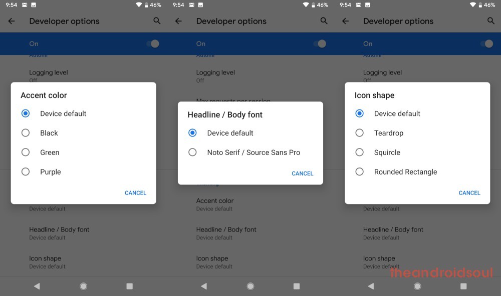
Android 10 supports theming the look of the OS to something that fits your needs. The option to do so isn’t directly accessible, though. To access it, go to the developer options in the Advanced System settings menu. If not enabled, hit the build number in About phone several times to enable developer options.
Once you access it, theming lets you tweak the accent color, headline/body font, and shape of icons, which isn’t much, but a good direction, definitely.
Initially, only a handful of accent colors were available, but in the stable release, Google added more accent colors namely Cinnamon, Ocean, Space, and Orchid.

Android 10 has reworked the way you interact with your device by introducing full-screen navigational gestures, which also, for the first time ever, gets rid of the back button. Swipe up from the bottom of your screen to go Home, while a swipe from either edge (right or left) will lead you back to the previous page. To access the recent apps menu, swipe up from the bottom of your screen and hold before releasing.
Android 10 also gives you the option of going back to the good old days by choosing 3-button navigation(Home, Back, and Recents).
Related → How to get Android 10 gestures on Android 9 Pie

Back sensitivity is adjustable
In order to avoid conflict with traditional navigation using the edges, like swiping from one tab to the other in the Play Store, or opening slide-in menu, it allows you to adjust the sensitivity of the Back gesture.
Setting the sensitivity to high will allow you to perform the Back gesture even a bit away from the edge while setting it to low will require you to reach the edge accurately and then perform the Back gesture.
Try this: Set the Back sensitivity to Low(est), and then open the Play Store. Now, perform the swipe from swipe to right from the left edge but a bit away from the edge, and you will be able to open the slide-in menu easily.
To go back, you will need to swipe from the edge only, not even a bit away from it. If you want the Back gesture to work effortlessly though, you can set it High, but then, for the slide-in menu, just hold a bit on the edge and then swipe to the right to bring the slide-in menu.
Swipe across the bottom bar to switch apps easily!
Yes, this is as simple as that! If you are a multi-tasker this will help you more than split-screen multi-window even.
Also, to launch Google Assistant, swipe diagonally from any of the bottom corners.
Bubbles
Google has reworked the notification delivery system in Android 10. If you have used Facebook Messenger, you’re already familiar with the whole ‘chat heads’ concept. Only this time, Google is making it natively available to a variety of apps. Messages and Hangouts are already part of the package, with many expected to join the pack after release.
Related → How to use Bubbles on Android

Android 10 gives you more control over the content you are sharing by displaying a sizable thumbnail of the image you’re handing out. If you are one of those people who have too many embarrassing photos on their device, this feature is ought to be a lifesaver.
Adaptive notifications
The Android 10 not only comes with better-organized notification settings UI in Settings > Apps & Notifications > Notifications, a new animation for Gentle and Priority notifications as well as an option to hide the status bar icons from Gentle notifications, but there is also something Google calls Adaptive notifications.
Sounds familiar? Well, it’s because it should [Hint: Adaptive Battery and Adaptive Brightness]. This feature is designed to set lower priority notifications to Gentle using “Automatic Prioritization.” This feature can also come in handy when you want to control Suggested Replies & Actions for a given set of apps.
Related → How to fix pop-up notifications issue on Android 10 by disabling Adaptive notifications
Smart replies for more apps
More Android 10 apps now support smart replies. The feature has now been fully integrated into the notification system of 10. This is all thanks to on-device Machine Learning. Apart from sending a pre-defined message, the system also recognizes Google Maps, YouTube links, and other URLs in your messages.

Improved privacy with new access limits
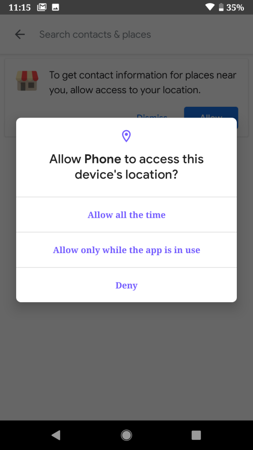
Android 10, as has always been the case with every other Android OS iteration, beefs up user privacy by introducing more limits to activities. For instance, Android 10 apps can only access location settings when in use and not when in the background.
Also, apps won’t be able to launch activities in the background without your consent. Android 10 will also let users deactivate unique device IDs used for advertising purposes. To have a more detailed understanding of the permissions your apps have, go to Settings > Privacy > Permission manager.
Live Caption
Android 10 has a feature known as Live Caption that provides real-time captions locally to anything that someone is saying on your phone. It doesn’t need an internet connection to work, which is pretty cool.
Live Caption can be enabled via the Accessibility settings menu in 10.

Android 10 has improved the usually janky UI of the share menu, where the specific content being shared now appears at the top of the new share menu with the top-right corner housing the clipboard button. Right below is a list of the usual target apps followed by your other apps.
Google wants to quicken the time taken to share stuff by implementing what are basically shortcuts, thus allowing apps to pre-set targets and instantly load when the share menu is invoked.
Undo accidental home screen icon removals
If you are the type who accidentally removes icons from their home screen, Android 10 has got your back. The newest Android lets users undo the accidental removal of icons on the screen.
Of worth to note is that this feature is limited to the Google Pixel launcher and not in third-party versions, but of course, we should start to see third-party apps like Nova Launcher begin to apply it.
Other noticeable changes you must know
Here are the other bits from Android 10 that you should know.
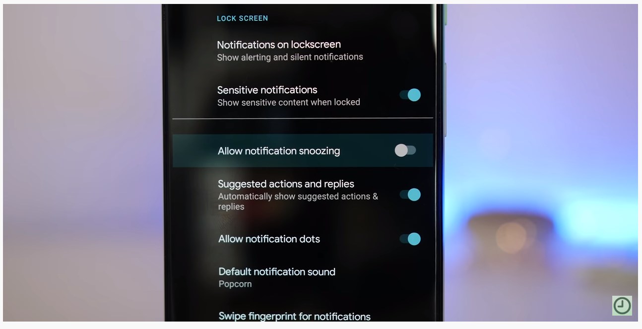
Notification snoozing disabled by default

In Android 10, Notification snoozing is disabled by default, so, you’ll need to do a bit of work to enable it. To enable, go to Settings > Apps & notifications > Notifications > Advanced > Allow notification snoozing.
Google Assistant hints
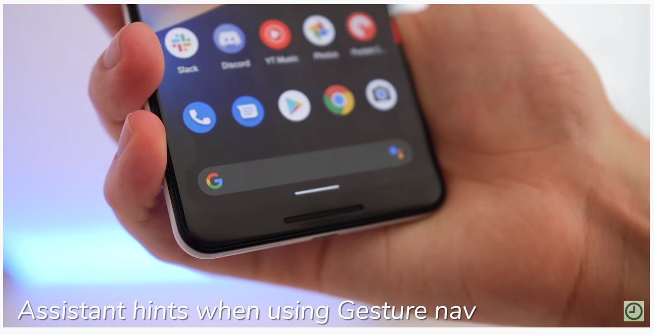
As discussed earlier, Android 10 brings a whole new gesture-based navigation system. Now, like every other new change, there’s a bit of a learning curve involved here as well. To make the transition easier, Google shows hints at the two bottom corners, prompting you to swipe outwards to toggle the Assistant.
Dynamic System Updates are live
Google keeps improving the speed at which Android OS updates are delivered to devices with each iteration. The most recent one is Project Treble that came with Android Oreo and improved in Pie, and now we have another effort called Dynamic System Updates.
This one lets users try a newer version of Android without actually affecting the currently installed version. Also, you don’t need to unlock the bootloader of your device to install DSU, which is pretty cool.
Even faster security updates
Usually, Pixel devices are the first ones to get Google’s security updates. And while that’s a hassle-free process for global/unlocked Pixel users, it’s often a painfully long procedure if you’re tied to a carrier. Starting with Android 10, Google will channel essential security updates through Google Play, which effectively eliminates carrier-related interruptions and delay. These security patches will be downloaded in the background and will be auto-installed.
Quick volume settings

Android 10 allows you to go deep into your volume settings without forcing you to jump through the hoops of tumbling around the Settings menu. To quickly access volume settings, simply tap either of the Volume keys and tap on the settings icon.
Smart Lock is now Pixel Presence
Since Android Lollipop, Google provides users with a Smart Lock feature that allows devices to stay unlocked in certain conditions, for instance, when at home or a known Bluetooth is connected. In Android 10, this feature has been renamed to Pixel Presence, although this seems to be region-wise.
Those in the U.S. still see “Kept unlocked by Smart Lock” displayed on the screen while those outside see “Kept unlocked by Pixel Presence” instead, but the change in names is only reflected in the SystemUI app and not the Settings app.
Live wallpaper preview
Prior to Android 10 beta 4 update, the UI for setting Google’s live wallpapers was updated with a new panel with details of the artwork. A neat addition, no doubt, but the problem came when you wanted to remove this sheet and you couldn’t, thus getting in the way of a fullscreen preview.

In the stable variant, users can now swipe away the information and even better is you get a “Preview” checkbox in the top-right corner for bringing it back as the wallpaper.
Swipe notifications in both directions
In Android 10, it’s now possible to dismiss notifications by swiping them in both directions instead of just swiping them in a single direction. Google removed this nifty little feature in the first 10 beta and later added a toggle to choose the direction you want with beta 2, but it’s great to see it back without the need of a toggle in the stable variant.
Relocated lock in on the lock screen
![]()
The lock screen in Android 10 has undergone subtle changes that have seen the lock icon relocated to the top, right above the time and weather. Prior to this, the icon was located at the bottom, just below text showing the current charging state of the device.
This change doesn’t leave the bottom section empty, instead, it now displays info whether Smart Lock or “Pixel Presence” is keeping the device unlocked.

The Share menu in Android 10 now includes up to 8 Direct Share targets based on how frequent you share with the targets in question. The menu also shows the full “Apps list” just below that.

Android 10 has brought back the contextual rotation button for the navbar. This button made its debut with Android Pie, but due to the new gesture-based navigation on Android 10, it was removed with no signs of ever making a comeback, but here we are.
The little button now appears as a standalone overlay in the bottom left corner of the screen when your device’s rotation orientation is locked, otherwise, it won’t show up. The button now also adheres to dark theme settings.
‘Sleep’ has been renamed to ‘Screen timeout’ in the Display settings

Android 10 has renamed ‘Sleep’ in the Display settings menu to ‘Screen timeout.’
Android 10 has face authentication in the settings menu with more details about how the feature will be used and what for. This appearance means the feature will be a mainstay in Android 10 devices, where it will be used to make in-app payments and sign in to apps as well.
To make it work, one will have to open their eyes and stare into the scanner. Of course, face data stored on the device can be deleted at a user’s discretion.
Changes to Always on Display
The Always On Display has received some new changes in Android 10. Look closely and you’ll notice the clock is now much bolder, the music app icon no longer appears next to the title of the song playing, the date is missing, and weather info now appears on the second row.

More dark theme tweaks in Launcher, notifications, and more
Android 10 beta 3 came with a system-wide dark theme that had been in the rumors mills for months. With Android 10 beta 4, the feature has now received more tweaks with respect to the Launcher, notifications, display, and so on.
In the display settings, for instance, the Dark Theme preference is now a toggle and not a full menu with two options like in Beta 3. The bottom search bar on the screen turns gray when the dark theme is turned on and even better is that the app actions panel (long-press on an icon) in the Pixel Launcher now has two lighter shades of gray that blend well with the dark theme.
Turn off battery saver automatically

In Android 10, you can choose when the battery saver mode turns off. Usually, the feature automatically turns on when the battery is at 15%, but this time the feature will also automatically turn off at 90% when enabled.
Remaining battery life estimate is given in the notification bar itself!
![]()
When the battery of the devices is running low, on Android 10, the system will give you the estimated time of the day until the battery would last. You can find a charger before that avoid running out of battery easily.
Digital Wellbeing gets focus mode and parental controls
Digital Wellbeing was one of the features that Android 9 Pie introduced and as expected, Android 10 is here to make it even better. Android 10 now has Focus mode, which allows users to temporarily disable apps they feel are distracting their current activity. This should come in handy for students when in class or even the working class when at work or in a meeting.

Additionally, Android 10 also brings a parental controls feature whose role is to do exactly that. Parents will be able to keep a close eye on how children use their phones by setting up things like daily limits and bedtimes. If they feel like the daily limit isn’t enough, children can request their parents for “bonus time” to keep using their phones.
Balance audio output

Android 10 lets you balance the audio output, giving you more control over your listening experience.
New UI and controls for notifications

In Android 10, gone is the option to snooze notifications and in comes “Alerting” and “Silent” notification modes. In the former, the notifications appear in the status bar, as heads-up notifications, and also make noise in case the ringer is turned on. As for the latter mode, notifications will only appear when you pull down the notification shade, but they won’t appear in the status bar or lock screen. Also, you won’t hear them coming in, that is, no sound or vibrations.
Easier access to system settings inside apps
When inside an app, you may feel the need to tweak something about this app, but usually, this forces you to leave the app and go to the Settings app to accomplish this task. In Android 10, you can easily access settings like Wi-Fi, Bluetooth, and so on.
For instance, if the current task requires a Bluetooth connection and it’s turned off, you’ll be presented with a settings panel with an option to toggle Bluetooth on. All this is thanks to App slices feature that came as part of Android Pie, allowing contextually-relevant parts of apps to be displayed outside of these apps.
Dynamic depth format for photos
Android 10 introduces the support for a special format for photos that brings out more depth information that can be used to apply specialized blurs and bokeh options, just to name but a few.
According to the Android Developers Blog, apps will request JPEG files with included depth metadata and a depth map that photo editing apps can use to create some cool effects on photos. This new format will in future be used for AR photography or to create 3D photos.
Estimated remaining battery now displays in quick settings shade

In Android 10, pulling down the notification shade reveals a nifty little addition, where you can easily see the amount time the remaining battery juice will last. But this requires that you have the battery percentage in the status bar turned on.
Active Edge tweak
![]()
Active Edge can now be configured to enable ‘Squeeze to talk.’ With it enabled, you can talk to the Google Assistant by squeezing the outside edges of your Pixel device.

New call-end tone
Apart from all the visual changes, Android 10 also brings quite a quirky audible tweak. The call-end tone now has a peppier tone, which is quite a subtle welcome change to have.


Android 10 lets users share and connect to Wi-Fi networks using QR codes, something that should come in handy for those who always want to have strong Wi-Fi passwords but aren’t just into typing those characters. All you need to do now is to simply scan and you’re in.
Generating a QR code needs you to open your Wi-Fi settings and hit the currently connected network and the Share button will pull up the code, although authentication will still be needed using your lockscreen password or fingerprint before proceeding. To scan the code, tap the button to the right of the Add network option in the Wi-Fi settings. Unfortunately, this feature is still limited to Android 10 devices.
Per-app grayscale settings
In Android 10, every app will include grayscale settings, meaning users will be able to set individual apps to display in grayscale. Unfortunately, this feature only exists on paper, so we can’t really tell how it works, but of course, it should arrive in a future 10 beta build.
With Android Pie’s Digital Wellbeing, users can already set the screen to display in grayscale with the help of Wind Down settings, thus making the phone less interesting to use. Apparently, Android 10 will apply this feature to all apps.
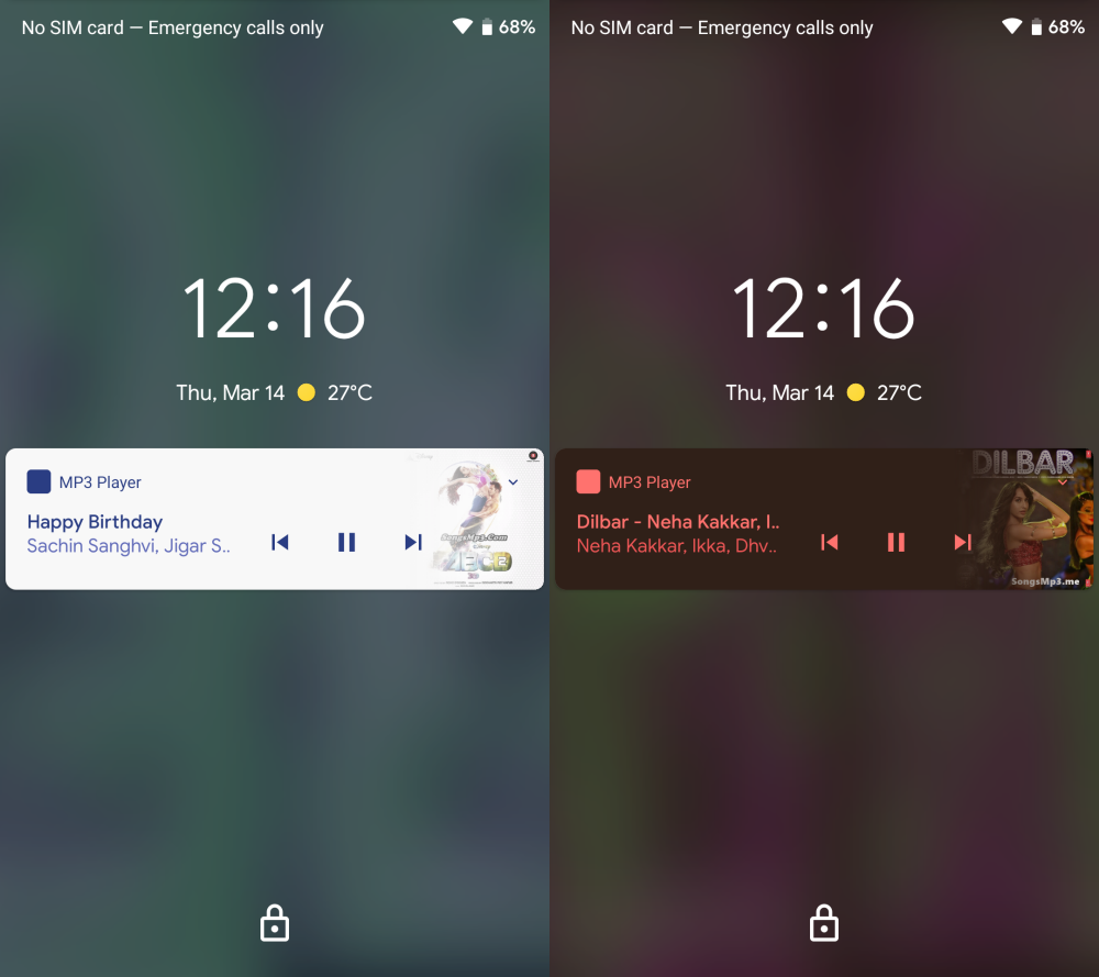
Blurred lock screen background appears when music is playing
Usually, playing music on Android devices displays a lock screen background with the audio’s art. In Android 10, the background switches to a blurred image instead of showing the art of the playing audio file.
There seem to be more filters to how the background appears and it seems they are applied based on the colors of the artwork of the audio files being played.
Seek music from notifications

Until Android Pie, we only had the option of pausing/navigating between neighboring songs in the notification shade. Android 10 adds the option of scrubbing through the audio file you’re playing.
New and better Files app

Stock Android has for years had one of the worst file managers, but the app has slowly been getting better with each Android OS iteration. With Android 10, Files has gotten even better, albeit with some interesting filters and updated material design.

The top of the screen has a search bar and just below it is a carousel of filters that ease the whole process of sorting data by file type. You also have the option to view files from third-party apps in a much better way than before, where they were buried in a hamburger menu.
NFC and Android Beam removed
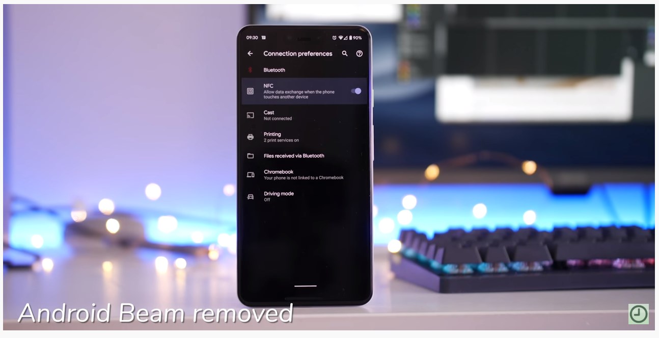
Google has gotten rid of Android Beam in Android 10. It was one of the least used features of the OS, so, it’s unlikely that the company will face significant backlash.
Dark theme boot animation
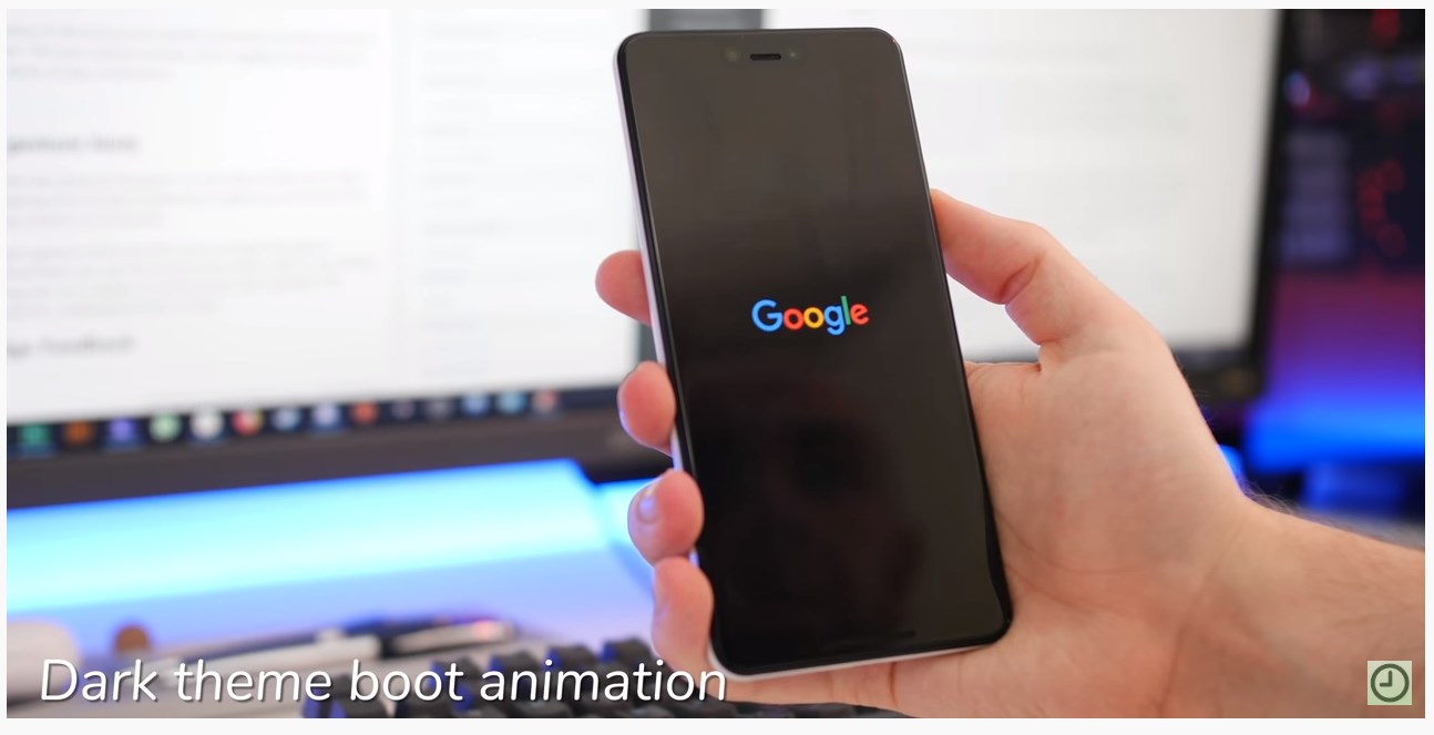
Upon turning on Android 10’s system-wide dark theme, you’ll see a pleasantly noticeable change in your boot animation as well.
New Autofill and APK installer UI
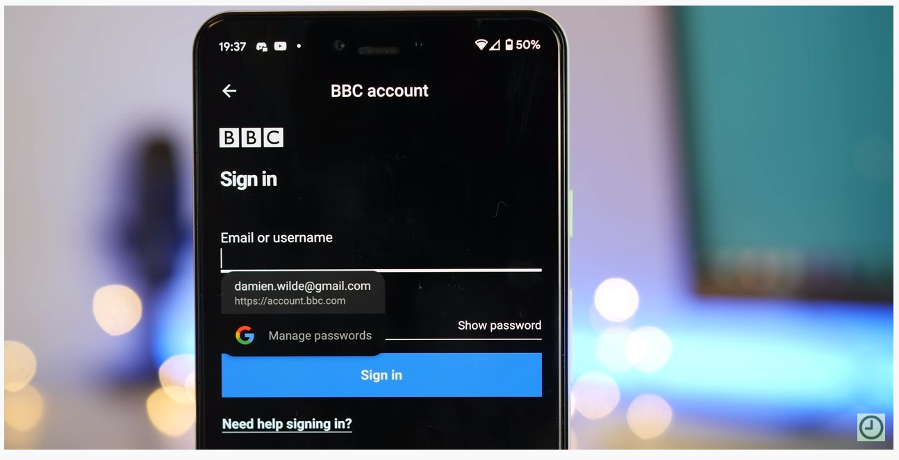
Android 10 has brought a lot of subtle changes, and this is one of the subtlest ones. Autofill information now adheres to the dark theme, maintaining consistency.
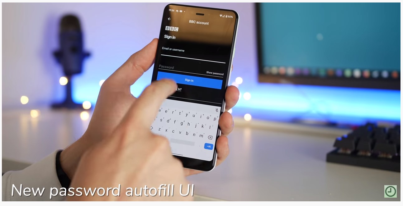
App installer UI has also gotten a neat facelift.

Enhanced support for foldable phones
The support for display screens with various form factors has been around since Android Pie and with Android 10, things are getting better. Developers now have the tools to develop software that supports switching between various display types, that is, folding and unfolding.

The lock screen Enter key on Android 10 adheres to any accent theme color you may have picked, and dresses in that color.
Night Sight now accessible through main camera UI

Night Sight has been integrated into the main camera UI and now sits just adjacent to the main camera tab.
Change default apps for call screening and emergency contact
The good thing about Android is that it lets users change the default apps and with Android 10, you can further change the default call screening and emergency contact information apps.
Out of the box, Call screening is attached to the Phone app while the Emergency app takes care of emergency contact info, but users can choose other third-party apps to take up the same roles.
New icons for Wi-Fi and battery
![]()
Adhering to Google’s material theme, Wi-Fi and battery icons have been made bolder.
Turning off sensors

If you’re too low on battery and are looking for a way to squeeze out some extra juice, Android 10 allows you to toggle off all your sensors.
Settings profile picture

Your Google account picture is now displayed in the top-right corner of the Settings menu.
Long-pressing notifications get more useful alerts

When you long-press on a notification in Android 10, unlike the previous OS, reveals more useful options that can be used to manage how the app in question alerts you in future. There is the option to “Block”, “Show silently”, or “Keep alerting”, an upgrade from “Stop notifications” and “Keep showing” in Pie.
Long-pressing a notification of an already silenced app reveals three options: “Block”, “Stay silent” or “Alert me.” And yes, the buttons are specific to the notification channel used by a certain app.
Check device uptime

Android 10 gives you the option of keeping track of how long your device’s been running. To check, go to Settings > About phone > look for Uptime.
Native desktop mode
With the Galaxy Note 9, Samsung improved on DeX by eliminating the need for a separate dock in order to turn the device into a full-featured desktop, but unfortunately, the fact that this solution is centric to Samsung devices means that apps must be optimized specifically for DeX in order to work perfectly when in desktop mode.
With Android 10, Google is getting its act together by including native support for desktop mode. The feature is currently hidden in the Developer Options menu under the “Force desktop mode” option.
Turn this option on and apps begin showing up in free-form windows on the connected display, but the status bar keeps its usual position at the top while navigation buttons are the bottom.
Emergency info panel
The emergency info panel has been redesigned, and it’s no longer in tabs. There’s also an option to choose a profile picture if you want.
Colorful Bluetooth icons

If you have multiple Bluetooth devices that have been paired with your device, Android 10 assigns colorful icons to help you easily distinguish between them.
Easily switch audio output for playing media
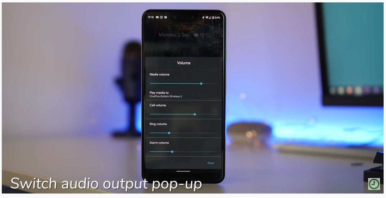
In Android 10, switching the audio output of playing media is a breeze. The Now Playing notifications have a new button for picking between the available audio output options, be if your phone speaker or maybe a connected Bluetooth speaker.
In Android Pie, this option is hidden in the Sound settings menu, which hasn’t always been easy to access.
Accessibility additions
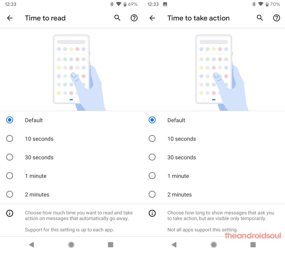
There seem to be a few additions to the accessibility additions as well since the options for Time to take action and Time to read have been added.
The time to take action feature lets pick “how long to show messages that ask you to take action, but are only visible temporarily.” Whereas the time to read feature lets you pick “how much time you want to read and take action on messages that automatically go away.”
It is worth noting that not all apps support this setting and the app developers would have to add support for the feature to their apps.
Related: These devices will receive Android 10 \update
What are your favorite Android 10 features?






Meh, I’m on Android P and pretty content. The OS has matured enough at this point that I’m not bothered about when the next update is going to arrive, like I was with earlier versions. I’m also good with Chrome OS now that Android apps can access external drives in version 72.
I would really like to see native support for in-display optical fingerprint scanners! I have a 6T and OnePlus decided not to relase that source code, meaning all roms are happening WITHOUT the scanner working -,-
I hope with Android’s support for a Dex Like feature, the existing Samsung Dex will be a better experience due to “native” support.
“Allow users to use the device as a PC via a built-in desktop UI similar to Samsung DeX” RIP MOTO ATRIX
waaooow are samsung recreating what WIndows Phone has from start, a Docking unit for TV. samsung remind me of CrAppel, the first enventor of all things..
How about a Backup / Restore system that, you know, actually restores my screen setup? There are files that store it, I should be able to get my installed apps reinstalled, the data that gets backed up for them downloaded, and the icon/group layout put back the way it is.
This is one thing that makes me hesitant to try the betas, how horrible the restore support is after the mandatory factory reset.