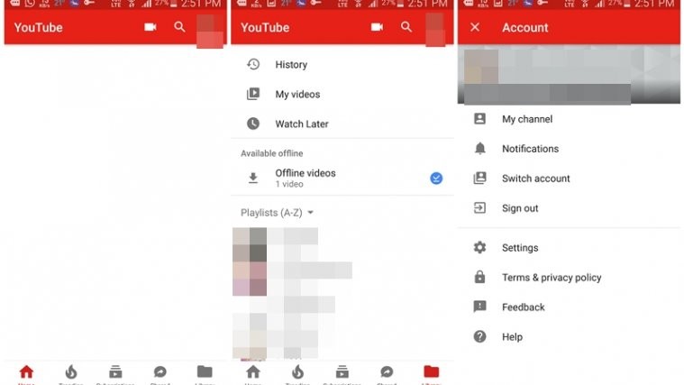
If you are a Youtube junkie, you must have noticed that Youtube silently introduced a new “Shared” feature in the Android app. The shared feature lets you easily share the YouTube videos with your friends in the app itself. Little did we know, this was a baby step in the major overhaul of the app.
The app in its latest update of v12.19.56 introduces new UI in the app. With the new UI, the top navigation bar is now present at the bottom of the app. Not only that, the size of the navigation bar that contains the Tabs has also been reduced. This gives you extra space to see more videos. Happy? Wait. There is a catch to this. The new UI has removed the ability to swipe between each page.
Check out: Useful WhatsApp tips and tricks that you should know
That said, the new update makes it easy to understand the various Tabs for the newbies, as now the Tabs show the names in addition to the icons. Further, there is a new Library Tab that includes your watch history, uploads, watch later, purchases and playlists – all under one tab.
However, your account details, settings and notifications are kept under a separate icon. Just tap your profile icon present in the top right corner to open the account details. To make it easy to switch the accounts, there is a separate option under the account settings to do so. However, you can still switch the accounts by tapping the down arrow present next to your name.
Last but not the least, the floating upload button has been replaced by a static upload button present in the top bar – next to the search.
Do you like the new update? Or hate it? Tell us in the comments below.


