Update [June 15, 2017]: The new UI is live on the stable Twitter app as well.
If you are on this page, we are presuming you are a Twitter user. So, umm, calm down first! Yes, the Twitter UI is about to change in the official Android app. So, before you start reading this post, we appeal to you not to break things around you.
Having said that, the new UI will take some time to come to the stable Android app. This new UI is currently available in Alpha and Beta versions of the Twitter.
Check out: Useful WhatsApp tips and tricks that you should know
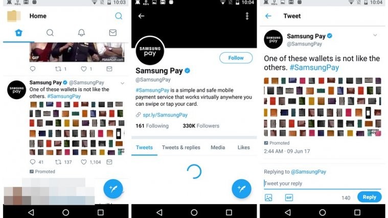
The moment you open the newly updated app, you will see new round icons all around you. To put it in a subtle way, the Twitter app has been round-ified.
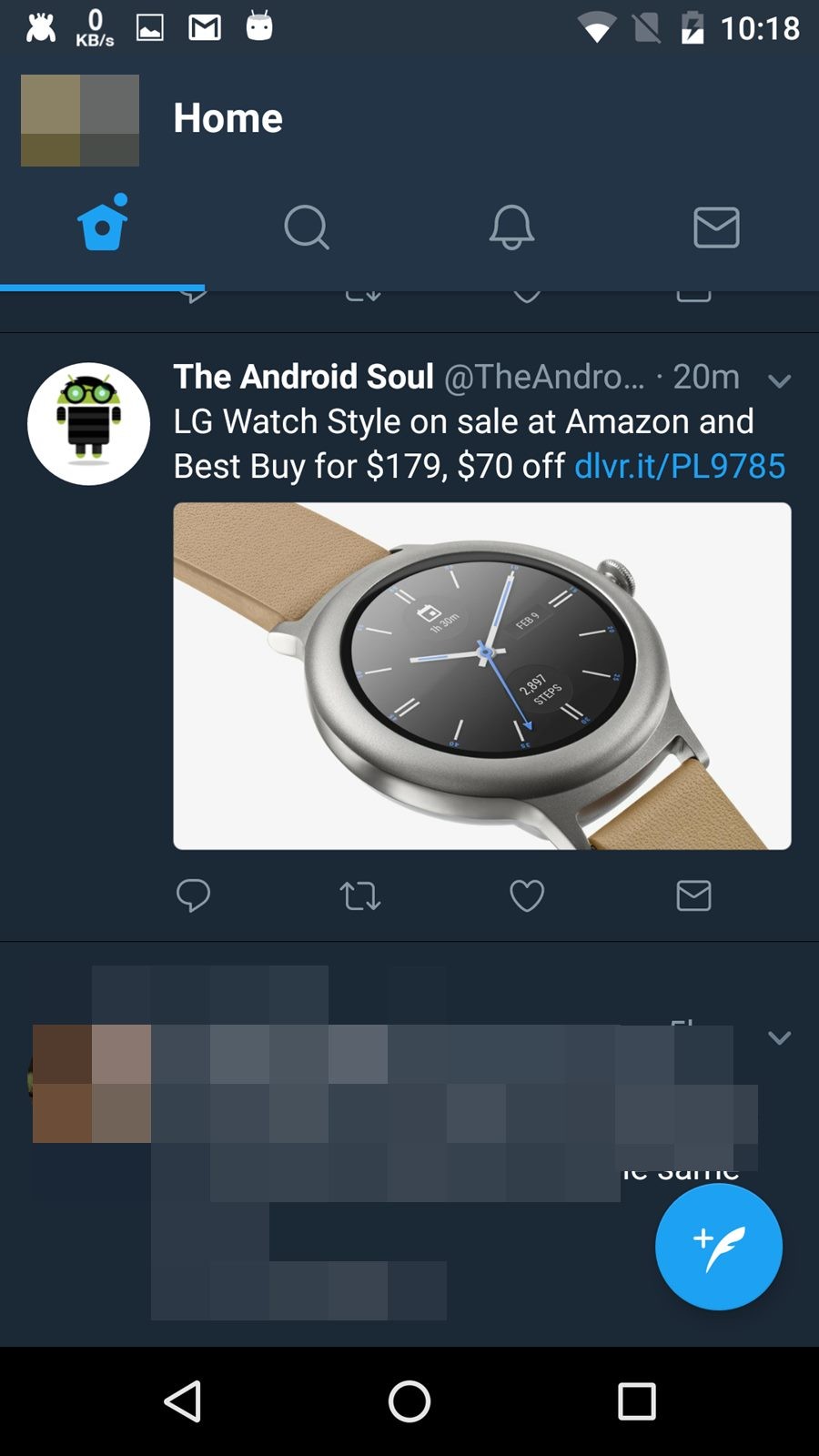
In the top bar, gray outlines or just the borders of icons replace the gray filled icons. Then the icons below each tweet have also got a makeover. There is a new reply button that looks like a chat bubble. Retweet button now has round corners and similar to tab icons, heart and DM icon below each tweet are now just outlines of the icon. Plus, square avatars/profile pictures have been replaced by round avatars. To be honest looks cool.
Besides that, while replying to a tweet, the old gray dull buttons are now more prominent, thanks to the new blue colored buttons.
Check out: Facebook app: Tips and tricks you should know
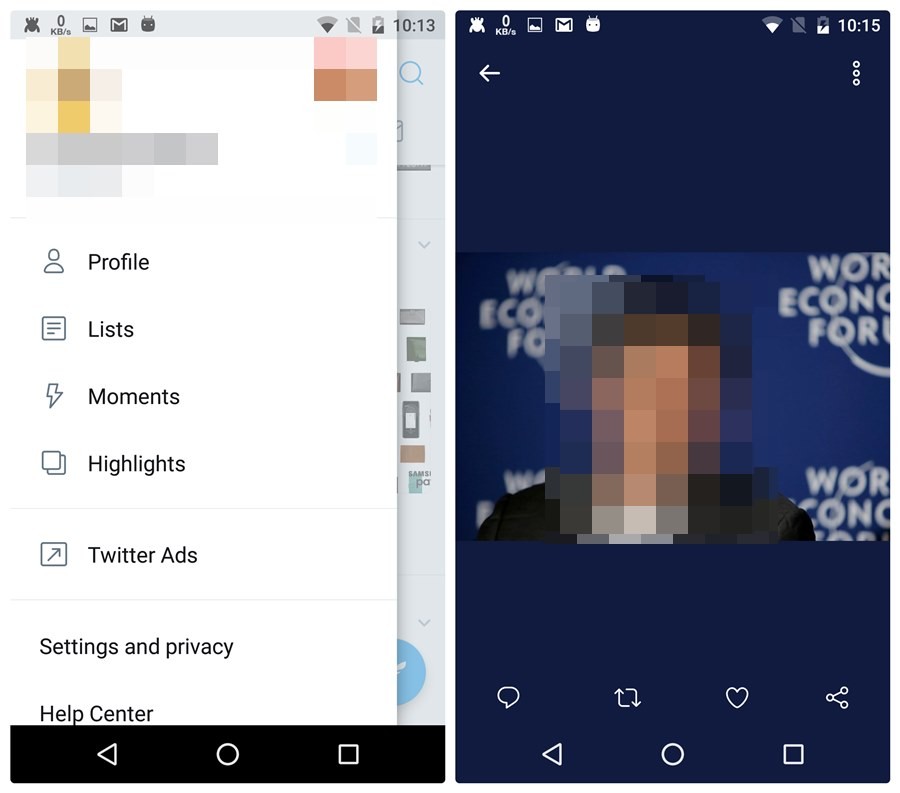
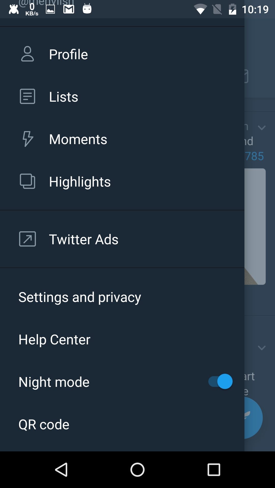
In addition to that, the floating “New tweet” button comes with a plus sign and the navigation drawer now looks clear with new icons and better UI. Plus, the order of items in navigation drawer has also been slightly changed.
Further, Twitter has changed the photo view as well. It now extracts the background color from the main color of each image, which makes it look amazing.
Last but not the least, the count below the tweets is now dynamic. You don’t have to refresh the timeline to get new count, it is updated automatically.
And in case you are wondering how the night mode looks like, here take a look.
Did we miss any new feature? What are your thoughts on the new UI? Let us know in the comments below.


