- What to know
- What is the Instagram grid view?
- Which posts show up on Instagram?
- Can you remove posts and reels from your Instagram grid?
- How to remove a post from your Instagram grid
- How to remove a reel from your Instagram grid
- Why your Instagram grid matters!
- How to plan your Instagram grid
- Tips for a better Instagram Grid
- FAQs
What to know
- The grid view on Instagram is where your posts end up in a 3×3 design layout, just below your bio and story highlights.
- Instagram grid helps you to highlight your posts to help you gain and connect to your followers.
- You can design your Instagram grid by tying multiple posts together using color combinations, thematic appeal, row-by-row, column-by-column, diagonally, as pieces of a larger puzzle, and various other creative ways.
Being a part of the crowd makes us feel accepted, but standing apart and claiming a unique identity helps us grow and give back. That is true for both the real and the digital world, and nowhere is it truer than on Instagram – arguably the world’s most popular social media app.
On Instagram, your profile grid is the face and body of work you choose to display. Casual users may not pay that much attention to their grids. But for businesses, influencers, and coaches, a thematic profile grid that is well-designed, aesthetically pleasing, and delivers the intended message is instrumental to the growth of their professional accounts.
If you’re new to Instagram or the world of grid design, there are a few basic things that you must know. To that end, the following guide will briefly introduce Instagram’s grid view, why it matters, and how you should plan your posts and style your grid to awe your audience. Let’s begin.
What is the Instagram grid view?
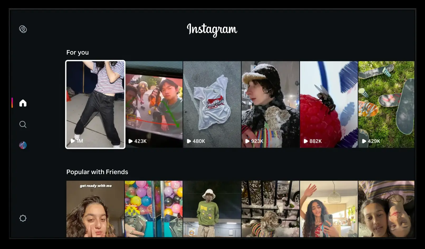
The Instagram grid is where users end up when they tap on a profile. The 3×3 grid layout is the heart of a profile page where one’s posts eventually end up being and creates the crucial first impression that determines whether you’ll get those views, likes, and comments.

When the pictures are disconnected or highly individualized, the profile grid may not form a coherent narrative or be aesthetically pleasing at the very least. Whereas carefully planned profiles can catch the viewers’ fancy quickly and grab their attention (and their thumbs).
Which posts show up on Instagram?
Whatever you upload on Instagram ends up on your profile grid. This includes your pictures, reels, as well as videos that are longer than 90 seconds and thus are not classified as reels.
Can you remove posts and reels from your Instagram grid?
Yes, you can always remove your posts and reels from your Instagram grid. Here’s how to do so:
How to remove a post from your Instagram grid
To remove a post on a grid, tap on it to select it first.

Then tap on the three-dot icon at the top right corner.

Then select Delete at the bottom.
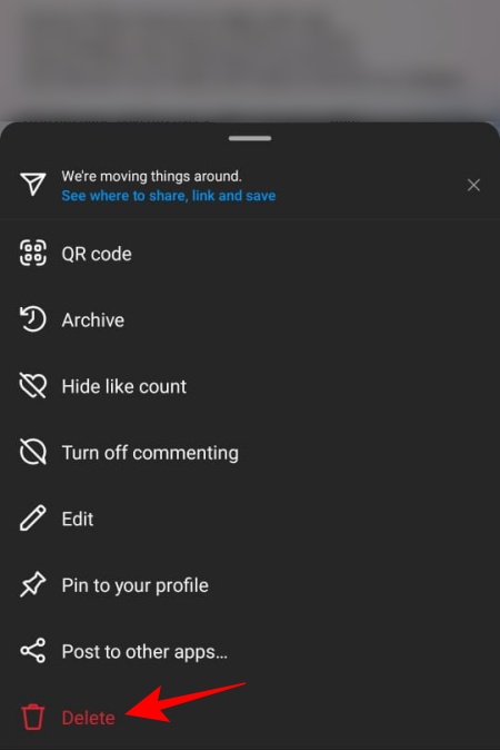
And just like that you would have deleted your post from your Instagram grid.
How to remove a reel from your Instagram grid
The steps to removing a reel or a video from your grid are the same as removing a post. To do so, tap on the reel to select it.

Then tap on the three-dot icon at the top right corner.

Then select Delete at the bottom.

Why your Instagram grid matters!
Your Instagram grid matters in more ways than one. Not only does it introduce your work to your friends and followers (or anyone checking out your profile), but a beautiful grid is much more likely to charm viewers, get them to interact with your profile, and, when it comes to brands, to act upon your post or message.
1. Creating a brand
Whether it is a personal or a professional brand, your Instagram grid is the portal to what you have to offer. Having a focused aesthetic, a consistent design choice, and your own style and flair are going to be decisive in building and improving your brand.
All these are important considerations to make before you start planning your grid. But there isn’t a one-size-fits-all solution – and that is the point! Depending on the nature of your brand, your grid can comfort your audience or jolt them out of their zones, vibe out coolly or give a dramatic punch, go with the flow, or buck the trend entirely. It’s all up to you and what you want the larger picture to be.
2. A neat aesthetic design
Of course, businesses and brands aren’t the only ones that benefit from a well-planned and thoughtful profile grid. We’re visual creatures primarily. And anyone, in fact, can (and should) take advantage of Instagram’s pictorial grid framework.
A single view of your profile grid is often enough for viewers to decide whether they will ever want to come back. Even if your followers are just your friends and family, visually delightful grids are more likely to get you the applause and the brownie points in your circle. Besides being a personal artistic challenge, having a well-designed history of posts will help your followers, both real and potential, learn what to expect. And if they like what they see, they will expect to see more of what appealed to them in the first place.
You don’t have to be a creative savant to design aesthetically pleasing profile grids. All it takes is making a conscious design choice and sticking with it. Refer to later sections to get started.
3. Set yourself apart
Your profile is your own. And keeping a well-organized profile grid will help separate you from the crowd. It is not all that hard, considering that most users tend to post whatever they feel like sharing with the world without much thought. Though there’s nothing wrong with it, one runs the risk of drowning in the ever-expanding sea of Instagram users out there.
Unless you’re a celebrity, meaningless and chaotic profile grids won’t win the hearts of your followers. They need to see and make a connection with what you have to offer. And there’s no easier way to do so on Instagram than with a profile grid that reflects what you or your brand is all about.
How to plan your Instagram grid
Ultimately, the posts on your Instagram grid act like pieces of a puzzle, and if you get it right, it can lift your brand to the stratosphere. If you’re running low on ideas, here are a few things that you can consider to start planning your Instagram grid.
1 .Work on a theme
There is no work of art (or one that matters) that is devoid of thematic nuances. Theme, one might say, is the larger set of ideas that the constituents of your work touch upon and explores. Basically, think about what it is that you want your profile grid to say, be it about yourself or your business and brand.
Themes are directly tied to the message or the story that you’re trying to tell with your grid. Consider having similar content close together in your post to create that thematic consistency. This is not to say that you cannot experiment with other elements like colors, textures, and filters. Your posts can be related even if these elements are different.
For instance, @adidasfootball is all about, well… football. So we expect to see players, footballs, and – you guessed it – shoes!

As you can see, the posts are all different. But there are unifying factors that deliver the theme. Of course, this is a very simple example since we all know what Adidas is about.
Let’s consider another example. Can you guess the theme here?

Bookstagram profiles are not hard to miss. Regardless of where the photo is taken or what else it contains, you’re invariably going to see books in there. And that is the main theme – love for books. Such is the case with @honeybooks_ as well.
Use such examples to consider what you’re trying to accomplish with your page. Let the overarching goal be the guiding light that illuminates everything else that you decide upon.
2. Find proper color combinations
Once you’ve decided on your theme, the next best thing to consider is the colors that you use in your posts. Because colors elicit emotions, they can have a huge impact on how others see your profile and engage with it.
Do you want your profile to be bright and inviting, or perhaps have a little gloom and doom infused in? Whatever color palette you choose to work with should be contingent upon your theme, of course, but also upon what you want to evoke in your audience.
Common sense and industry standards should also inform your color choices. For instance, if your brand is about all things verdure and vegetative, then perhaps you would want to play around with green more than any other color. Of course, it isn’t a must. Look at how @hugs_for_trees uses different colors to create a captivating grid depicting nature (and trees) in all its forms.

At the end of the day, you’re not held captive by your choices. But knowing what you’re trying to show will help you make the right decisions and, if needed, be consistent with your color combinations.
3. Use a checkerboard!
Patterns and designs are great. But how can they be worked in on your grid? A checkerboard pattern is one of the more interesting (and simple) designs that can be executed no matter what you’re trying to accomplish. With a checkerboard design, every other post is related, be it by color, text, or any other element.
Checkerboard patterns also allow you to juggle two different themes (or two aspects of a single theme) in your profile grid, and give you the best of both worlds, whatever they may be.
@bossbabe.inc does a great job at helping women entrepreneurs with pictures and texts.

Similarly, there is also @cerebralmist that combines inspirational quotes and text with color-coded images to enhance an otherwise minimalist profile grid.

4. Decide between columns vs rows for your design
Another design choice that you can make is to arrange your posts with similar elements by columns (vertically) and rows (horizontally).
4.1 – Columns
The 3×3 grid can seem limiting at times. But within it, there is potential enough to explore different design patterns. Breaking up the grid vertically to create a long vertical line of posts can bring attention to them far more easily.
Take for instance @mintcontent_ whose post columns are simple, elegant, and – more importantly – well-arranged.

These vertical row designs can span as many or as few squares on your grid. But, of course, three or more make up a series or a pattern. You are also not limited to any one column. In fact, all three columns can be designed differently. As long as three or more squares in a column are bound in some way, and are coherent enough to appear so visually, then your column designs will exist as a single entity.
4.2 – Rows
Similarly, the same idea works horizontally as rows of posts that are tied together in some fashion. The only difference here is that, unlike columns that can potentially go on forever and can be scrolled through, row designs are limited to three.
But having more freedom doesn’t equate to more creative output. The pattern of horizontal designs provides a strict beginning and end marker for you to work within, and can often be more liberating. Check out how @swipeablecarousel uses the three horizontal squares to show one big picture (more on these later).

Sure, this will require you to up your photography skills too (or hire a photographer). But that is never a prerequisite. As long as three squares are tied horizontally by a single unifying factor, you have yourself a row design. See how @sarah_peretz designs her rows, pulling the squares together with color combinations.

5. Add borders
Having borders framing the posts is not a grid design choice that many make. Much of this is because if you choose to add borders, you will have to be consistent with that exact border and hem in all your posts with it. But if consistency is what you’re looking for in your grid, then nothing’s easier than adding borders to your posts.
This will free you up to make the actual content of the post any way you like, perhaps even mix and match different elements, or just enhance any other design element that you’re going for. Besides, everything looks better when it’s framed. See how @blad_journal does it with thickly bordered posts.

6. Use diagonal patterns
Besides horizontal and vertical patterns, there are also diagonal patterns that you can experiment with. These can be tricky to execute but it’s nothing that you can’t do with a little bit of foresight and planning.
With diagonal grids, the patterns run from top-left to bottom-right, and/or top-right to bottom-left. The rest of the pictures can be stand-alone but they themselves come into better view when the diagonal squares are arranged so. Learn from @abundantbossbabes and other such profiles to see how these diagonally patterned grids look in action.

7. Go for one big picture puzzle
This is perhaps the most visually appealing profile grid design and, arguably, also the toughest to execute. This is due in no small part to the fact that you have to treat every post not as an entity on its own but as a part of a bigger puzzle.
Consider this an extension of the row/column design where you don’t just choose to extend your image along the horizontal or the vertical squares, but both of them together. Although the individual posts in the feed may look bizarre and incomplete, as puzzle pieces do, they more than makeup for it by bringing the grid to life as a single large picture.
Check out how @tsechanpan does it to highlight its products.

For this, pick out an image that you want to highlight in your grid and divide it into nine photos for the 3×3 grid. Then rejig the entire piece using grid layout tools for Instagram (some of these are mentioned in the later section).
8. Is no layout the best layout for you?
And finally, you can simply have no grid layout at all. If your theme, message, or story narrative that you want to convey feels limited when you consider implementing grid designs, perhaps you should forego those designs altogether.
You don’t have to look far for examples of this type. You will find this to be the case with most profiles on the ‘gram.
Tips for a better Instagram Grid
Depending on how serious you are about sprucing up your Instagram grid, you may need to spend a healthy amount of time planning and executing your posts. Here are a few tips that will help you get the Instagram grid of your dreams:
1. Use online tools to create a better Instagram layout
Once you have decided what you want to layout, you will need an online Instagram layout planner tool to help you design, re-arrange, and publish your posts. Sure, all this can be done via the Instagram app as well. But there are a variety of tools that can simplify your project without you having to juggle too many things.
These include the likes of Content Studio, Planoly, and Creator Studio. Many of these are free tools or have free trial periods for you to try them out before deciding to purchase a subscription (if you like). They’re also fairly intuitive to use and will even provide useful video guides to get you started.
2. Schedule your posts
Your posts don’t need to be dumped all at once. Unless they’re collages or multi-grid pictures, you will benefit from scheduling your posts ahead of time using Instagram content tools such as the ones mentioned above. This will save you a ton of time and energy and allow you to work on them in your own time without having to come back to them again and again.
3. Be consistent
Consistency is key in any endeavor, and so is the case with your Instagram grid posts as well. Make sure you set a goal of posting once or twice every week. Not only will it give your followers something to look forward to, but will also improve your analytics. You are also likely to gain more followers (and retain the ones you have) if you are consistent with your posts.
4. Plan and preview before publishing
Planning your posts cannot be overstated. But you also should preview them before posting if you want to see exactly how they will appear to anyone landing on your profile grid. You don’t want to go through the task of editing and planning your grid posts only to find that something is off and have to take it down later. So, make sure to plan and check the preview before posting.
FAQs
Let’s take a look at a few commonly asked queries about Instagram grids.
How does the grid work on Instagram?
The default view of the posts on your profile is the grid view. It is a 3×3 layout that can be organized and planned as you see fit and designed to bring attention to your posts in a variety of ways.
Why is the Instagram grid important?
Your Instagram profile’s grid matters greatly if you are a creator or a business brand. It is indispensable to your social media outreach program and can be creatively curated to stand yourself apart from the crowd, gather a following, or, if you’re just a regular Instagram user, have a neat and inspiring Instagram profile page.
How do you make a grid on Instagram?
There are a variety of design choices that you can make when looking to curate a stunning Instagram grid. Everything from the theme, color choices, design patterns, and messaging are tied to how you organize the posts on your grid. Refer to our guide above for a detailed explanation and examples of the same.
Your Instagram grid can be anything you want it to be. For any creator or brand looking to gather an audience and potential customers, the Instagram grid is one of the most important pages where you get to showcase your message, your products, and your creativity, and also to interact with others.
We hope this guide helped you in gaining an understanding of how the grid works on Instagram and some of the design choices that you can implement to improve your Instagram profile. So, what are you waiting for? Get started today!