Even among the most adamant Android advocates, there has always been a fundamental, unspoken truth: the go-to smartphone solution for anyone who fits in the category of “tech-averse” is an iPhone. Granted anyone can technically use Android, but few would argue that Apple’s iOS is by far a safer choice for those people who are terrified of technology, unfamiliar with it, or somewhere in-between. Google’s OS has always required far more resourcefulness to figure out — just try and explain how to change keyboards to someone back in the days of Gingerbread (2.3.X) — and has thus often been deemed the Windows of mobile as far as usability goes.
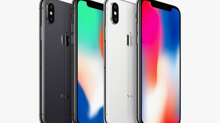
Assuming one accepts the above as a general truth, there exists a striking disturbance in the force: the iPhone X is perhaps the most confounding creation ever to leave the planning room at Cupertino.
The tide turns
When the iPhone first released it was essentially an iPod Touch with a web browser, e-mail client, and cellular connectivity. Usability was simple and sufficient. Then Apple started tinkering, adding in more elaborate multi-touch gestures to facilitate more elaborate functionality. More recently, it began to heavily poach functionality from Android, and lo and behold iOS users got Notification Center, notification widgets and other such splendors. This was facilitated by all manners of further gesture-based prowess, and suddenly the “simple” operating system required some genuine basics to make use of key features.

Then came Force Touch, an “innovation” that defied the fundamental ingrained logic of electronic hardware usage: pressing the screen — hard — is a good thing. To this day, years after the feature was first introduced via the Apple Watch, it’s still largely ignored by app developers. There was even a time when it looked as if Android would embrace it full-on (see the Huawei Mate S) and all manner of rumors were circulating that Samsung was definitely going to include taptic UI elements in their next Galaxy S or Galaxy Note and yet the most that ever came out of it was Android’s long-press to “right click” feature. Force Touch has never taken off because it’s not intuitive at all.
X-clusive Confusion
Having spent time with the iPhone X, it’s crystal clear that Apple has finally created a product so complicated that it can no longer be recommended to the company’s original audience. In fact, usability is so different from even the iPhone 8 – which released this Fall – that even iOS veterans will need to re-learn things. Arguably no words can even explain the insanity, so just take a look:

Because there is no home button, returning to the main screen requires a swipe up from the bottom of the display, a gesture that until now had brought up the quick settings toggle. This gesture is, and has always been horribly broken however, as many apps implement an immersive mode which requires multiple swipes: one (or more) to make the push-tab appear, and then another (or several) to actually complete the gesture properly because of glitches in disabling the immersive (lack of) interface.
The aforementioned quick settings toggle has been moved to the top right of the infamous notch, and now requires a pull down to bring up. Fantastic. And even more confusing? The mini-scandal that arose when iOS 11 — the OS version shipped with the X — launched earlier this year: Turning off WiFi or Bluetooth on the quick settings overlay simple disables the current connection. Users need to manually deactivate the feature via the settings menu to turn them off entirely, and clearly, Apple intended this.
Notifications, which had previously been pulled down by pulling down anywhere along the top part of the display have now been relocated to the top left of the notch. And design language? Notifications are a slide down menu while quick settings are an overlay. No design coherence whatsoever.
The argument for Android is stronger than ever
Now keep in mind at no point should it be taken that the iPhone X is a bad phone. In fact, it’s a very good phone when considered in the context of doing what it does well. And yet, its existence proves a single and significant point: the argument that iOS is “safe for dummies” and “Android is for detail-oriented dorks” no longer holds water.
Android has always been about choice, and about customization. It still is, and iOS still isn’t. But whereas it was once possible to argue that the inane number of settings and selections and sequences needed to understand how to properly use Android were a deciding factor in buying a “simple” iPhone, it’s difficult to see how anyone who has used an iPhone X could make the same argument. Even Apple itself has been forced to include a tutorial explaining basic user interface gestures at setup.

Google and its OEM partners really need to capitalize on this, and it’s almost shocking they haven’t. Just imagine a marketing campaign from a company like Samsung, where it shows an iPhone 7 user playing with an iPhone X and expressing confusion. “Hey, how do I go home from my game?” or “You mean I can’t use my fingerprint to unlock the phone at all?” Then have a similar comparison sequence of a Note 5 user interacting with a Note 8 and showing the fingerprint reader, the virtual home button, etc. The end message could be “Samsung Galaxy Note 8: No Confusion Necessary”.
Wrap Up
To be sure, Android still isn’t perfect. Google continues to introduce new features (such as this year’s Always on Display) yet does a half-baked job (no option to set automatic turn off while sleeping for example). Google is still behind the functionality afforded by companies like Samsung, and it goes without saying that Android is long overdue for customizable UI themes, something custom ROMs have had for almost a decade now.
With that said, however, Apple’s UI coherence and cohesion has taken a major dive in recent years, and the iPhone X is perhaps the absolute worst offender of them all. New hardware will always have some degree of a learning curve and may indeed shake up the status quo, but it should not alienate the entire history of its origins to the detriment of its legacy and key selling point. Google and its Android partners need to hammer this point down solid, and do so starting now.
What do you think? Have you used an iPhone X and found it to be sufficiently reasonable for new or existing users to figure out? Do you think Google should try and adopt more of the gesture-based functionality seen on iOS? Leave a comment below and share your thoughts!


