When it comes to chronological news feeds, Twitter is your best shot. The app displays all that your network is doing in a time-based order, however, it appears the company wants to move away from this traditional feed, much like what other networking apps have been doing in the recent past.
Despite all the goodness that comes with a chronological news feed, one problem with Twitter’s timeline is that you end up seeing the same stuff over and over again. For instance, if ten people in your network tweet about the same link, your timeline will have ten different entries about the same link. Since they appear on your timeline based on the time they were tweeted, they’ll feature in different positions on the same timeline. Thus, you end up with a scenario where you bump into the same link multiple times while scrolling through tweets.
Related: How to bookmark tweets
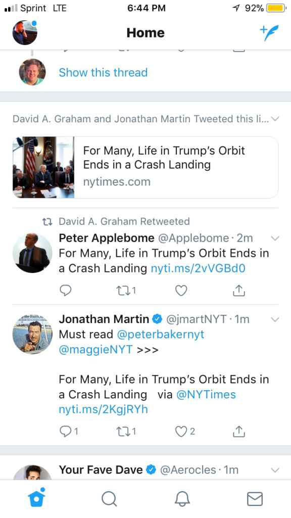
The latest update serves to address this issue, where you’ll now see a card-like banner housing all tweets and retweets about the same link. The update is rolling out to all users of Twitter on Android, iOS, and the web, but it’s gradual.

Ideally, the updated Twitter version analyzes links in tweets shared by your network, singles out tweets with the same link and then groups them together. In this way, you won’t see the same link appearing multiple times throughout your timeline.
Related: How to post a GIF on Twitter
Can I get grouped timeline right now?
You are probably wondering how to get the new grouped timeline on your Twitter account. Well, it’s easy! Since the update is rolling out to all users, all you need is to ensure you have the latest version of the app installed.
You can grab the latest version from the Google Play Store for free. If you don’t see the change even after installing the latest version, a little more patience may just be the right ingredient for you. That’s because the feature will be rolled out to the masses gradually.
What are your thoughts on the new Twitter timeline? Let us know down in the comments!


