Google Docs is a comprehensive and free online word processor from Google that allows you to create almost everything you can imagine. You can create documents, articles, blog posts, brochures, and a lot more. While it offers the most common features, when it comes to creating graphic-intensive documents, you can end up feeling a bit limited in terms of creative options. This might be an issue you might be facing if you’re trying to create a flyer in Google Docs.
If you’re in the same boat, then here’s a comprehensive guide to help you create detailed and eye-catching flyers in Google Docs.
Does Google Docs offer a flyer template?
Unfortunately, Google Docs does not have a dedicated template that can help you easily create flyers. However, Docs offers a lot of tools that can help you create attractive flyers manually. You can add images, charts, drawings, shapes, and a lot more when creating a flyer in Google Docs. These tools can help you create most types of flyers in Google Docs, including flyers with tear-offs. You can use the sections below to help you create flyers manually in Google Docs depending on your current requirements.
How to make a flyer in Google Docs
You can choose to create a normal flyer in Google Docs or one with tear-offs. Use the relevant section below to create the preferred type of flyer, depending on your current requirements. Let’s get started.
Style 1: Make a normal flyer
Making a flyer is pretty similar to creating a brochure in Google Docs. You simply need to replace the graphics, images, and text with the event or service you’re promoting using your flyer to help you create one. The only difference is that when creating a flyer, you should use the entire page to your advantage for maximum chances to grasp the reader’s attention and keep your budget in check. Use the steps below to help you create a normal flyer in Google Docs.
Step 1: Format your page and margins
Let’s start by setting up your Google Docs page so that you can easily create a flyer and remove margins from your flyer. Use the steps below to help you with the process.
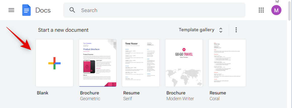
Open Docs in your preferred browser and click + Blank at the top.
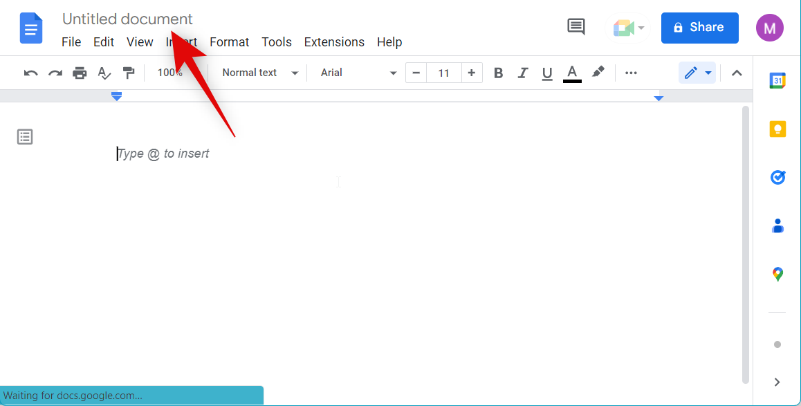
A new document will now be created. Click Untitled document and name your document.
Now click File.
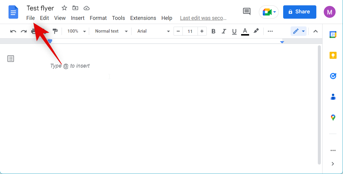
Click Page setup.

Ensure Pages is selected at the top.
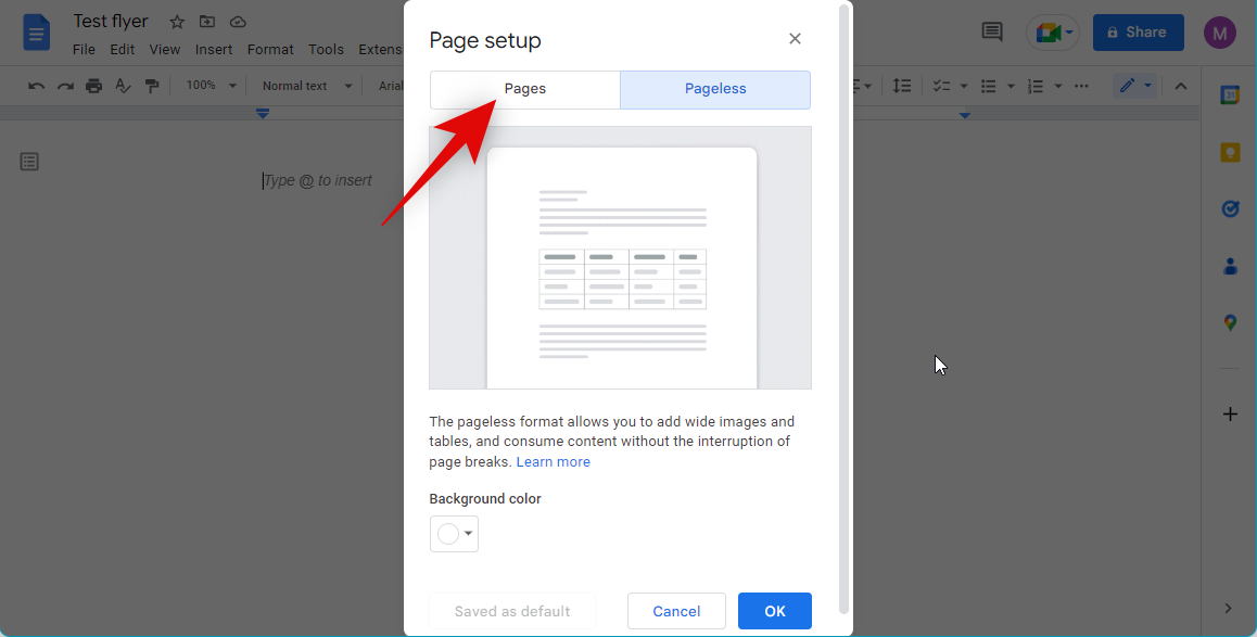
Click the drop-down menu for Apply to and select Whole document.
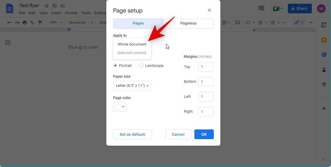
Click and choose your preferred orientation for your flyer. Let’s create a landscape flyer for this example.
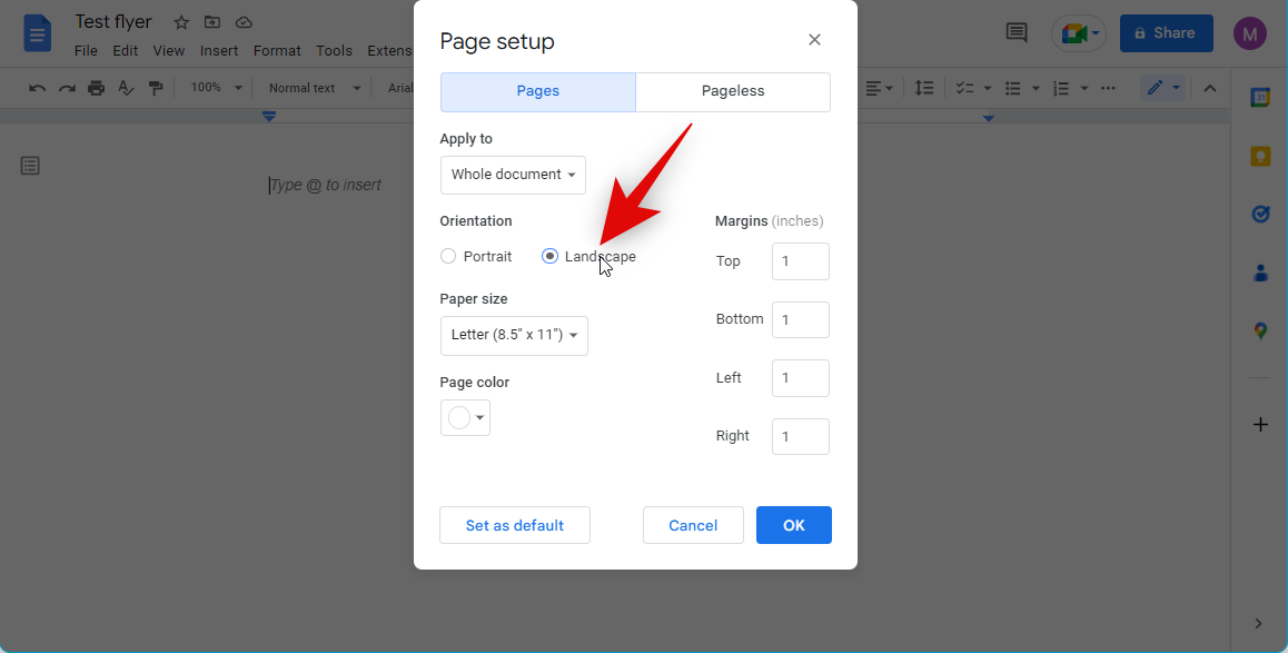
Click the drop-down menu for Paper size and choose your preferred size. Ensure the size is in line with the paper you wish to use to print your flyers.
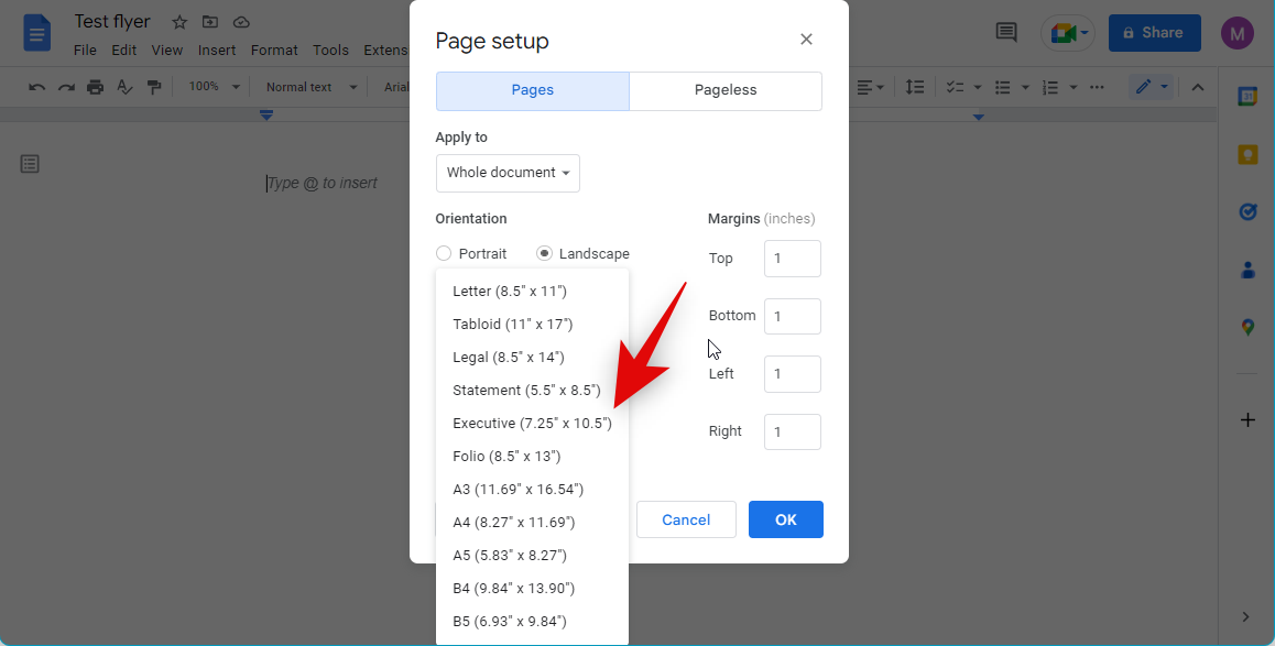
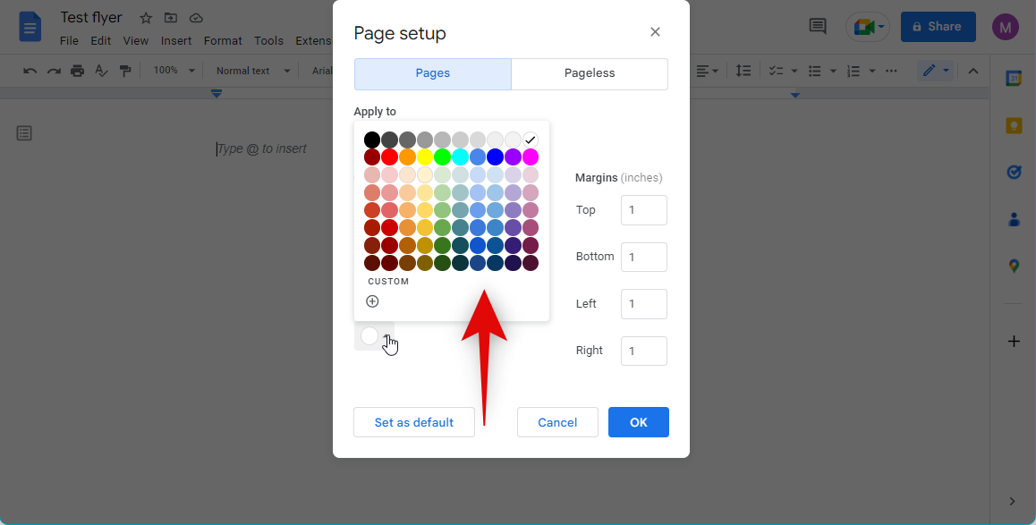
Add a preferred page color using the drop-down menu. A colored background will help your flyer stand out from the rest and help you get more readers.
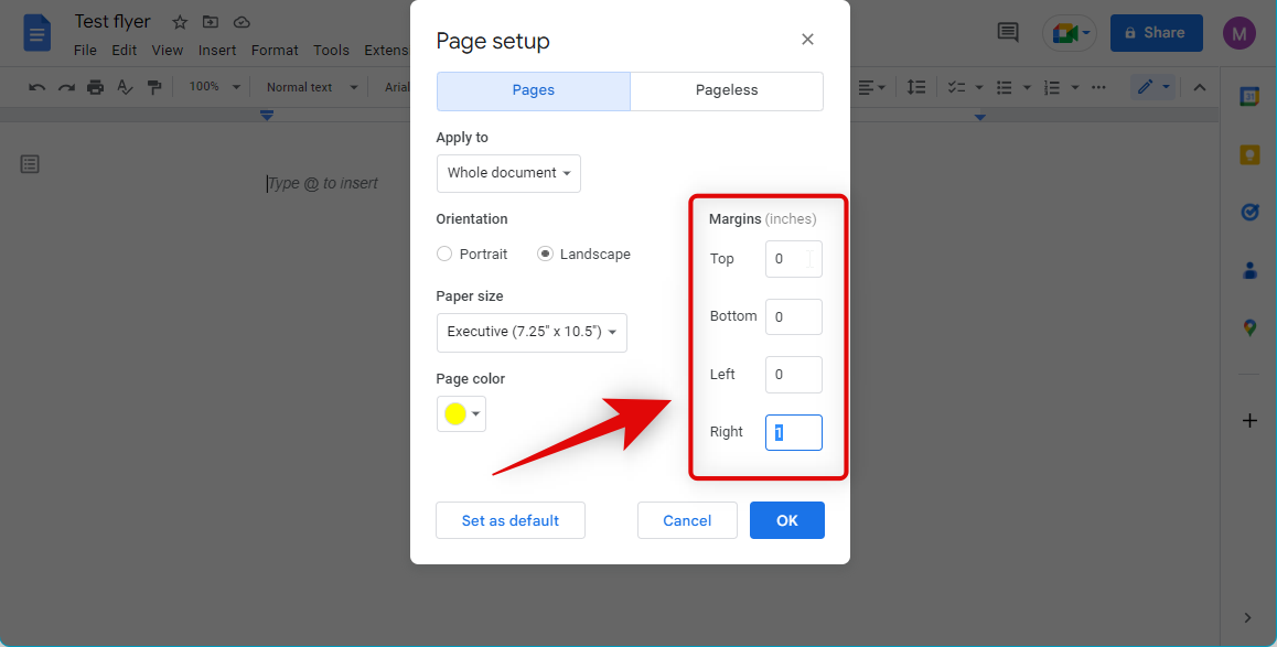
Lastly, replace all your margins with 0. This will allow you to use the entire page when creating your flyer. You can choose to keep margins if you don’t wish to add much content to your flyers and wish to keep the design minimalistic.
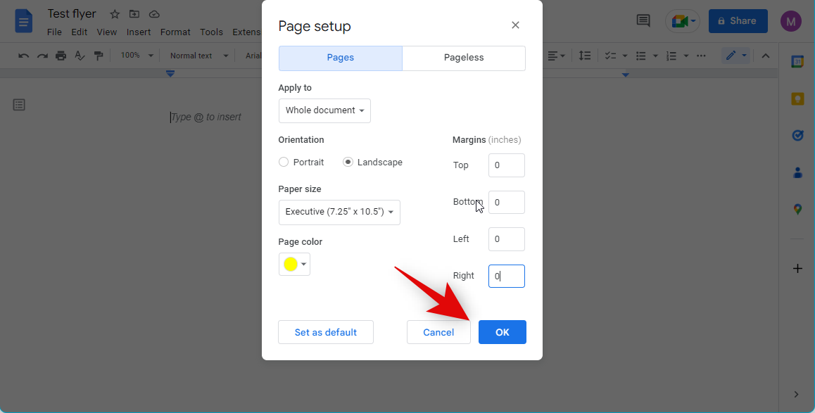
Click OK once you’re done.
And that’s it! You will now have formatted your page to fit your flyer needs.
Step 2: Format your text and images
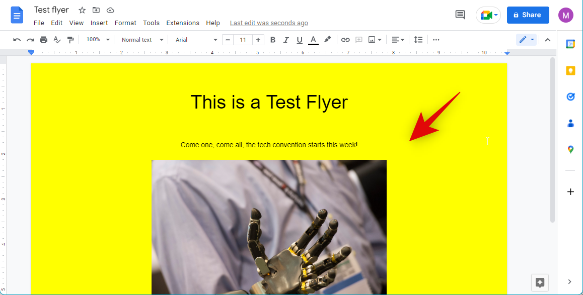
You can now add images and text to your flyer to complete your design. This process is pretty much similar to creating a brochure in Google Docs. Thus, we recommend you refer to this guide from us to help you create your flyer. You can add images, create drawings, format your text, change and add watermarks and much more using the guide. This should help you create an interesting and unique flyer catering to your needs.
Style 2: Make a tear-off flyer
To make a tear-off flyer, you can use a drawing to create and add vertical text to your flyer, which can then be torn off by potential customers. Here’s how you can make a tear-off flyer in Google Docs.
Step 1: Create a flyer
Start by creating a flyer as you did above. Ensure that you leave enough space at the bottom to add your tear-offs. While we will be adding tear-offs in the footer, it will still end up taking space at the bottom of your flyer. Thus we recommend you leave enough space and add additional text if you have space remaining when you finish your flyer’s design. Additionally, we recommend you keep in mind the paper you wish to print your flyer on. We recommend using the Portrait orientation when dialing in your page sizes and margins using the guide above. This will give you enough space to create your flyer while making sure you have enough space in your footer to create tear-offs.
Step 2: Create space for tear-offs
Now that your flyer has been created, let’s make space for tear-offs in your footer section. Follow the steps below to help you along with the process.
Open your flyer in Google Docs and click Insert at the top.
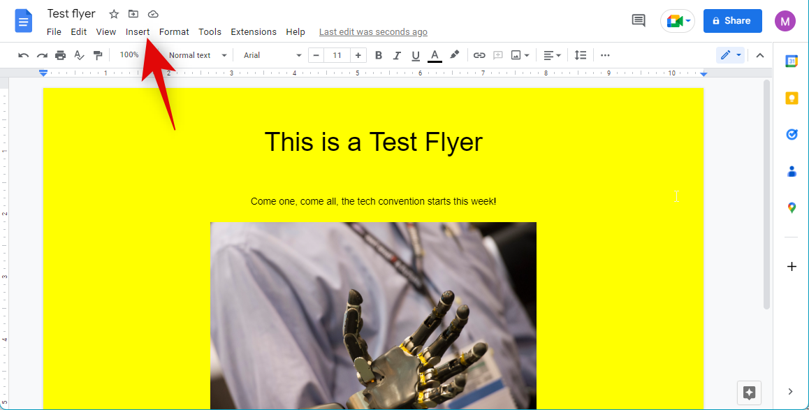
Hover over Headers & footers and select Footer.
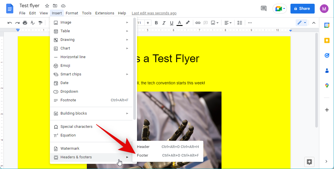
Now place your cursor on the extreme left, at the position of the first character of the footer.

Click the left margin marker in the ruler at the top and drag it to the extreme left if you chose to keep margins in your design.
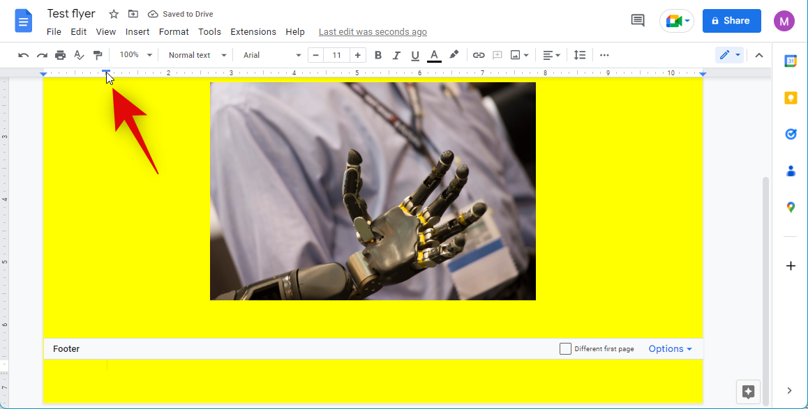
Similarly, drag your right margin marker to the extreme right.
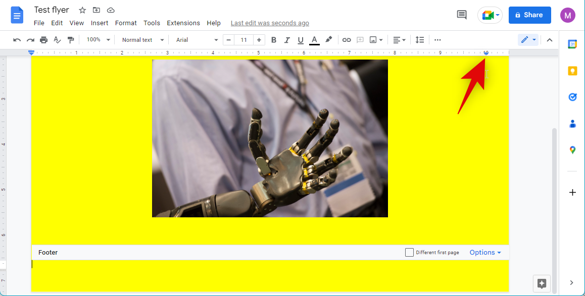
You will now have created space for tear-offs in your flyer. You can now use the next step to add drawings with your contact information and more for tear-offs.
Step 3: Use drawings to add vertical tear-offs
Drawings allow you to add text and shapes. These can be used to our advantage to create tear-offs in the footer. Use the steps below to create tear-offs in your flyer.
Open your flyer in Google Docs and place your cursor at the position of the first character in your footer. As we dialed in the spaces above, your cursor will show up at the edge of your document.
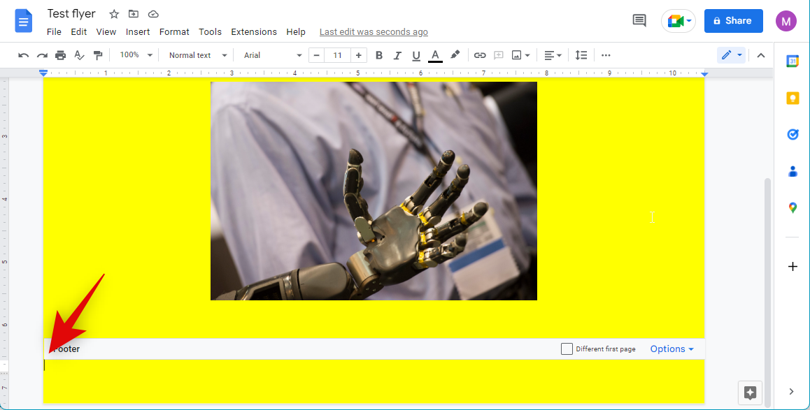
Click Insert at the top.
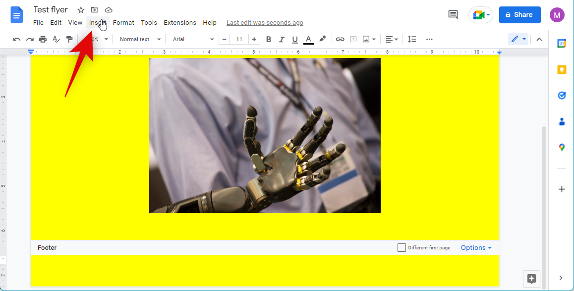
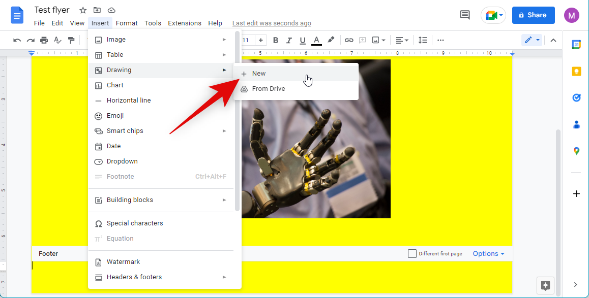
Hover over Drawing and select + New.
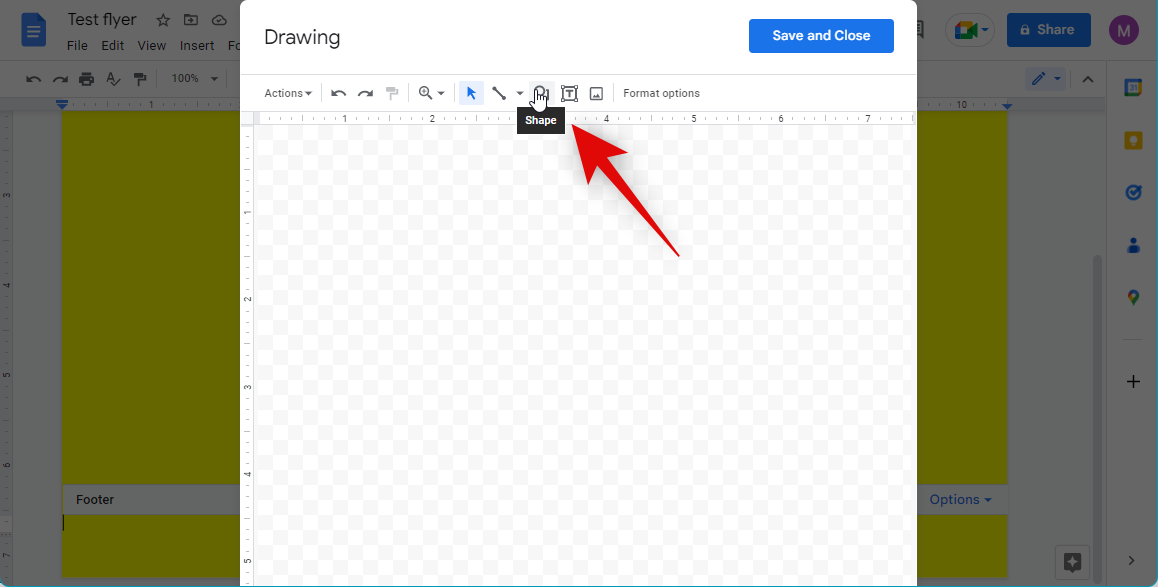
Firstly, click the Shape icon.
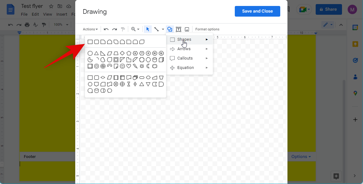
Hover over Shapes and select the basic rectangular box.
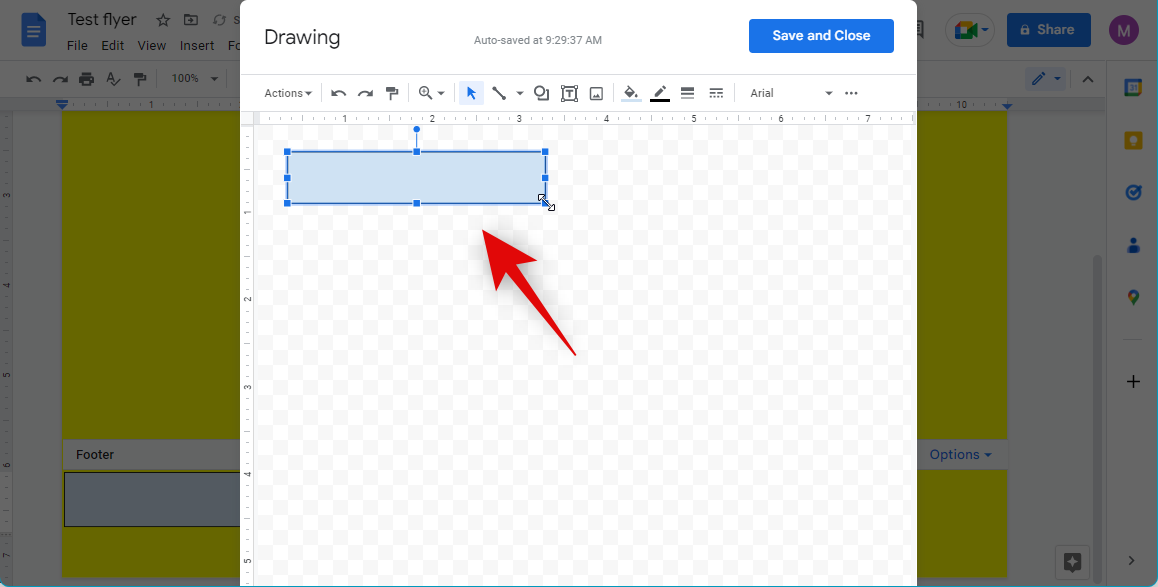
Draw a box roughly the size of the text you wish to add. You can adjust this size later to better suit your needs.
Now click the Text box icon at the top.

Create a text box by clicking and dragging on your screen. Now type in the details you wish to add to your tear-offs. Let’s use a phone number for this example.
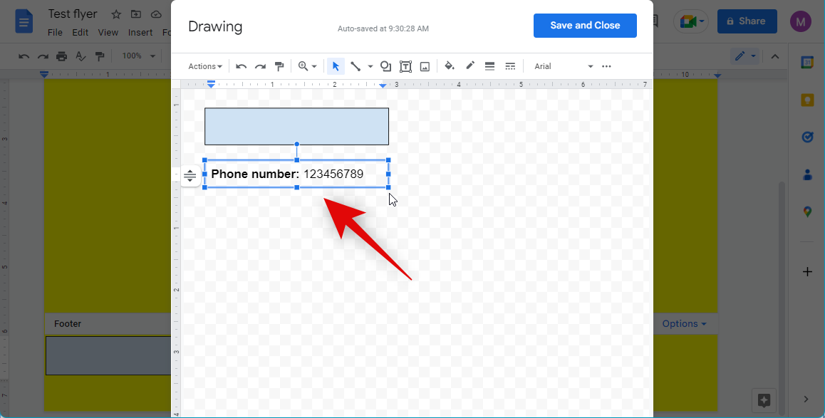
Adjust the size of your text box so that the information fits in a single line.
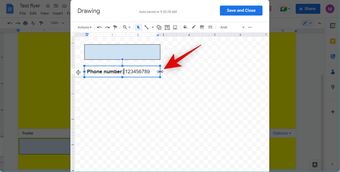
Now with your text box selected, click Actions.
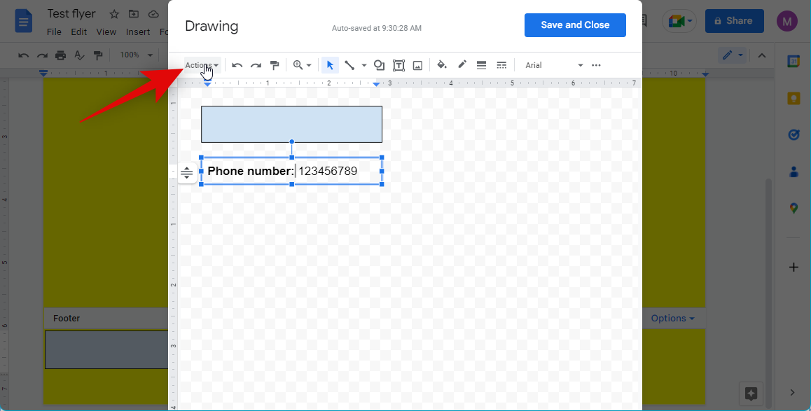
Hover over Rotate. Select Rotate clockwise 90° or Rotate counter-clockwise 90° based on your preferences.
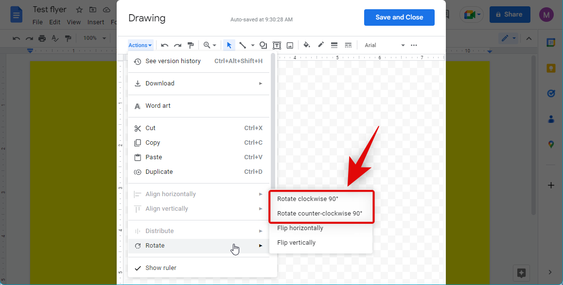
Note: Ensure you have the text box selected and not the text. These options will be greyed out if you have the text selected.
Similarly, rotate the rectangular box we had added earlier.

Move the text box above the box shape we had added earlier.
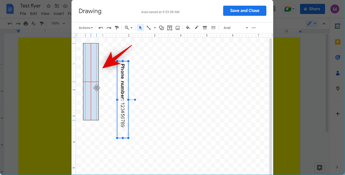
Now adjust the size of the rectangular box to fit your text box.
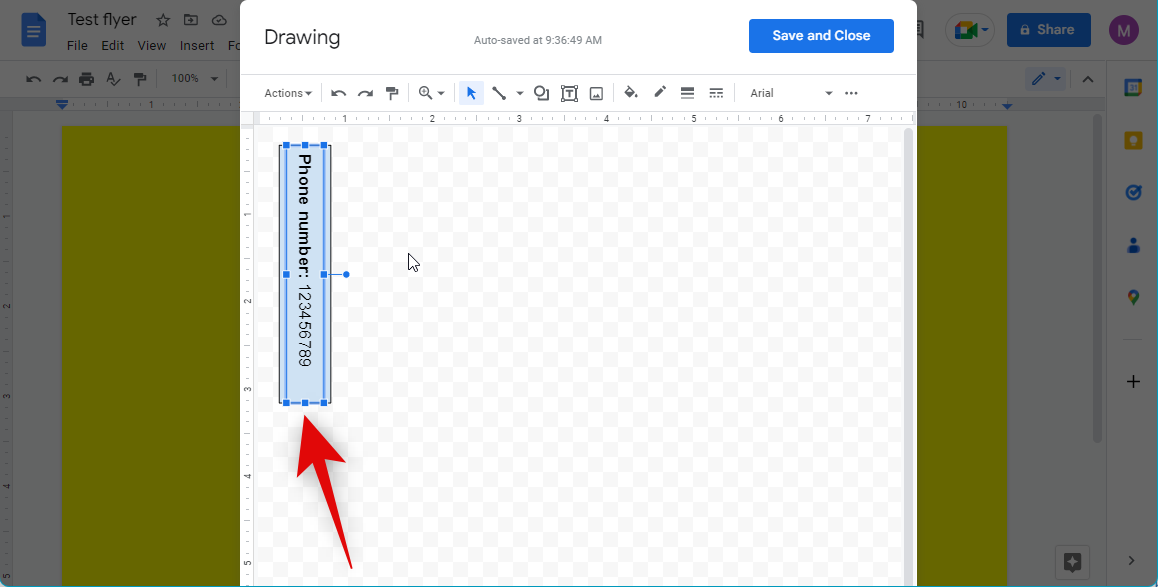
You can now adjust your box’s background color and the border color of the rectangular box to help your text stand out. Click the Fill color icon at the top and choose your preferred background color.
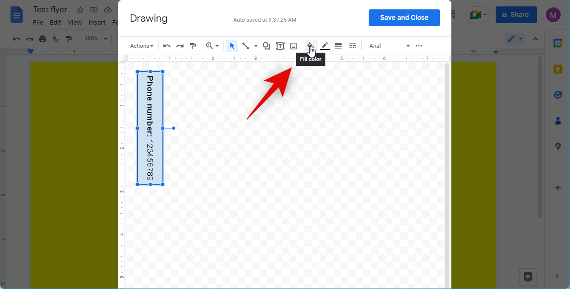
Click the Border color icon and choose your preferred border color.

Click and select the text in your text box by pressing Ctrl + A.
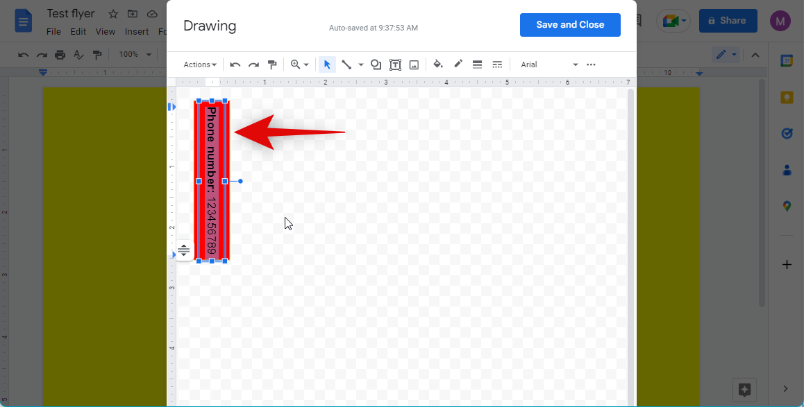
Now click the Font color option and choose your preferred font color for the text.
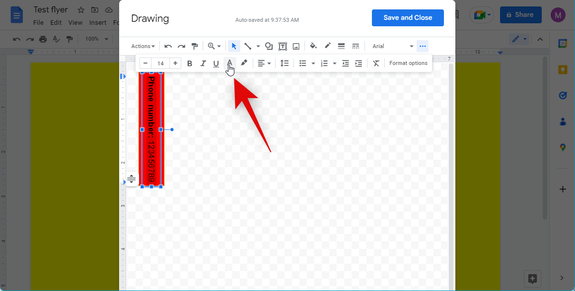
Additionally, you can choose to Bold, Italicize, and Underline the text if needed using the dedicated icons.

Once you’re happy with your tear-off design, click Save and Close.

The drawing will now be added to your footer. Click and select the drawing and press Ctrl + C to copy it to your clipboard.
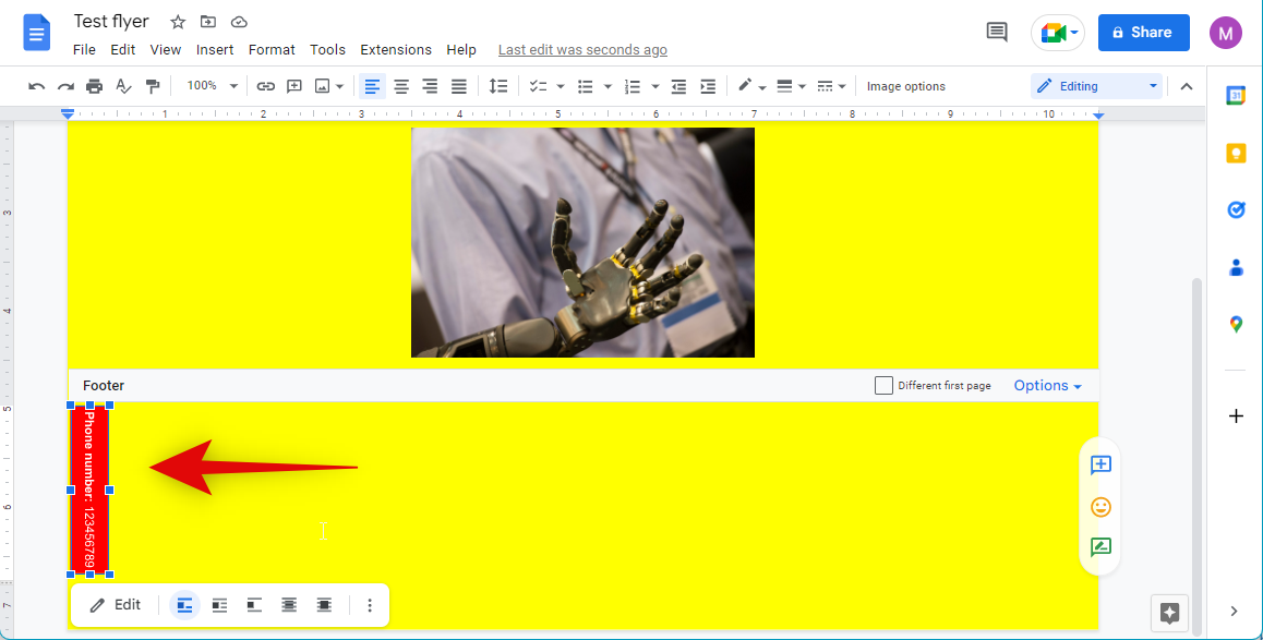
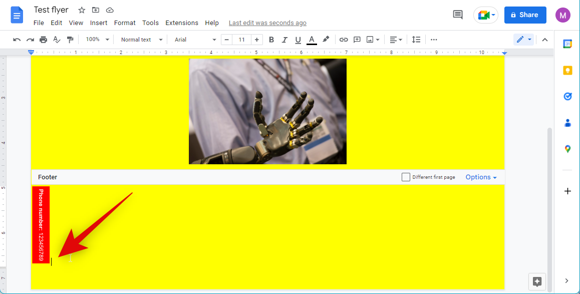
Place your cursor beside the drawing and use Ctrl + V to paste a copy of it.
Press Ctrl + V multiple times to populate the entire footer.
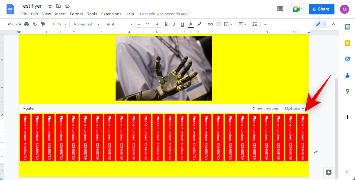
And that’s it! You will now have added tear-offs to your flyer in Google Docs.
Pros and Cons of using Google Docs to create a flyer
Google Docs is a free-to-use word processor, which makes it easily accessible to anyone. You get access to a huge library of fonts, templates, formatting options, and more when creating your flyer. This makes it pretty easy to use without having to worry about export options and how you will be printing your document.
On the other hand, it offers limited options when it comes to adding images, graphics, overlays, and more to your flyer. You could end up feeling limited in terms of creativity which can be a huge downside if you are looking to create a professional flyer. Thus if you’d like more creative control over your flyer, you can choose to use one of the other alternatives mentioned in the next section.
Other services you can use to create a flyer
We recommend using Canva or Visme to create a flyer. These services offer exceptional tools and templates while also offering a huge collection of stock assets. You can also choose to use one of the other alternatives mentioned below based on your current needs and requirements.
How to make a flyer in Canva
Canva is a popular graphic design platform that can help you create numerous types of documents, flyers, brochures, posts, and more. Here’s how you can use it to your advantage to create flyers.
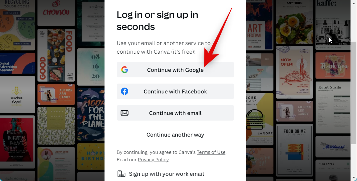
Open Canva.com in your browser and log in to your account. You can register an account for free if you don’t have a Canva account.
Now search for Flyer using the search bar at the top.
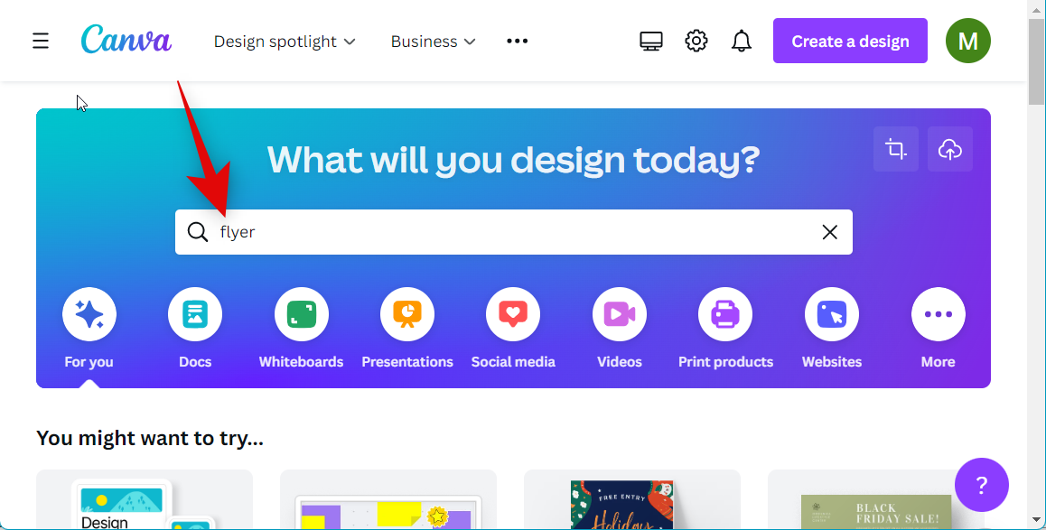
Select Flyer (Landscape) or Flyer (Portrait) depending on your preferences.
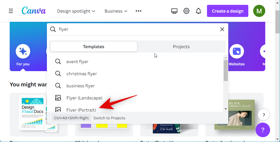
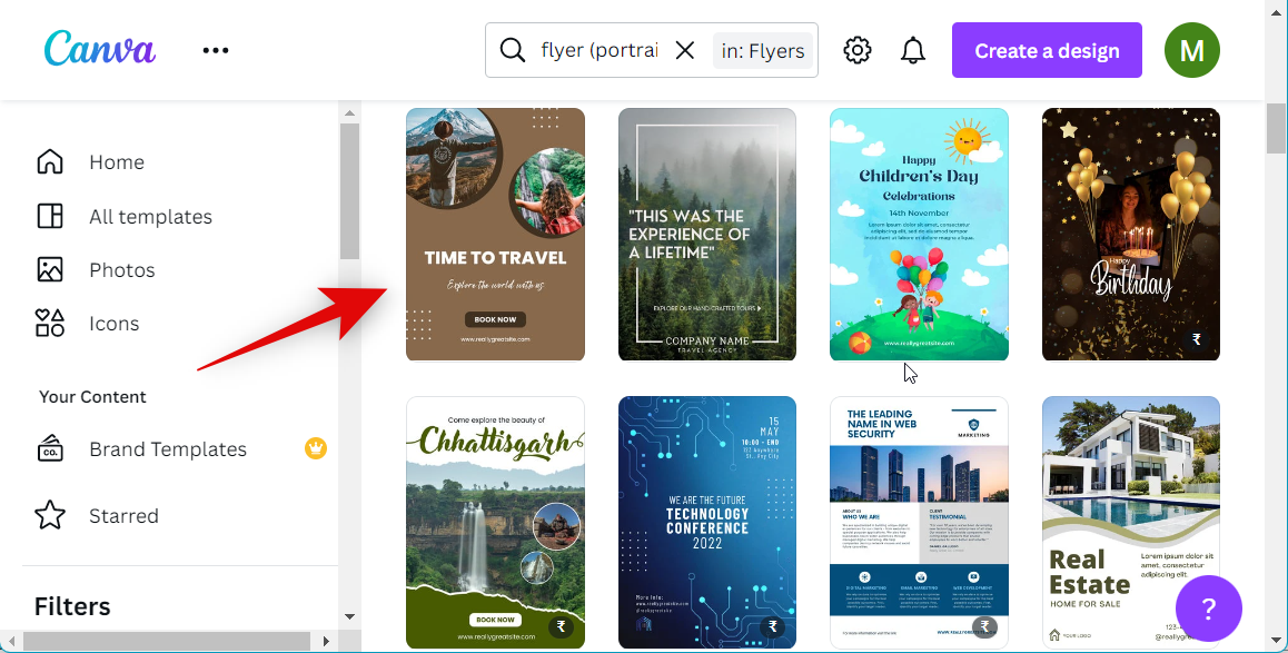
Now select a template you like.
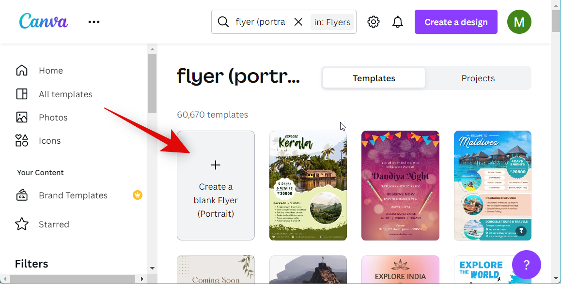
You can also choose to create a flyer from scratch by clicking Create a blank flyer.
Note: Canva offers paid assets as well that will need to be purchased. If you wish to create a free design, keep an eye on the bottom right corner of the template. Templates using premium assets will display Paid in the bottom right corner.
Click a text box and edit the text to reflect your own flyer’s design.
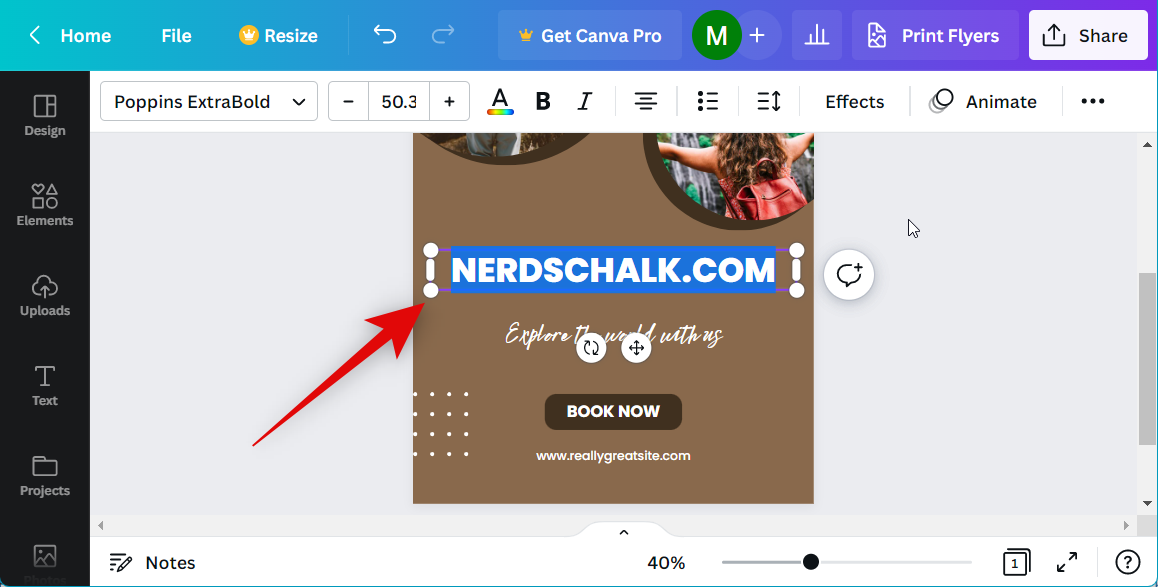
Similarly, click and drag the graphics to reposition them according to your needs.

If your background is a solid color, click the background to change its color if needed.

Click the color icon in the toolbar at the top.
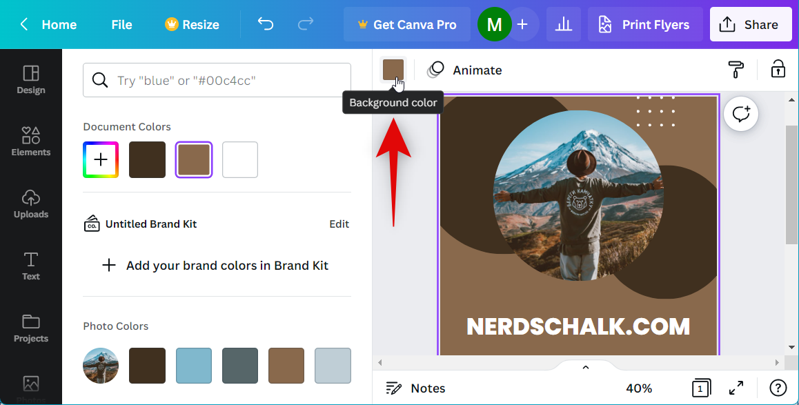
Now choose your preferred color from the left sidebar.

If your background is an image, click the background and select Edit image.
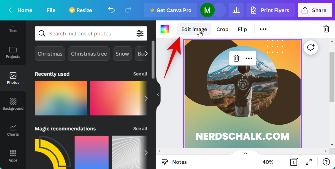
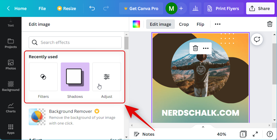
You can now apply various effects, filters, and more to your background image using the left sidebar.
If you wish to replace stock images with your own, click Uploads on your left.
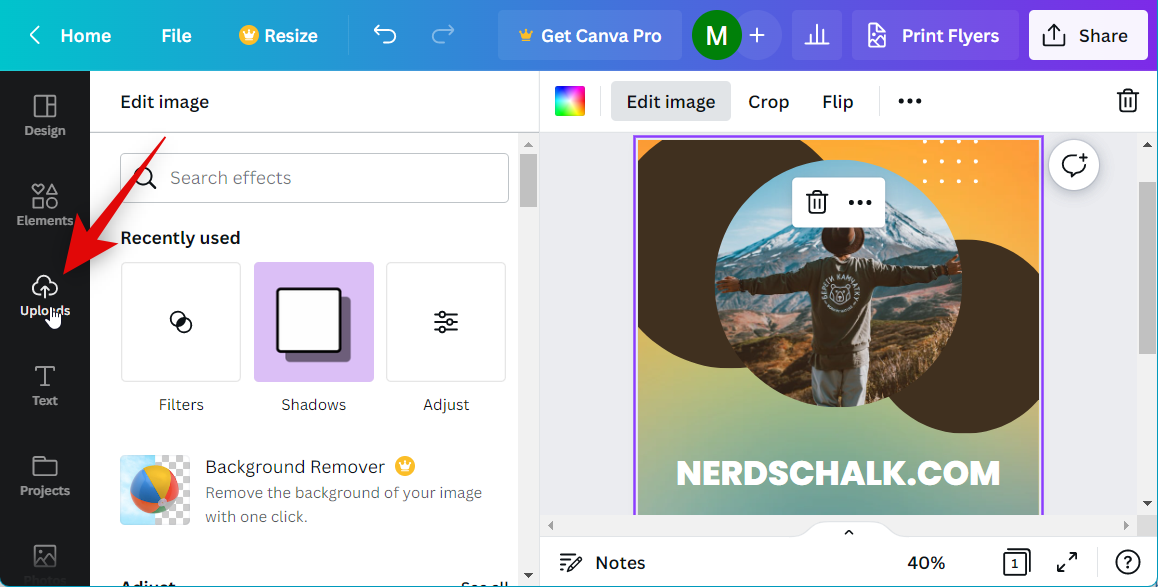
Click Upload files and upload your preferred images.
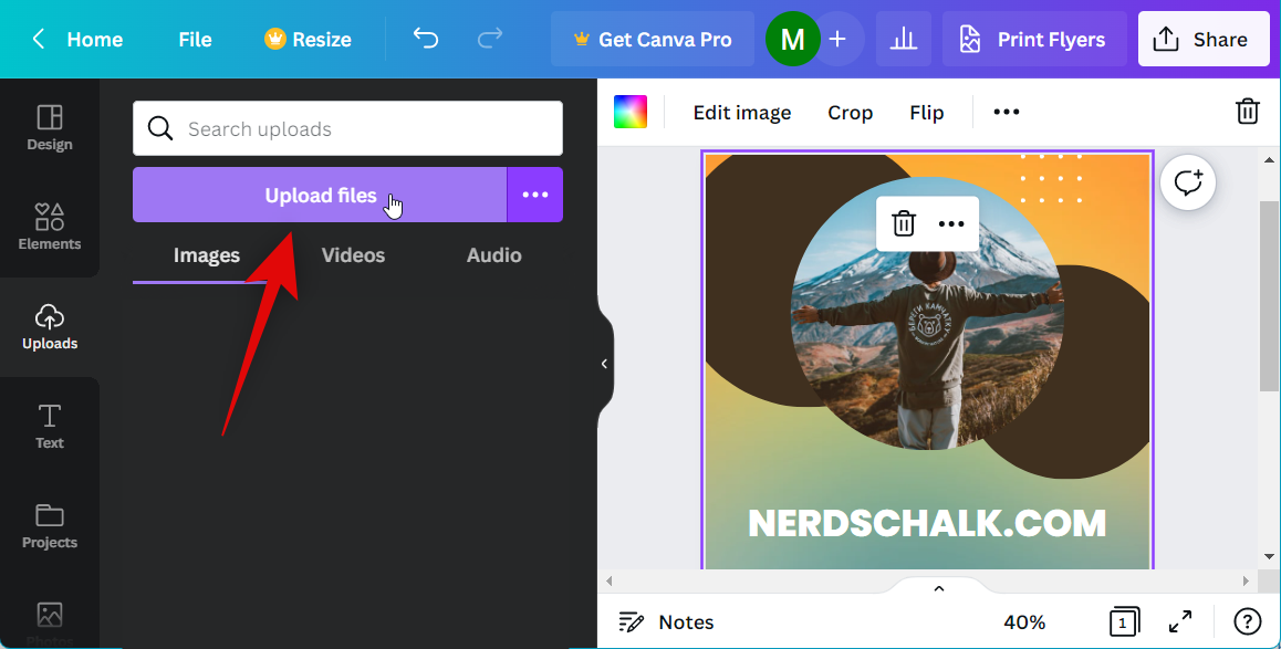
Once uploaded, simply drag an image over an existing image to replace it. You won’t need to resize or reposition your image.
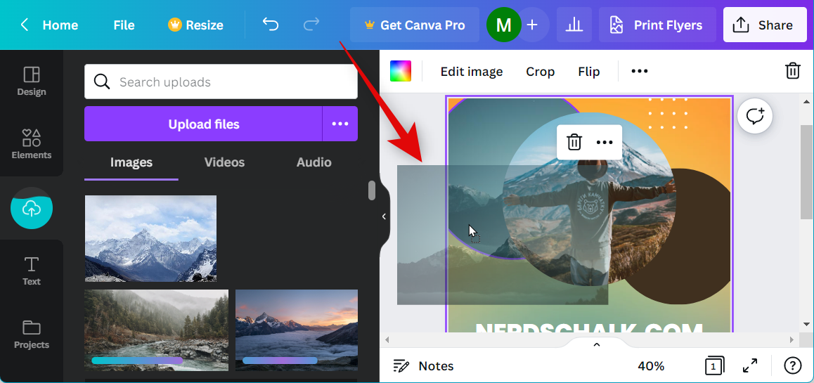
Double-click an image to adjust its size and position in the placeholder.
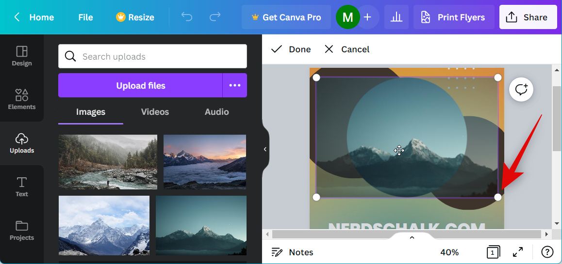
Additionally, if you wish to add more elements to your design, you can use the left sidebar.
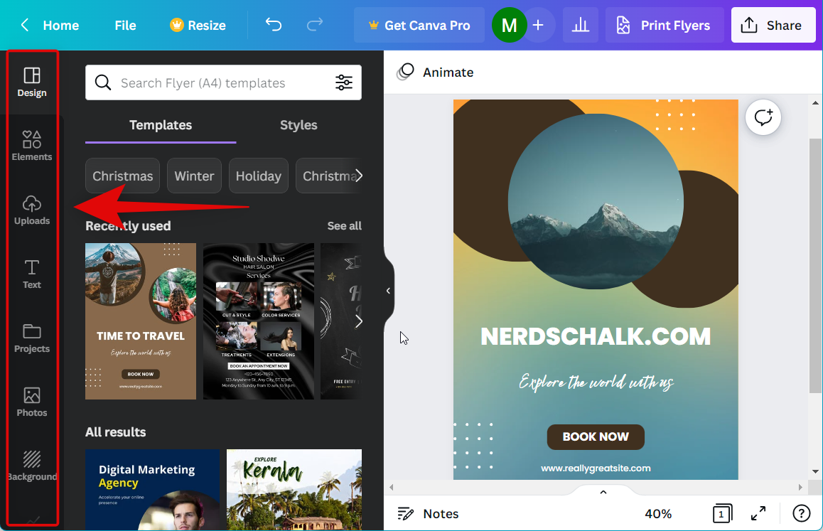
You get the following options when using Canva.
- Elements
- Lines and shapes
- Graphics
- Stickers
- Photos
- Videos
- Audio clips
- Charts
- Tables
- Frames
- Grids
- Text
- Photos
- Style collecions
- Backgrounds (dedicated)
- App integrations
You can use these elements to your advantage to create the perfect flyer based on your requirements. Additionally, you also get dedicated editing options for each element when you select it in the toolbar at the top.
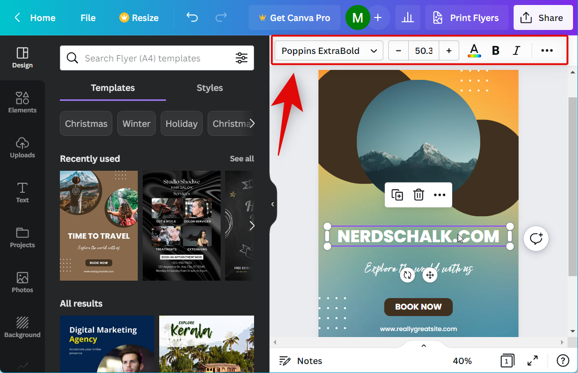
You get access to the following editing options and more depending on the element and file type you select.
- Font choice
- Font size
- Font formatting and alignment
- Effects
- Animations
- Linking and lock options
- Cropping
- Flipping
- Individual color options (graphics only)
- Ability to control position (foreground or background)
- Transparency
Use these options to further customize elements added to your flyer. Once you’re done with your design, click Share in the top right corner.
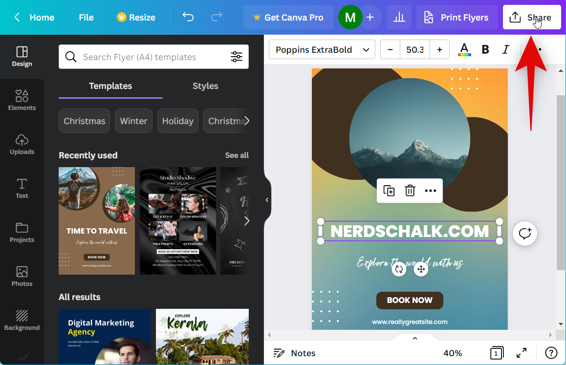
Click Download.
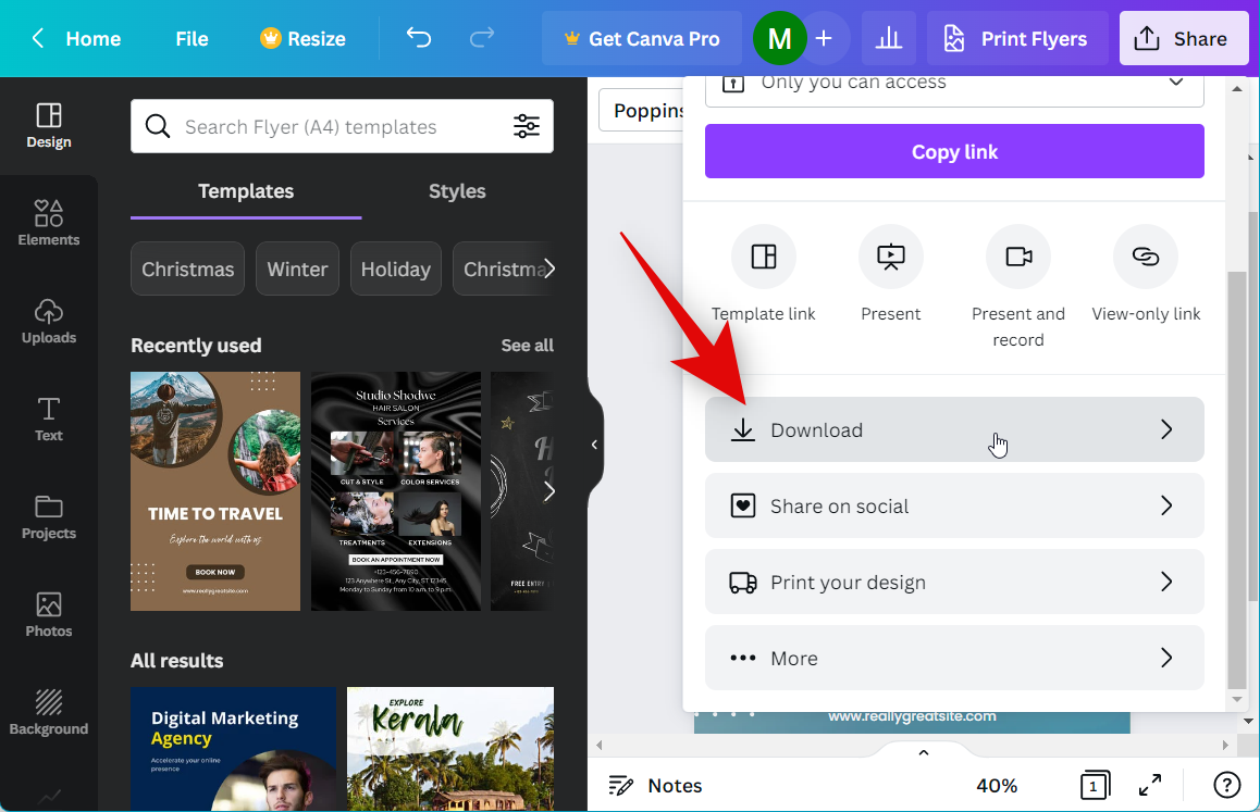
Select your preferred format using the drop-down menu for File type at the top.
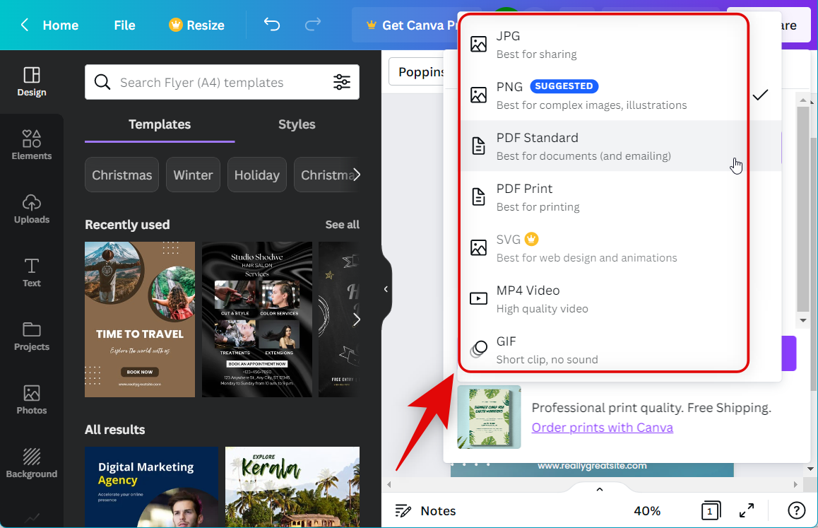
Click Download.

And that’s it! Your flyer will now be downloaded to your PC, and you can now print it out based on your preferred methods.
How to make a flyer in Visme
Visme is another online graphic design platform that can help you create attractive flyers. Use these steps to use Visme and create a flyer in your browser.
Note: Visme offers a premium subscription that includes most of the assets offered by the service. In our experience, most assets require a premium subscription to use when creating a flyer.
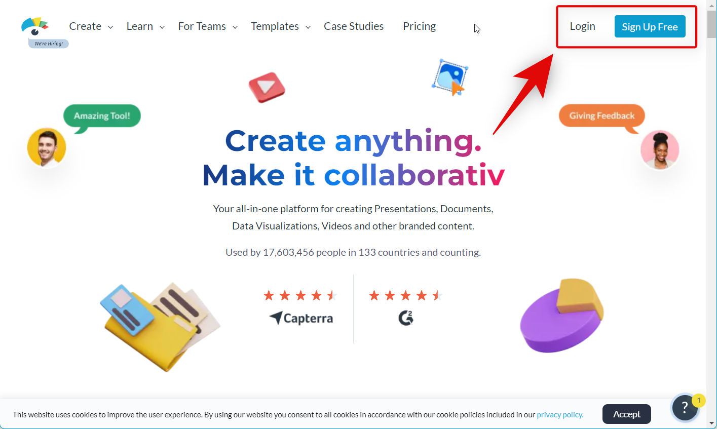
Visit this link and log in to your account. Creating an account is free, so if you don’t have a Visme account, you can sign up for the platform using the option in the top right corner.
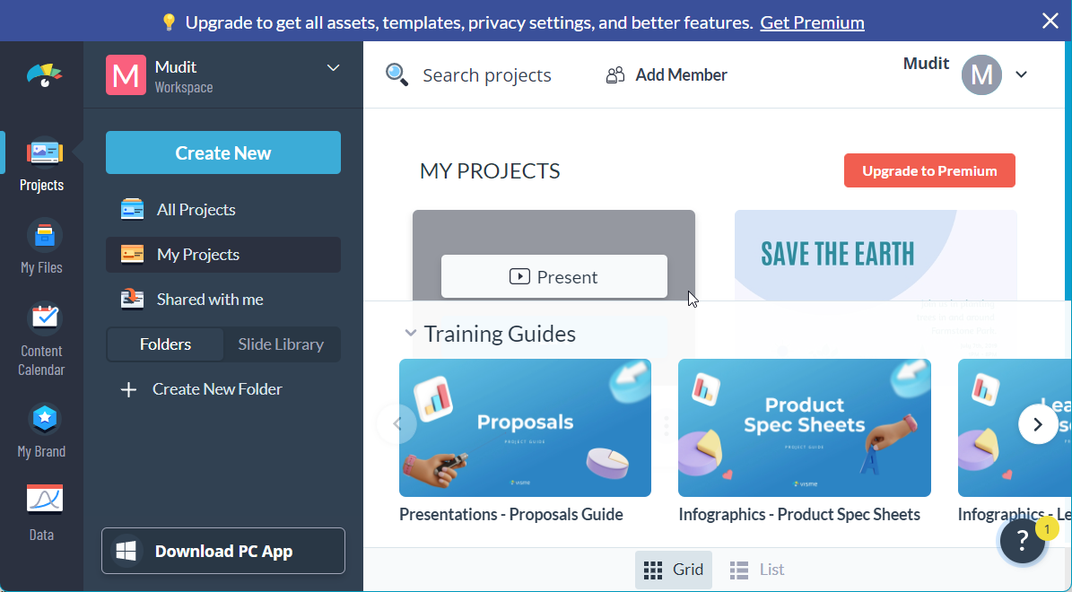
Once logged in, click Create New on your left.
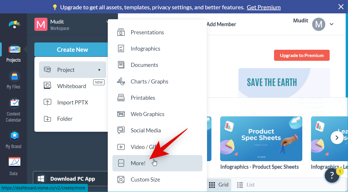
Hover over Project and click More!
Now click the search bar at the top.
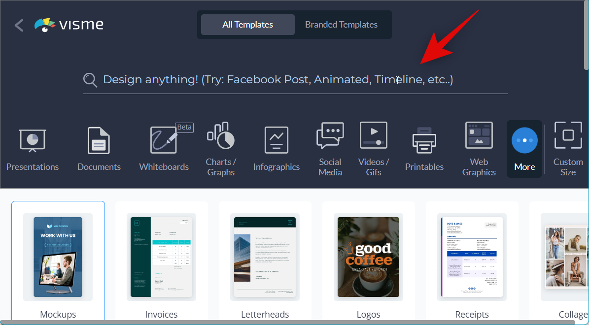
Search for Flyer and choose one of the options mentioned below from the search results.
- Flyers (small)
- Flyers
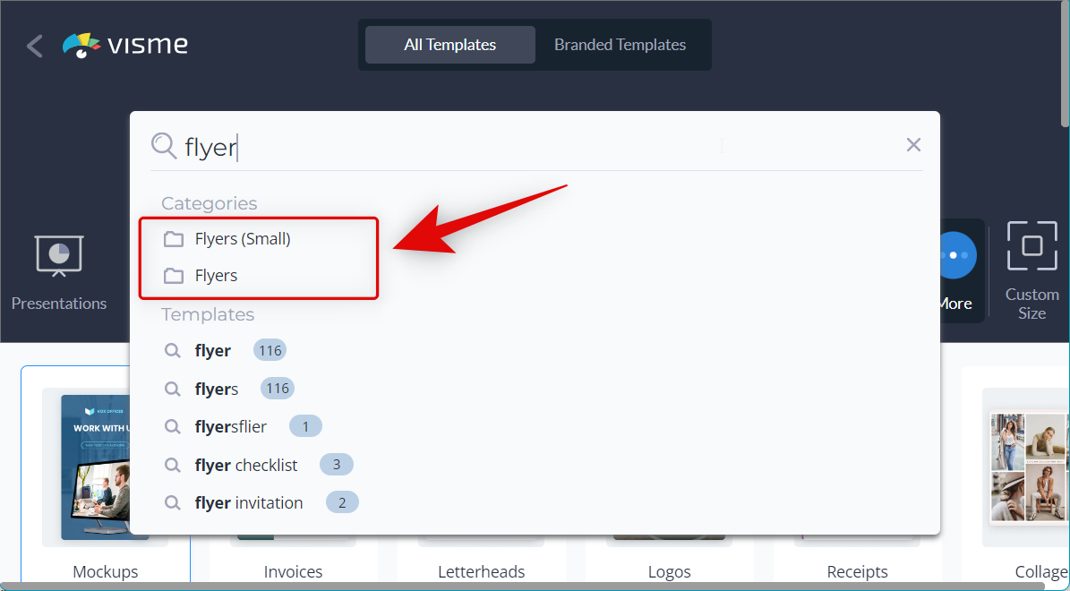
Now choose a template you like from the choices on your screen.
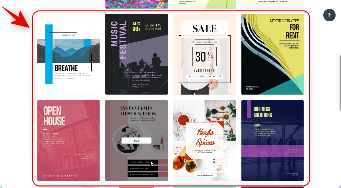
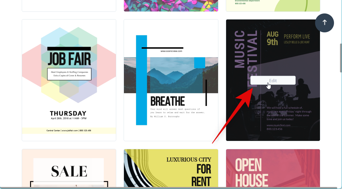
Once you find a template you like, hover over it and click Edit.
Now click a text box and edit the text to reflect your design.
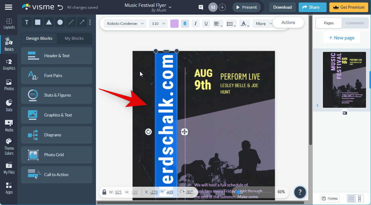
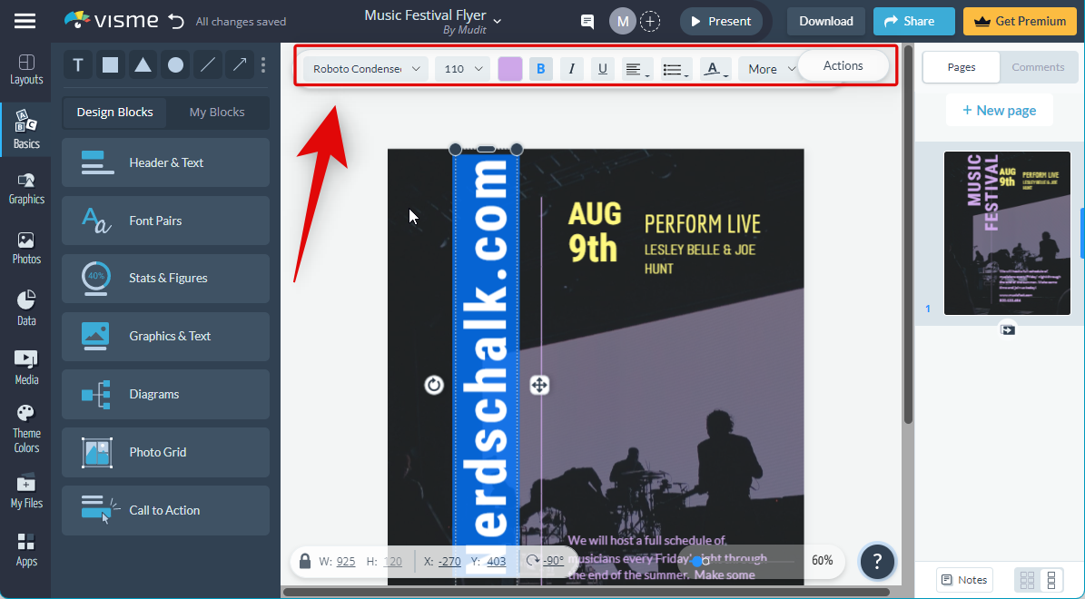
You can use the options in the toolbar to modify and format your text as needed.
Similarly, click the graphics to edit them.
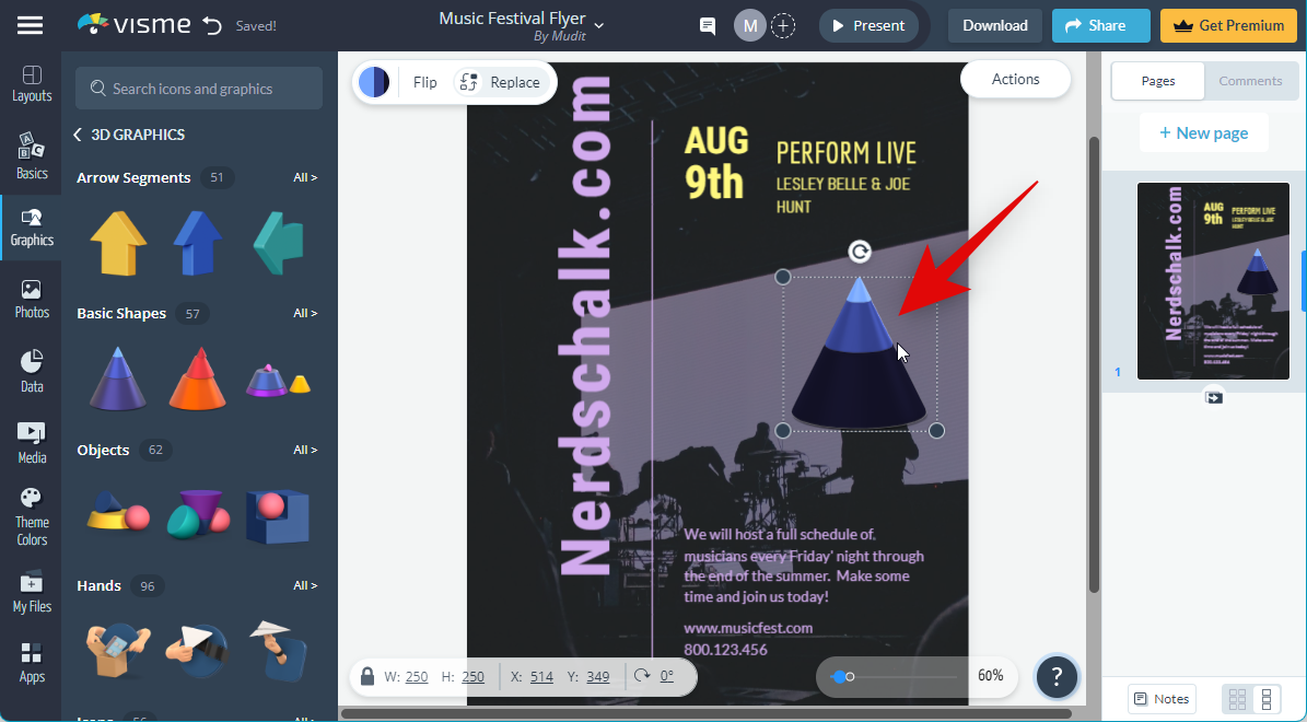
You can perform the following functions when you have graphics selected in Visme.
- Click and drag to reposition
- Click and drag corners to resize
- Use the Flip option at the top to mirror and edit the graphic
- Use the color option at the top to change the color
- Use the Replace function to add a new graphic
You can now use these functions and options to design your flyer as needed.
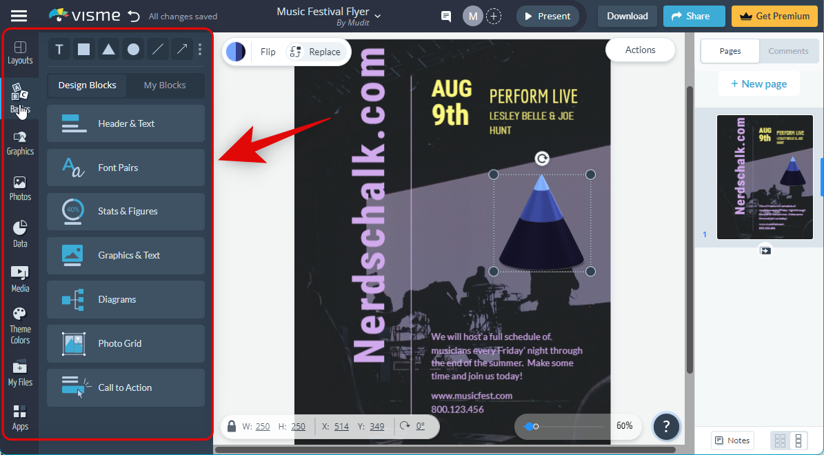
Additionally, you can use the following options in the left sidebar to further enhance your design.
- Basics: These options will allow you to edit essential aspects of your design, including text, headers, footers, and more.
- Header & Text
- Font Pairs
- Stats & Figures
- Graphics & Text
- Diagrams
- Photo Grid
- Call to Action (CTA)
- Graphics: You can use this category to search and add new graphics and overlays to your design.
- Photos: You can use this category to find and add stock images to your design. You can also use this category to upload and add your own images to your design.
- Data: Use this category to further add additional graphics to your design, including the following.
- Charts & Graphs
- Tables
- Maps
- Data Widgets
- Dynamic Fields
- Media: You can use this category to add audio and videos to your design. You get the option to add stock videos, audio clips and embed online content from other websites.
- Theme Colors: This is a unique feature in Visme that allows you to apply pre-curated color palettes to your design so you can easily change the overall look of your flyer.
- My Files: This is a dedicated section in Visme for all your uploads. Any files you upload to use with your flyer will show up in this section, including images, videos, audio clips, and more.
- Apps: This section in Visme can be used to integrate third-party apps into your design so you can use elements from other apps and websites. Visme supports YouTube, Vimeo, Wistia, Google Drive, Dropbox, MailChimp, HubSpot, Slack, and more, so you can easily integrate and work with these apps when creating your flyer.
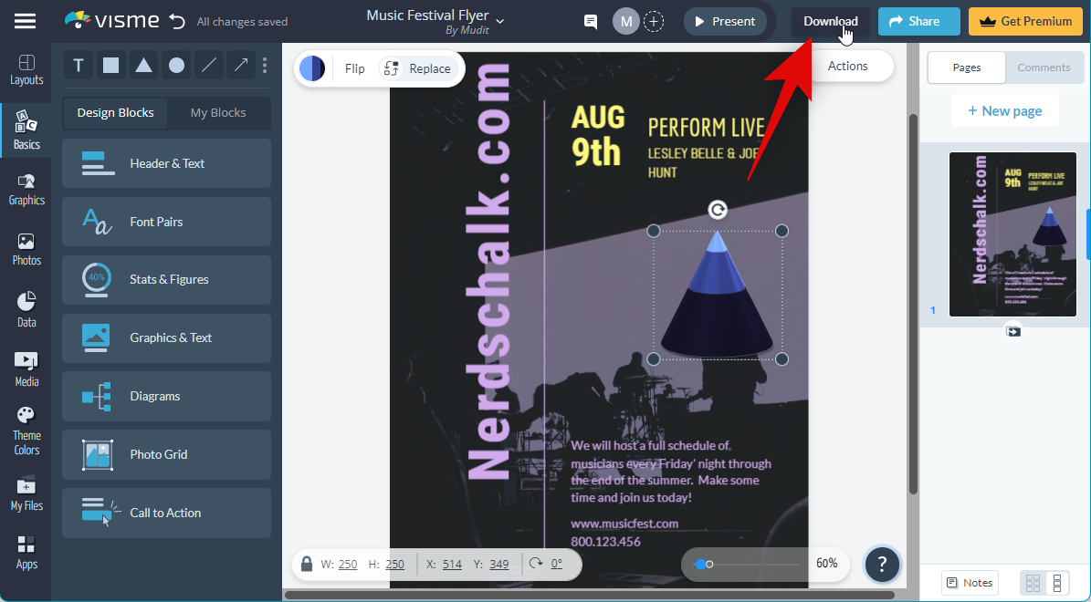
Once you have finalized the design for your flyer, simply click Download in the top right corner to download it to your PC.
Start by choosing the type of file you wish to download using the options on your left.
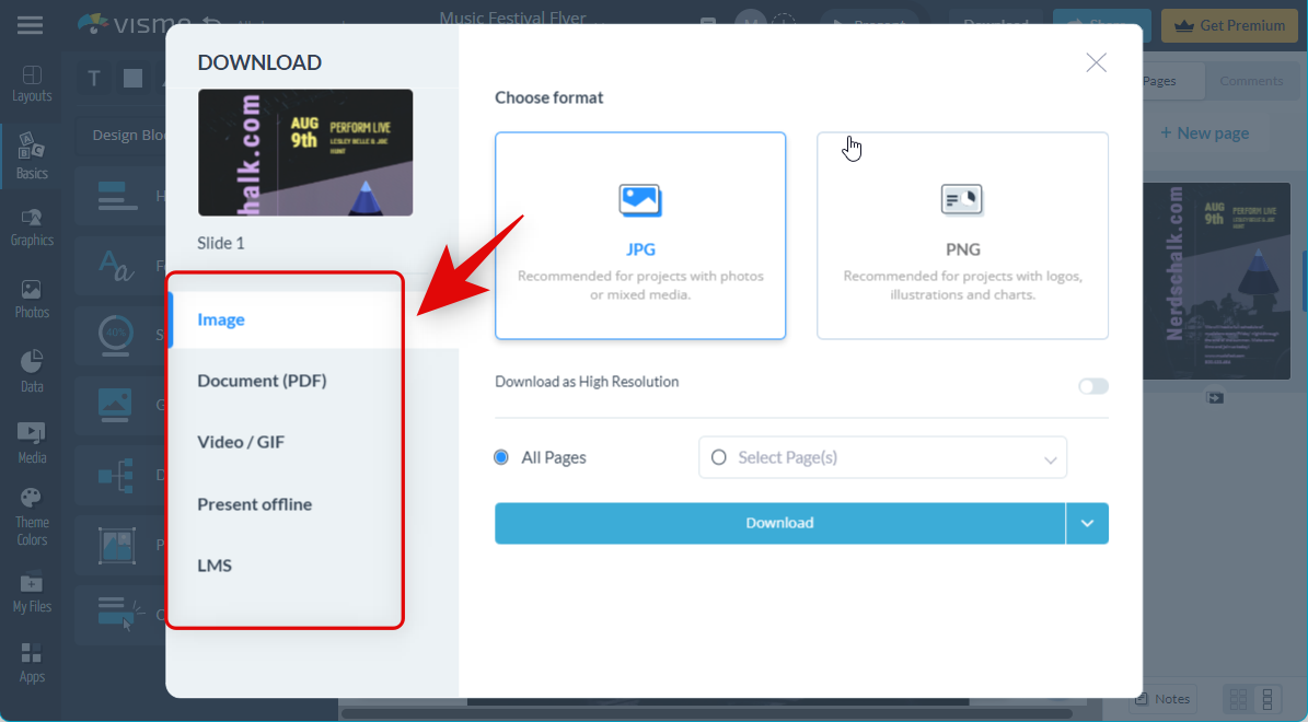
You get the following options at your disposal.
- Image
- Document (PDF)
- Video/GIF
- Present offline
- LMS
Let’s download the design as an image for now. Click and choose your preferred image format at the top.
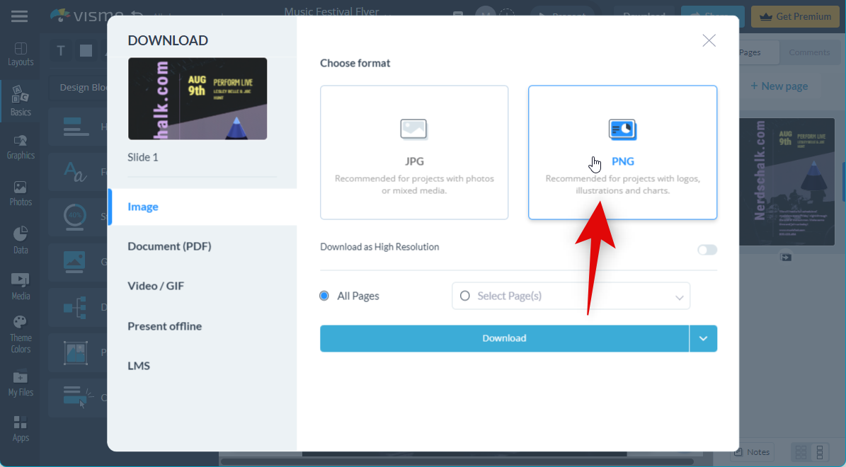
Now you can turn on the toggle for Download as High Resolution if you wish for a larger-sized copy of your flyer.
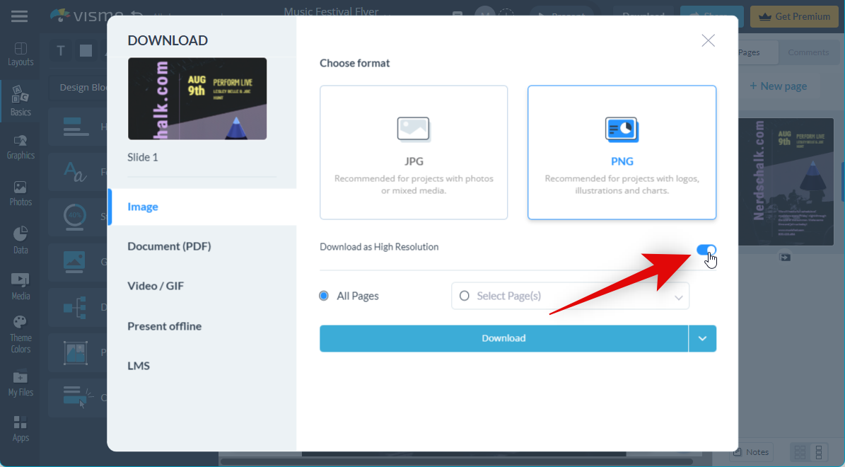
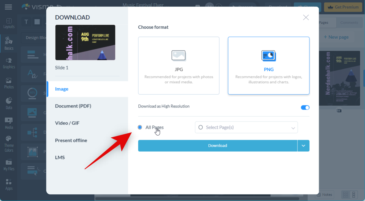
If you have multiple pages in your design, choose the pages you wish to download in the next section. If you wish to download every page, click and select All Pages.
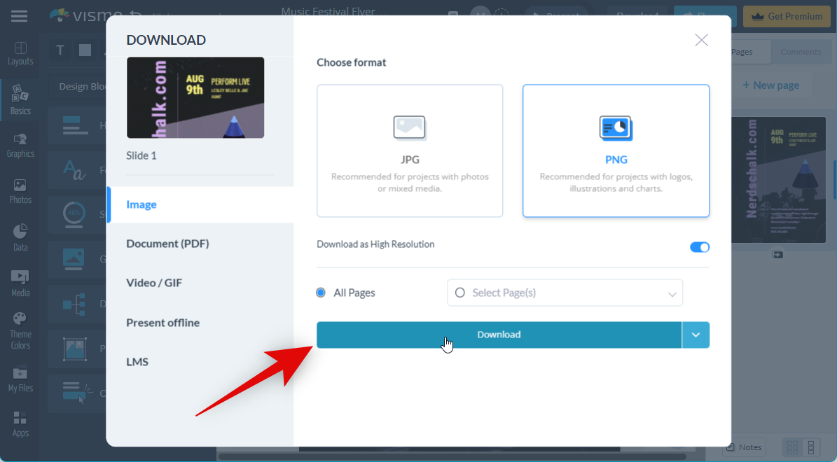
Click Download once you’ve customized your options.
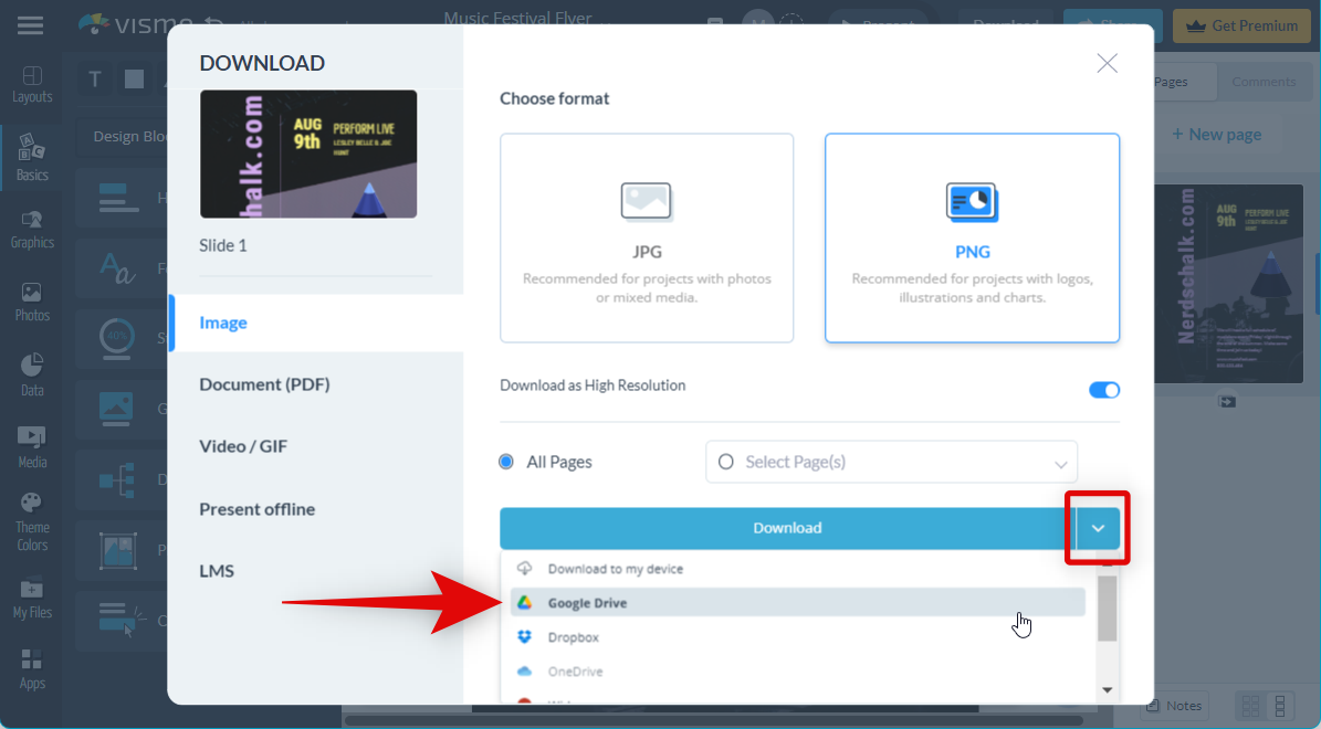
You can also click the arrow beside Download to transfer your flyer to integrated apps like Google Drive, Dropbox, OneDrive, and more.
And that’s it! You will now have created your flyer using Visme in your browser.
Other third-party services to create flyers
If Canva and Visme do not fit your current needs, then you can try out one of the following alternatives to help find a service best suited for you.
We hope this post helped you easily create a flyer for your event or service. If you face any issues or have any more questions, feel free to reach out to us using the comments below.


