By now, you must have gotten accustomed to smartphone companies plucking the best features from their competitors and either blatantly re-implementing them in their original form or making some tweaks to (mostly) improve the features in question.
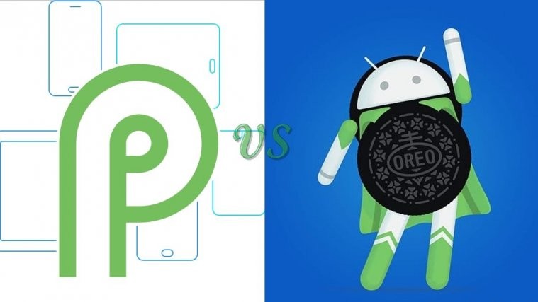
Over the past few months, we’ve seen lots of phones arriving with a notched display and Face unlock, features that emulate Apple’s iPhone X. Android P has even welcomed this idea by including support for display screens of various form factors, notably the notch. These are cool additions, but they’re mostly hardware-related, which is one area Google doesn’t thrive, yet.
Check out:
While Apple is one of the best when it comes to smartphone hardware, it’s not your best bet when looking for regular software redesigns and introduction of new features every time a new version of iOS is released. But with iOS 11, the iPhone maker did introduce a new and what is proving to be a game-changing feature on iPhone X dubbed gestures.
To quash away any suggestions that Google copied gestures from iPhone X, VP of Engineering for Android, Dave Burke, was quick to point out that this is the result of over a year’s work. As you may know, the iPhone X came to fruition in September 2017.
The introduction of gestures in Android P represents the future of navigation on Android phones. For years, the system has been about buttons, but with Apple having already made the switch, Google wasn’t gonna sit around and become the laughing stock.
The new gesture-totting home button is here to do all that the current Home, Recents, and [hopefully] Back buttons are doing on Android Oreo. That is, a three-in-one kinda thing! For now, the Back button is still intact, showing up only when you need it, but the way things are going, it won’t be long before one is able to swipe left to go back to the previous screen.
Also read:
- These phones will receive Android P update
- These Samsung phones will receive Android Oreo at the same time Android P stable will be released
It’s worth noting that the new key still keeps its role as the home button. When you tap on it, it will take you to the home screen. Like on Oreo, long-pressing it will launch the Google Assistant, but that’s where the similarities end.
Everything else about the Android P gesture button is different. From now on, it’s about swiping up, back and forth on the key when executing various tasks. For instance, when you swipe up, you will either open the overview screen (recent apps) or the app drawer, but the latter requires the swipe to be slightly longer than the former. In the overview screen, you can swipe up to dismiss the open app or swipe down to make it full screen.
On Android Oreo and before, double tapping on the Recents button switches between the two most recent apps, but now that this button is gone on Android P, it doesn’t mean you can’t achieve this. In fact, it’s now much easier as all you need is to swipe right and release the key and the previously opened app will show up on your screen. Note that swiping right without releasing the key will take you through all your recent apps in what looks like a scroll wheel, but upon releasing it, the app on top will go full-screen.
As pointed out earlier, we dream of a case where the Back button will also be replaced with a swipe left gesture, but for now, you’ll have to deal with it in its old format.


