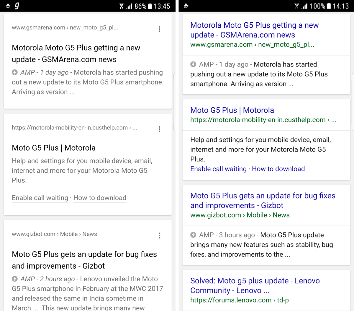
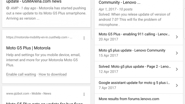
Google might be testing a new search style for mobile devices. We were only able to see it once in action, but, thankfully, we did capture the new style in the screenshots that you see above.
Repeating the search in a different window brought us back to the regular mobile search layout, but here’s a side by side comparison (below) between the new and current search styles.

The new style that Google is testing is clean as it rips off all colors from the titles and links in search results. However, it’s also taking up much more space than the current style. As you can see in the screenshot above, the new style is able to display 3 results in a single view, whereas the current style is able to display 4 search results on the same screen in a single view.
We think Google is in the process of redesigning the mobile search layout, and they were probably only testing while we took notice of it. We’ve tried repeating the search on a number of devices, but the new search layout is not showing up again for us.
For anyone curious, here’s link to full page screenshot of the new search style.


