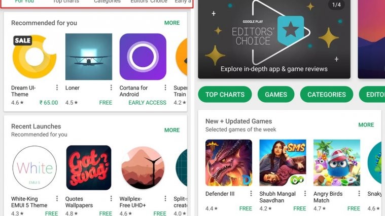
Google Play Store is receiving yet another UI update that makes it easier to jump between various categorised menus on the app. The new UI puts the navigational options in a much more visible arrangement that users will be able to easily access when they open the app.
The previous UI had the main categories of Google Play grouped as “Apps & Games” and “Movies, Music and Books”, but with today’s update, these categories are no more grouped but have their own tabs at top bar on the app’s home screen. This top bar is followed by another bar which is now home for navigational options such as For You (personalised recommendations), Top charts, Categories, Editors’ Choice, Early access and Family apps.
Also the two new navigational bars stay visible most of the time on the Play Store app except for when you open an app listing or perform a search or go into an app level category.
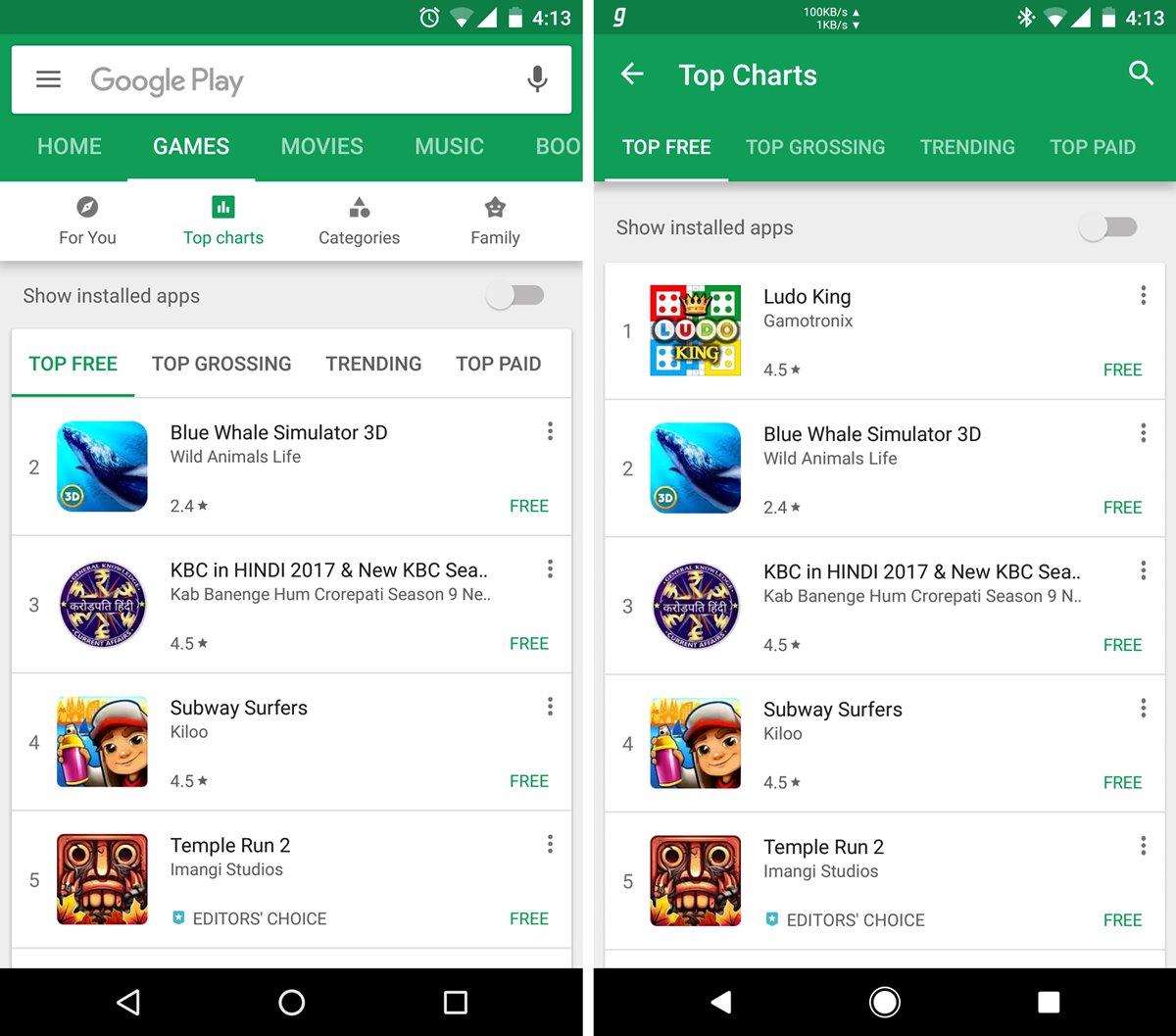
The new UI is rolling out in stages and might take some time before it reaches your Android devices. It doesn’t require you to install the latest Play Store version (8.2.32) which rolled out a day ago. We’re able to get the new UI on both Play Store versions 8.1.73 and 8.2.32, so it’s safe to say that this is a server side update and you do need to force update your Play Store version to get these UI changes.
That said, it’s always best to have the latest Play Store update installed on your Android device. To get the latest version, go ahead and grab the newest Play Store APK file and install it manually like you’d install any other APK file’on your Android device.


