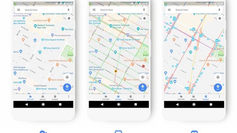
Google has announced that they are updating the look of Google Maps to make it easier for users to find places. The search giant is basically adding new colors, new icons, and more to all aspects of Maps.
The new Maps will provide better information as well, and make it so that the user can read things more easily. It will also show relevant information when it is necessary. Scheduling an event on Google Calendar will reflect that information when you’re near that event.
Read: Google brings phone comparison to its Search
The entire Google suite is now better connected to Google Maps, making things better for the user. The driving, transit, navigation, and explore maps have received a new look. For example, Gas stations will be better visible and more prominent when you’re using navigation.
Check out: Google removing apps using Accessibility Services from Play Store
When traveling in a train, or bus, information related to that such as bus stops and train stations will be more prominent on the transit screen. The color scheme for different places have been updated, and are no longer the same color. There are a bunch of new icons as well, which will help you identity the places better.

Restaurants show up in a different color to Cafe’s or Hospitals or ATMs. And that’s quite useful actually, as it’ll make it easier to find where you want to go. All of these changes are rolling out to Google Maps, on the phone, on the web, Google Earth, Assistant, Android Auto and on third-party apps/services that link to Google Maps API.
It may take some time for these changes to take affect, so don’t worry if you don’t see them right away. Google is updating a lot of its apps, most recently it updated the Google Home app, giving it a new look as well.
Source: Google


