Android O has brought in lots of new features, many of which are visible in Settings and notifications shade. While some of the features have been covered well already, like ‘extra information’ in status bar that remains when you pull down the shade, as also tapping on quick settings toggle text taking you to its settings, some of the features need some highlighting.
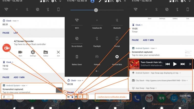
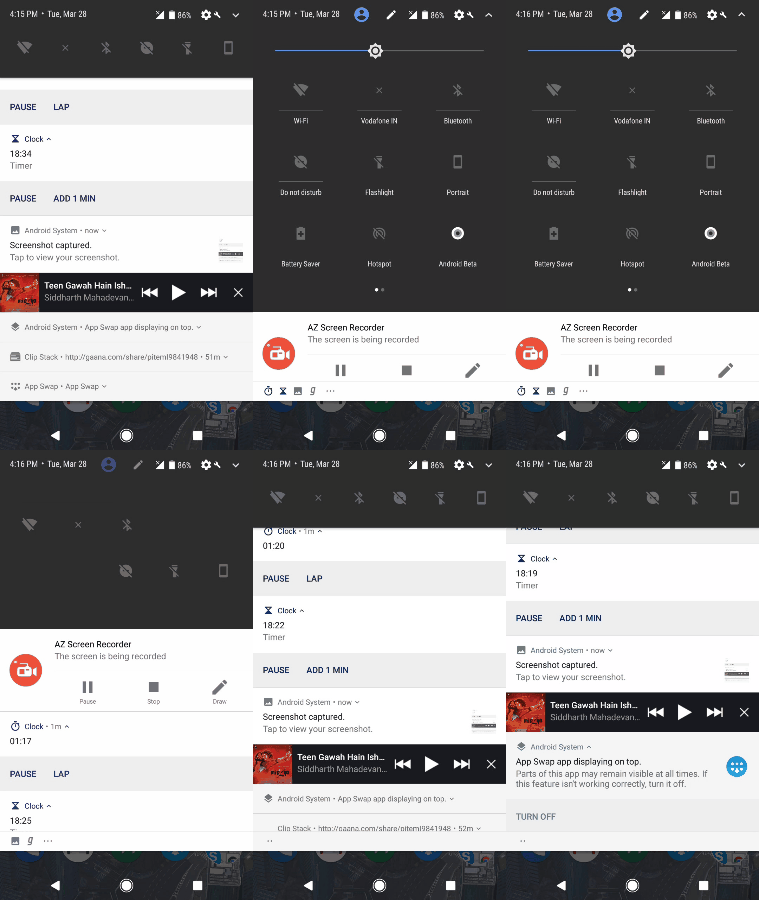
One such feature about Android O and its notifications shade is, that now it features a bar — row? — at bottom, which shows you icons of the notifications that are not in your current view of the shade.
Of course, it comes to life when you have more than around 6-7 notifications, or when you simply pull down the quick settings toggles to cover up most of the space in the shade.
Read: How to install Android O
Check out image at the top, in which quick the quick settings panel closed in first screenshot, but when we expand it , we see that in second screenshot, the bottom bar in the shade now shows icons for AZ Video recorder app, Clock and System (screenshot preview).
Now, we we close the quick settings toggle panel, and scroll down, then in third screenshot we see the notificaitons of which the bottom bar was shown app icons of.
That is cool, right?
Find below a GIF that shows it in action.


