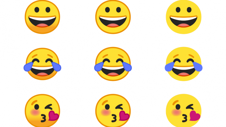
Google has redesigned emojis for Android O which it released during I/O 2017. Although changes have been incorporated to make the new emojis look more refined, not everyone seems to like the new look. For this disgruntled lot, here’s a look at the same Android O emojis but with a little tweak.
With the help of little photoshop, the Android O emojis have undergone a look change which is much cooler, thanks to a Reddit user. This user has pulled out some of the emojis from Android O, turned them flat and without borders, and then shared them over at Reddit. And we must admit, the new emojis look much better in flat and borderless design compared to the original ones released by Google.
Read: Android O feature: SMS Authentication should be dead easy with new API
Although Google made efforts to put a breath of fresh air in the Android O emojis and redesign them more in line with the iOS emoji set, they still looked dull. The changes brought about by Google were doing away with the gumdrop shaped emojis in favor of rounded ones with gradients and more shading and textures.
But not all is dull about Android O emojis. Google will also release new emoji characters with the O update such as a vomiting face, an orange heart. Also, the EmojiCompat support library will be introduced with Android O which will help app developers include the library within their app. This will enable the developer to display all the latest emoji in their app that may be available in a newer version of Android.
Read: Google testing a new search layout for mobile devices?
Via: Reddit


