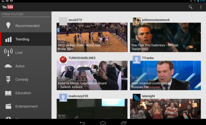
If you’ve always been using a 10-inch Android tablet, then chances are that you’ve not been too impressed with the standard YouTube UI you have encountered. Especially so, when you keep seeing and hearing it compared to how intuitive the YouTube experience is on the iPad. Well, looks like Google is in wish-granting mode this season.
Google just updated the official YouTube application for Android, introducing an entirely new UI for 10-inch tablets like the Nexus 10.
Looking strikingly similar to the current smartphone UI, the revamped two-pane interface offers a more intuitive experience, allowing users to navigate by swiping through channels and genres on the left, while browsing content on the right.
Check the screenshot above, or better still, update the YouTube app on your 10″ tablet an experience it for yourself.
Besides the obvious visual alterations, the update to version 4.2.16 brings a some much appreciated bug fixes as well, for all devices. If you haven’t already got the update notification on your device, you can hit the link below to update it manually, and enjoy the new Made for 10-inch tablet UI for YouTube.
And if you prefer to use the mobile website to access your favorite videos, you will see the new look there as well. Good Going, Google!
Via Engadget


