We are only a couple of months away from the official unveiling of Google’s Android 10 operating system. Android Pie promised and delivered plenty, but it still missed its mark in a couple of areas. 10 aims to rectify those mistakes and add a bunch of new features to take your Android experience a couple of notches higher.
So, without further ado, let’s take a look at seven new visual changes in Android 10 that you should be excited about:
Dark mode
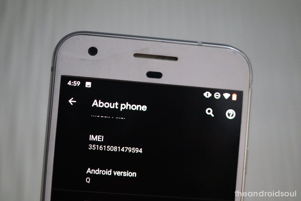
One of the most anticipated features of Android, the dark theme has been on everyone’s wishlist probably since the dawn of time. After teasing it in the Beta 1 and 2, Google finally confirmed the inclusion of the dark theme at the I/O developer conference. The system-wide feature will have a positive effect on your device’s battery life, as it requires minimal effort to generate black or deeper greys in comparison with white-dominated shades. The volume panel has also been made part of the dark theme.
Theming Options

Endless customization is a big part of the Android experience, and it all starts with changing the way your device looks generally. Up until now, the stock Android didn’t have many customization options in that department. But that is set to be a thing of the past with the new Android 10. The upcoming Android OS will allow you to change accent colors, fonts, and even icon shapes. The selection is quite limited until this point but the final release is expected to have a more extensive catalog.
Bell Icon to Indicate Notifications
Google has invested a lot of time perfecting the way you are made aware of an incoming notification. And in Android 10, they are set to bring the most refined notification delivery system yet. The Android 10 Beta 1 brought a subtle ‘bell icon’ to let you know which notification interrupted your peace most recently. This handy little feature is expected to be a part of the final release.
New Colorful Icons for Bluetooth Devices
Android 10’s entire Settings panel has been painted in pristine white, giving your device a cleaner look. Now, to make things pop out, Google has re-imagined the Bluetooth panel as well. Android 10 Beta 3 brought new colorful icons for previously-connected Bluetooth devices — a subtle visual tweak that is expected to make its way into the final release.

Music Info in Ambient Display
When playing music in Android P, the Ambient Display used to show an additional icon below the song information, alongside other notifications. In Android 10, it will be displayed as a unified notification, meaning that there won’t be a second icon below the song information.

New Icons for Wi-Fi and Battery
Keeping in line with the visual adjustments, the Battery and Wi-Fi icons have also been revamped. Android 10 Beta 4 has introduced an outline around the two icons, giving them a bolder look. It’s also to be noted that the battery saver no longer makes the battery icon orange.
![]()
Profile Picture
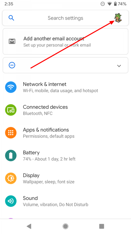
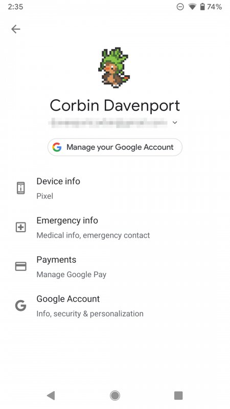
In Android 10, your profile picture will feature in the top right of the Settings panel. Upon tapping, you’ll be directed to your device information, account settings, emergency information, and payment methods.
Images credit: Android Police (2, 3, 4)


