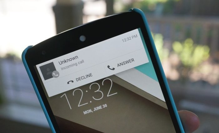
All the features that came with Android 5.0 Lollipop were pretty cool, the heads-up notification too, but only when we saw the thing pop-up for notifications we realized how nonsensically Google has implemented it.
In case you don’t know, heads-up notifications serves notifications as an overlay in a header pop-up when you’re already doing something on the phone. Its sole purpose is to bring notifications to you right in the eye, when you’re already looking at the screen.
However, it turned out to be an annoying feature for many users. If I’m watching a movie on my phone, and a text arrives from my brother, heads-up notification will display it as an overlay on screen (which is good, since it was an important message), but if I just want to check it out later then that’s not an option. If I swipe away the heads-up notification, it’ll also disappear from the notifications center. Also, if I tap on the message, it’ll open the messaging app rather than just giving me an option to reply from the overlay screen itself, saving me from switching apps.
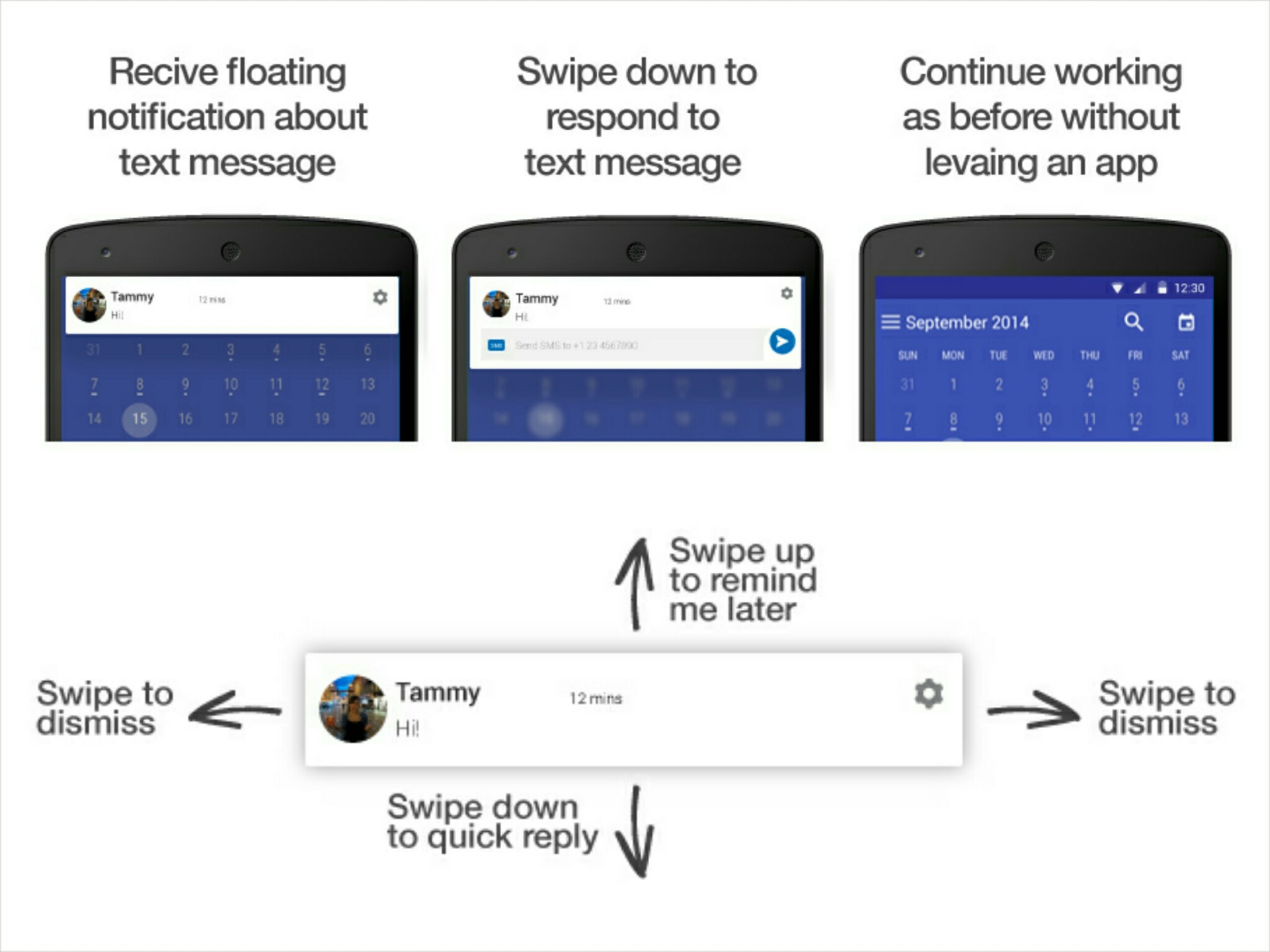
Well, a redditor has made a perfect functionality plan for the heads-up notifications system (check the image below). While some may argue that it’s not intuitive, and that newbie users would not understand it easily, but we think that’s okay, no? Functionality has always mattered more for Android users.
This is how Heads-Up Notification should work on Android
Source: Reddit


