In the last week of November, Samsung officially rolled out the stable build of Android 10-based One UI 2 to the Galaxy S10 lineup in Germany. Over the next couple of weeks, the update was released in all major regions, fulfilling Samsung’s promise of delivering the latest version of Android before the end of 2019.
After the current S-series flagship, two mid-rangers, the Galaxy M30 and M20, were granted the opportunity to run Google’s latest OS. And finally, on December 13th, the Galaxy Note 10 duo were successfully bumped up to One UI 2. 2018-make Galaxy S9 and Note 9 are already running One UI 2 beta and could be updated to the stable build before the end of the year.
Last year, with the introduction of One UI, Samsung pretty much overhauled its entire customization routine. This year, One UI 2 takes almost all cues from its predecessor, so there aren’t many visual changes. But there still some fundamental Android 10 goodness that you should be aware of.
RELATED: When will my Samsung device get One UI 2
We have had some time to play around with the stable build of One UI 2, and this section is all about pointing out the subtle or big changes we found. We have divided the whole roster of the changes into two sections: Visual and Functional. So, let’s dive in. Now, without further ado, let’s get to it.
-
Visual Changes in One UI 2
- Smoother Animations
- Date and time in the notification shade is smaller
- New Edge Lighting Effects — Hearts, Fireworks, Eclipse, Echo
- Now playing music info in notification panel with seek bar
- Improved lock screen readability
- Privacy and Location now show up in settings
- Silent notifications
- Rounder calculator
- Permissions now show up at the bottom of the screen instead of the middle
- Quick settings panel doesn’t expand when you tap a notification
- Wallpaper and Themes appear in separate sections instead of Wallpaper & Themes
- Alarm UI change
- Device Care has a more simplified UI
-
Functional Changes in One UI 2
- Camera UI reworked
- Screen Recorder quick toggle
- Digital Wellbeing improvement with Focus Mode
- Auto optimization can now clear background applications
- Smaller incoming call pop-up
- Improved battery tracking
- One handed-mode gesture changed
- Dark Mode also darkens the background
- Corner swipe for Google Assistant
- Google gestures available alongside Samsung’s old school gesture
Visual Changes in One UI 2
Smoother Animations
Samsung has worked on transitions a great deal on One UI 2 and the results are encouraging. It now resembles Apple’s iOS, and we mean it as a sincere compliment.
Date and time in the notification shade is smaller

One UI has always been about easier One-handed usage. So, this change doesn’t make much sense from that perspective. However, the option to access more toggles is encouraged.
New Edge Lighting Effects — Hearts, Fireworks, Eclipse, Echo

Edge lighting has always been quite effective at grabbing attention, and these four effects help to keep the tradition alive.
Now playing music info in notification panel with seek bar

Dragging down the notification panel does reveal the ‘Now playing’ widget just as before, but you can now pull down the widget further to reveal the option to seek.
Improved lock screen readability

The lock screen has been changed for the better, flaunting improved visibility. The text on your screen changes color according to the background — white text in black background and vice versa.
Privacy and Location now show up in settings

Privacy and Location have been granted separate entries in the settings menu.
Silent notifications

This area under your notification bar shows incoming/continuing alerts that aren’t drawing your attention through sound/vibration.
Rounder calculator

Buttons in the calculator app have been made rounder and friendlier.
Permissions now show up at the bottom of the screen instead of the middle

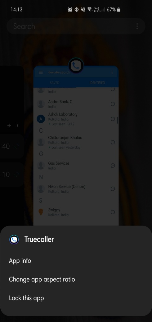
When an app asking for permission, the dialogue box now shows up at the bottom of the screen instead of the middle. It isn’t a huge change, of course, but improves reachability, nonetheless. The same has been implemented on the Recent apps screen.
Quick settings panel doesn’t expand when you tap a notification
Earlier, One UI had an annoying quirk where the Quick Settings panel would automatically expand when a notification was selected. One UI 2 takes care of that “issue” for good.
Wallpaper and Themes appear in separate sections instead of Wallpaper & Themes

Wallpaper and Themes have been put in separate sections.
Alarm UI change

The UI of the Alarm app has been tweaked. Changes in buttons and Alarm animation.
Device Care has a more simplified UI

Device Care shows more detailed information about phone usage. Battery, Memory, Storage, and Security are all shown briefly on a single screen.
Functional Changes in One UI 2
Camera UI reworked

The camera app has once again gone through an overhaul. The usual lesser-used features, such as Night Mode, Food, Slow-Mo, Super Slow-Mo, Hyperlapse, Pro, and Panorama now show under More. You can, of course, move them into the main UI.
Screen Recorder quick toggle

As anticipated, the screen recorder has made its way into the Android 10 system, and we couldn’t be happier. To make things better, there’s also a Quick toggle to help you out.
Digital Wellbeing improvement with Focus Mode

Last year, the introduction of Digital Wellbeing was greeted with thunderous applause. This year, the addition of Focus Mode is only going to make things better.
Auto optimization can now clear background applications
Auto Optimization now has the authority to clear background applications, making quick cleaning more efficient than ever.
Smaller incoming call pop-up

Incoming calls while you’re using a different application can be very annoying. Thankfully, One UI 2 has recognized the problem and has implemented non-intrusive call popups
Improved battery tracking

With One UI 2, it’s now possible to check your battery usage for the last week.
One handed-mode gesture changed

The One-handed mode gesture has changed in One UI 2. Instead of swiping inwards from the bottom corners, now you’ll need to swipe down from the middle of the screen.
Dark Mode also darkens the background
One UI introduced Dark mode in 2018 itself. And now that Google, too, is officially supporting the feature, Samsung has implemented it on the background itself. Turning on Dark mode will not only dress your menus and settings in black. But it will also darken your phone’s background.
Corner swipe for Google Assistant

To trigger the Google Assistant, swipe inwards from either of the bottom corners.
Google gestures available alongside Samsung’s old school gesture

As we all know, Android 10 has introduced new gestures to brighten up the experience. Samsung has, however, kept its old gestures, making sure no one feels out of place.


