Lenovo and Motorola have started getting closer to each other in their approach to Android. When Lenovo acquired Motorola, people were concerned that the firm might force its approach to Android on the Motorola devices.
Now, a year after the acquisition, things have taken a twist. The Motorola executives have repeatedly claimed that the firm has no plans to modify its stock-plus approach to the Android platform. Following this, Lenovo has taken a cue from Motorola and it is rethinking the way it utilizes the operating system.
Till date, Lenovo devices based on Android have been weird. Though the devices such as the Yoga Tablet 2 came with impressive designs and superior build quality, the software was clunky and confusing. It combined the typical Android elements with an iOS finishing.
The criticism on the device and the new colleagues at Motorola have made Lenovo rethink on the approach to Android. Lenovo is planning to unveil a new scaled-back Android based user interface that will cleanup the software.
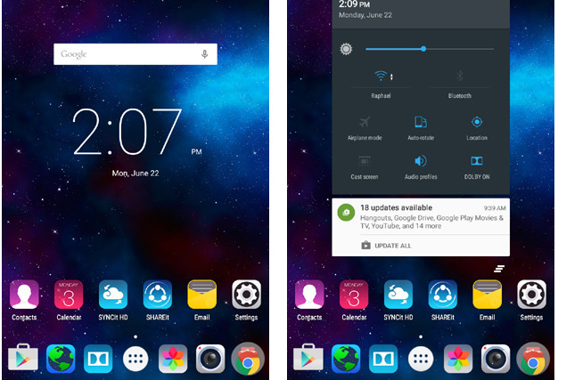
Previously, the home screen of the Lenovo based Android devices were similar to the iOS as they place all the applications, shortcuts and widgets on the home screen. The only way to remove them is to uninstall them as in iOS.
There is a Gingerbread level overflow menu icon along with the system buttons that is a permanent one. It will pop up every now and then. Also, the notification panel is weirdly split into two parts – an outdated panel for notifications at the top of the screen and a hidden panel for the settings that will appear when it is swiped upwards.
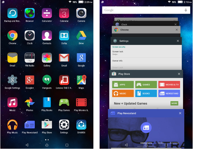
After the new Android UI from Lenovo, the home screen has received dramatic changes. The interface looks better and it works similar to the other devices based on Android. There is an app drawer, an app switching interface as in Lollipop and no overflow menu icon.
The new interface has a few issues. The iOS inspired icon designs still remain for a major share of the preloaded apps and system functions. Some of the silly preinstalled apps such as the outdated Android Browser app still remain.
The change is good, but seems to have done for the sake of it. It is not similar to the pure Android UI that is provided on Motorola devices as it is still closer to what Lenovo has provided in the past. However, it is decent enough to use.


