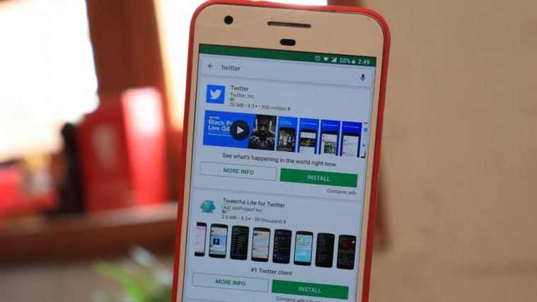
Google is testing a new search UI on the Play Store, which, apparently, shows all apps in the search list with large info cards. The new UI now indicates full app info such as app size, rating, installs, screenshots and install button right on the search page.
The feature isn’t rolling out to all Android users yet. We have the new Play Store search UI on our Google Pixel, but our Pixel 2 and other Android devices still have the old UI where only one app gets the large info card style on the search results page.
Check out the video below to see the new Play Store search interface in action.


