What to know
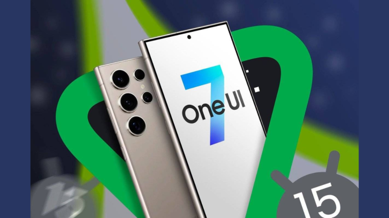
- Samsung’s upcoming One UI 7.0 update has some big and spritely design adjustments that will change the look of your Galaxy devices.
- Ahead of its beta release, a few leaked screenshots show a multi-page notification and quick settings panel, a ‘Dynamic Island’ type notification pill, and rounded corners throughout the UI.
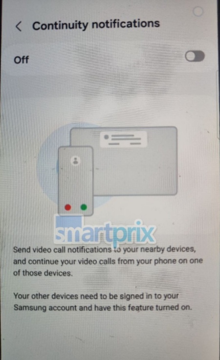
- There’s also a continuity feature that will allow you to connect to other Galaxy devices and continue calls and share other features.
Samsung’s One UI 7.0 update is still a few months away. But several leaks have already surfaced, showing all the major changes in the quick settings, notifications, and the general UI elements that Samsung has in store for Galaxy devices.
Screenshots uploaded by tech sleuths on X (formerly Twitter) and elsewhere show the decoupling of the notification panel and the quick settings. The design approach is not unlike the multi-page notification panel that’s implemented by Apple and Xiaomi.

Having separate dropdowns for notifications and quick settings could be a controversial move on Samsung’s part. Earlier, the two elements were tied to a unified shade that you could swipe down once for notifications and twice for quick settings.
The UI elements on the whole also have more prominent rounded corners.
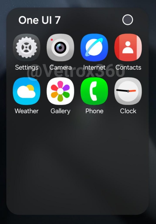
This is present just about everywhere, be it in the settings menu, the notification bubbles, or the app icons.
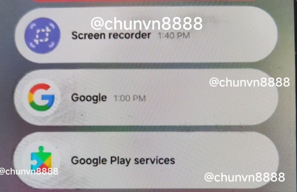
But that’s not all. There also appears to be a pill-shaped icon for system apps that look as though they’ve been pulled straight out of Apple’s ‘Dynamic Island’ playbook.

There’s also a new ‘Continuity notifications’ page that will allow Galaxy users to continue their voice and video calls across devices. This is a big push for Samsung’s ecosystem as the feature will be available across all Galaxy devices. Presumably, you’ll also be able to share cameras and access storage between devices using this feature.
Though all these features and design changes are yet to be confirmed (and could be different on the final, stable release in October), the imminent release of the beta version should provide us with further insight into what the One UI 7.0 is really like.


