In the past few months, Google has been actively working on improving the user experience on its Play Store app. The recent updates to Google Play Store app have redesigned some sections and added new features, which make it easy to browse and use.
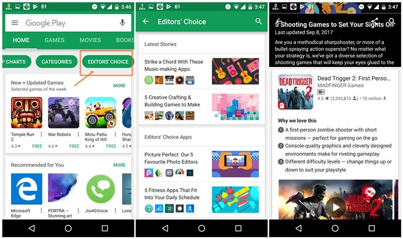
One such section happens to be the Editors’ Choice section. If you have never noticed it, it’s present in those bubbles below the “Home, Games, Movies…” section on the home page of Play Store. Swipe the bubbles to the left to reveal other categories such as Early Access.
Play Store has had Editors’ Choice columns for a long time. And only recently Editors’ Choice columns received a makeover. The section now looks like a Buzzfeed section of the Play Store where instead of just showing app names, Google creates stories such as 5 shooting games to set your sights on, 5 word games to build your vocabulary etc.
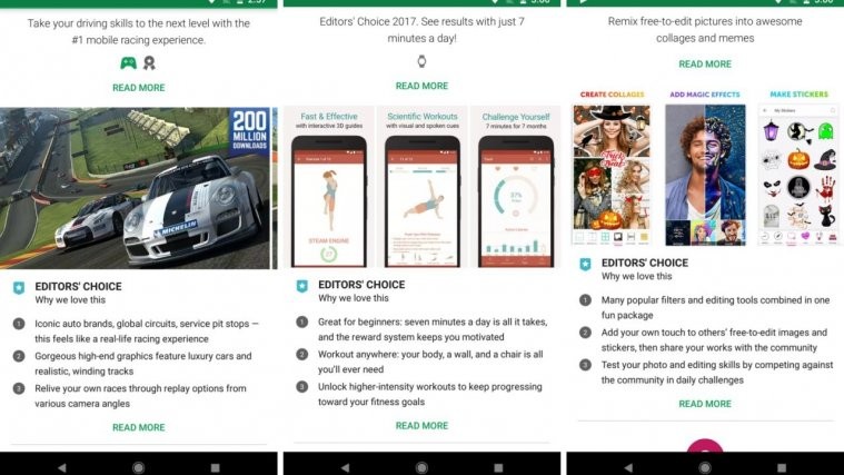
When you open any story, each app listed under the story shows three reasons why you should download the app or in simple words, highlights the top features of an app or game. This feature was earlier available only in Editors’ Choice columns but now the Editors’ Choice highlights also show in app listings.
Check out: Google Play Store refund policy: Everything you need to know
Yes, when you open an app which has been selected under any of the Editors’ Choice columns, then you’ll now see highlights or three reasons why an app is bestowed with Editor’s Choice award inside the app listing itself (below the screenshots). Thanks to this new addition, it’s now much easier to see why an app was chosen for Editors’ Choice award.
Moreover, you now get two “Read More” options. The first one is the old Read More that takes you to the description of the app. However, when you tap on the second “Read more” present below the highlights, Play Store will take you to the Editors’ Choice column where the app was mentioned.


