With the unveiling of the iPhone 14 Pro and iPhone 14 Pro Max, Apple has introduced Dynamic Island – a new UI that’s going to be exclusive to the two new devices. While the name may sound weird at first, what Dynamic Island does is camouflage the two separate cutouts for the Face ID sensors and selfie camera into a single pull-shaped unit that can be interacted with across a bunch of apps.
In this post, we’ll explain how Dynamic Island works, how it behaves when apps are running in the background and all the apps that currently support this feature.
- Which iPhones support Dynamic Island?
- Dynamic Island apps support: List of apps compatible with it
- How many apps can Dynamic Island show at once?
- How does Dynamic Island behave on different apps?
- How can you interact with apps on Dynamic Island
- What does the notch look like without the Dynamic Island feature active?
Which iPhones support Dynamic Island?
Dynamic Island is an interactive UI that’s designed to maximize the functionality of the pill-shaped cutout that is available on the new iPhones. The feature isn’t however available for all models of the iPhone 14. At this point in time, Dynamic Island can only be used on the iPhone 14 Pro and the iPhone 14 Pro Max as these are the only two devices that currently implement the pill cutout for the Face ID sensors and the front camera.
Since the iPhone 14 and iPhone 14 Plus come with a notch cutout, Dynamic Island won’t be available on any of them. This means you cannot expect the new UI feature to come to older iPhones like the iPhone 13, iPhone 12, or other devices.
Dynamic Island apps support: List of apps compatible with it
As of September 10, 2022, Dynamic Island supports most of Apple’s own apps on iOS and you can also use them with multiple apps at once as explained above.
For non-Apple apps, support should arrive once an app’s developers integrate the Dynamic Island UI on their apps. Users will then be able to use Dynamic Island for supported third-party apps as soon as they update the concerned app from the App Store which could arrive soon after the iPhone 14 Pro models go on sale.
For now, here are some apps and iOS functions that you can use with the Dynamic Island right away on your iPhone 14 Pro:
- Apple Maps
- Apple Pay
- Apple Music
- Clock
- Phone
- FaceTime
- Wallet
- Voice memos
- Shortcuts
- AirDrop
- Focus
- Battery levels and charging
- Connected devices like AirPods
- Lyft
- Flighty
This isn’t a complete list by any stretch as there may be more apps that work with Dynamic Island straight away and it will get longer once third-party apps add their own version of Dynamic Island at the top.
How many apps can Dynamic Island show at once?
When you have a single background process running on your device, Dynamic Island extends the pill-shaped cutout at the top to a larger size with elements from the app that’s running in the background. The whole experience works in a way that your display emulates as an extension of the pill cutout that’s symmetrical but the changes aren’t just cosmetic.
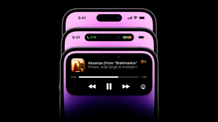
For example, when an ongoing call is minimized, Dynamic Island elongates the pill horizontally to show the call duration on the left and the voice waveform on the right. That’s just one instance of Dynamic Island but there are variations to its behavior depending on the app you’re currently using in the background.

When you’re dealing with two apps that are running in the background, Dynamic Island splits the elongated cutout at the top into two sections. So, you’ll see a smaller pill on the left for one app and a small circle on the right for another app. For example, if you have a song playing in the background from the Music app and a timer set on the Clock app, you’ll see the song’s album art on the left pill and the timer icon inside the circle on the right as shown below.
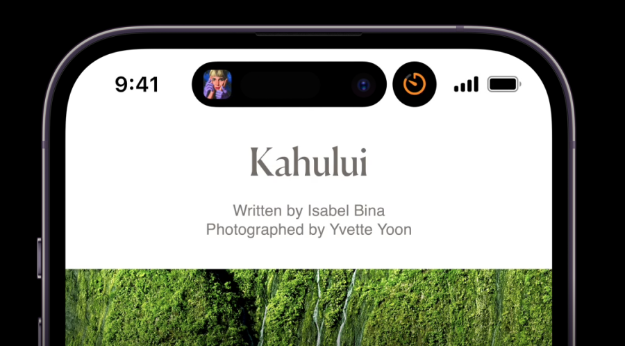
At any time, however, you will only see a maximum of two apps appear on Dynamic Island when they’re running in the background. When you open any of these apps on the screen, Dynamic Island will now only show the elements of the other app that are not currently active.
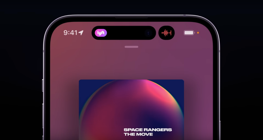
When there are more than two apps running in the background, Dynamic Island will show elements from two of the most recent apps that you minimized. From the image above, you can see that Dynamic Island hosts elements from the Lyft app and Voice Memos since the Music app is currently active on the screen. If you open any of the apps that currently have its elements on top, its space will now be taken by the third app that has an ongoing background process.
How does Dynamic Island behave on different apps?
At the time of writing, you can use Dynamic Island in a lot of different ways with the apps that are currently supported. While it’s impossible to keep up with the changes for every app out there, here are some implementations of Dynamic Island for different apps you use on the iPhone 14 Pro:
- Minimized phone calls will show call duration and waveform in a single pill.
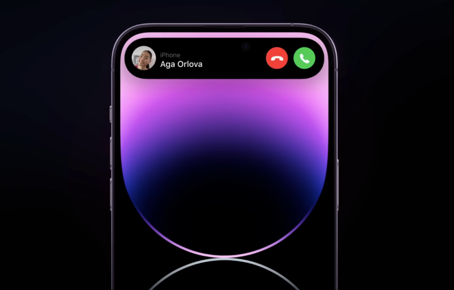
- Incoming calls will show up in a larger bubble at the top.
- The minimized Music app will show album art on the left and waveform on the right.
- Hold down the Music app’s element on Dynamic Island to expand it and access more controls.
- Using the Ringer switch shows a white bell icon on the left and a “Ring” label on the right. Shows a red bell icon with a “Silent” label when Silent mode is enabled.

- The Clock app shows the Timer icon and remaining time on the left and right.
- When multiple apps are open, the Clock app shows the Timer icon only inside the pill or circle.
- Maps app will show the next turn direction with the Maps icon.
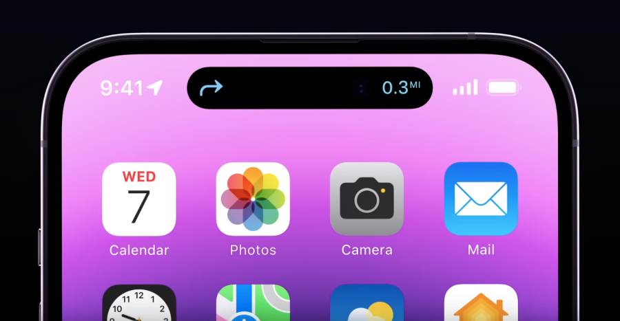
- When you hold down a Maps element, you will see a rectangular box at the top that shows more directions for navigation.
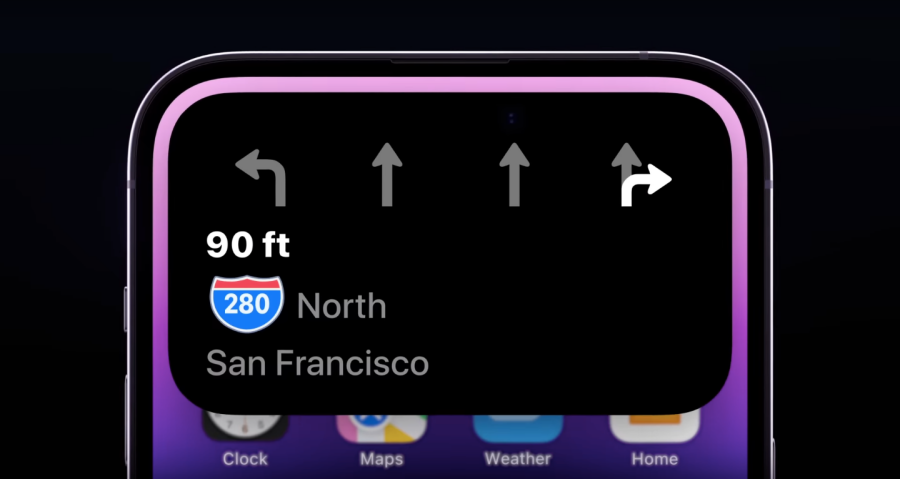
- The Apple Pay app shows payment confirmations in a square box.
- The Lyft app shows the app icon on the left and the estimated arrival time on the right.
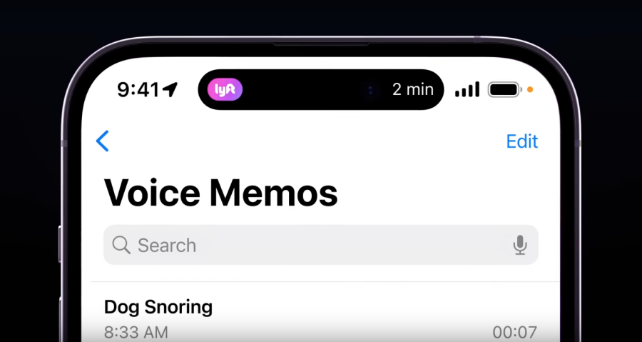
- When a Focus routine is active, its icon will show up on the left. Tapping on this pill will expand it to a larger box with the Focus name. When enabled or disabled, you will see an On or Off label alongside the Focus icon on the right side of the pill for a short period.
- When recording using the Voice Memos app, you’ll see a waveform on the left and its duration on the right.

- Shortcuts app will show an ongoing action and its progress inside an elongated pill.
- When you connect an AirPods or another device, its device icon will show alongside its battery level in a single pill.
- When sharing files via Airdrop, you’ll see the Airdrop icon on the left and transfer progress on the right side of the pill. Tapping and holding on it will show an expanded bubble with details regarding who it’s shared with.
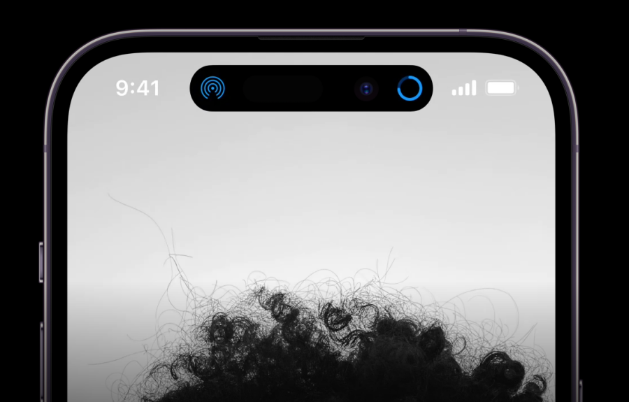
- When plugged into the adapter, your iPhone shows a “Charging” label alongside the battery percentage in an elongated pill that later shortens to a smaller pill.
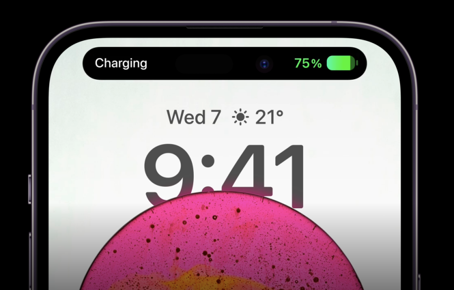
- When your iPhone’s camera or mic is in use, you’ll see privacy indicators for them inside Dynamic Island.
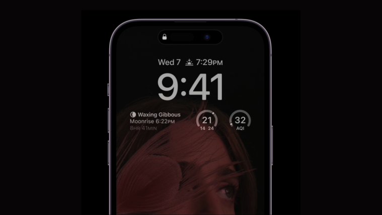
- When iPhone is locked, you’ll see a lock icon on the Lock Screen.

- The Flighty app shows Destination and arrival time in a single pill. When held upon, pill expands to a box with more details.
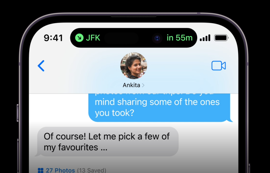
- When any of the above apps are minimized, you will see elements from two of the recent-most apps inside Dynamic Island.
- When dealing with multiple app elements, you can tap once on any element to open the app or long-press to open additional controls or details.
These are just a few instances of what you may be able to do with Dynamic Island on the iPhone 14 Pro. When support for more apps arrives, you will see their elements at the top when you minimize an app or let it run in the background.
How can you interact with apps on Dynamic Island
When Dynamic Island is triggered for a background app, you will either see an elongated pill with just one app’s elements at the top or a combination of a pill and a circle that shows elements from two different apps.
One thing to keep in mind is that Dynamic Island only shows up an app’s elements on both sides of the original pill if this is the only app that’s active in the background. When the app is currently open on full screen, its elements will disappear to show the default pill cutout.
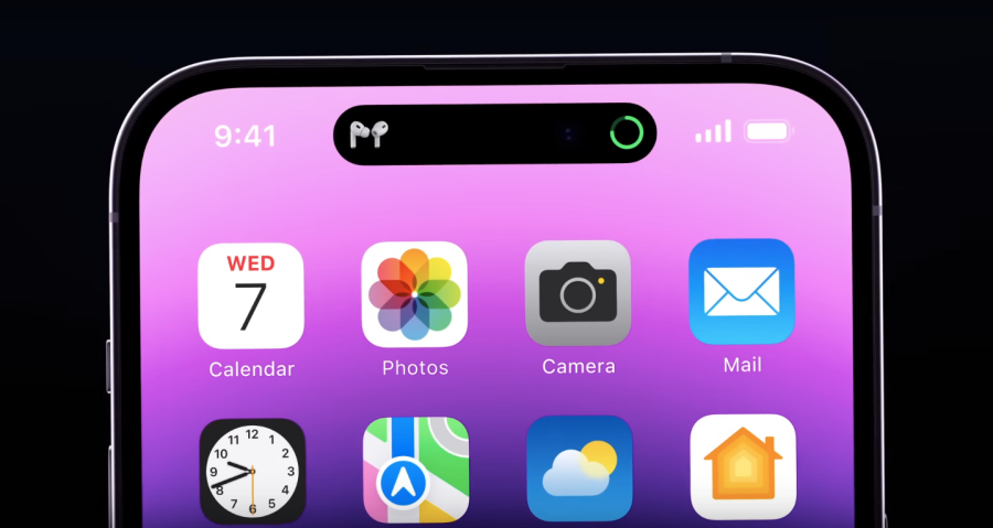
The same applies when there are multiple apps with background processes. Dynamic Island will replace the current app’s elements with those from other minimized apps.
When it comes to interacting with these elements, you can simply tap on an element to open its app on full screen. For example, if you have a track playing on the Music app, you can tap on its available element at the top and this action will open the Music app on your screen.
Some elements will show additional controls when you tap and hold on them. For instance, when you tap and hold on the Music app’s element, you will see an expanded box that lets you play/pause, rewind or forward the current track. You can further tap on this box to open the Music app on your screen.
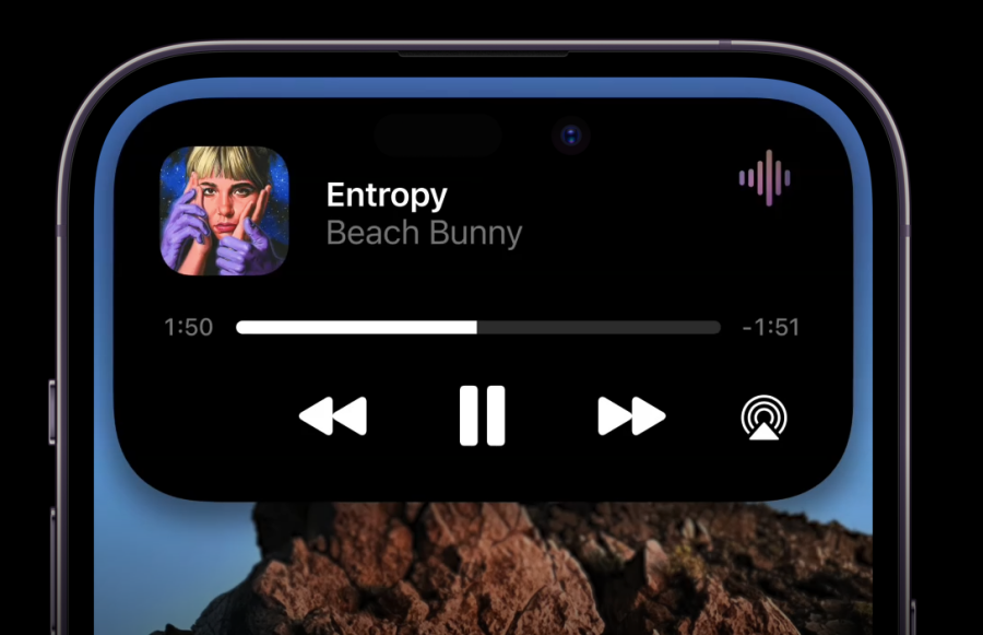
If you have multiple apps or processes running, you will see their icons inside Dynamic Island for quick access. The feature works a lot like a Dock on macOS where apps are minimized so you can open them instantly on any screen.
What does the notch look like without the Dynamic Island feature active?
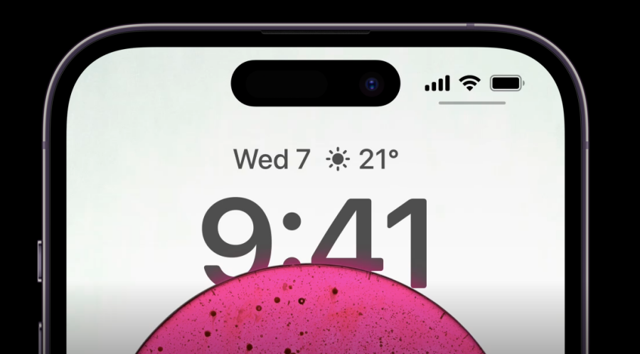
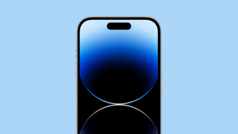
By default, the Dynamic Island UI on the iPhone 14 Pro takes the shape of a pill that combines the two cutouts at the top to resemble a single pill-shaped hole using software to add black pixels to the OLED screen. No apps or widgets appear for as long as you don’t open a supported app or perform an iOS action. This pill will expand when you start an action on one app and minimize it to go to your Home Screen or another app.
That’s all you need to know about Dynamic Island on iPhone 14 Pro.



I am concerned that once this is adopted by many apps you may find the apps you are most interested in watching will be replaced by some things you don’t care to see. For example, i may want to see the lyft info but the music app and some other app will supersede it.
Hloo
The new Apple Dynamic Island can support multiple apps at the same time. This is a great way to improve productivity and efficiency!
It’s really a big change coming from apple in the last 10 years. But it is still not fully optimized for all applications