Google has officially announced the Android 5.0 Lollipop version of Android along with the Nexus 6 and Nexus 9. We’ve been using the beta version of Android Lollipop as Android L for the past few months, so we already know most stuff about it. But Android L was a beta release and the Android 5.0 is its final release, so obviously there are some changes and added functionality with the final release. SDK or Factory images for the Android 5.0 aren’t available yet, but Google’s Android 5.0 features page offers a glimpse of some of the changes made in the final release.
Android L was a very early build for sure, and missed a lot of things even from KitKat that it almost felt a step backward at some places. But that’s okay, since, after all, it was a developers only release. We hope Google has addressed everything that felt wrong with the Android L developer preview with the final release, Android 5.0 Lollipop.
Judging by the looks of things at the Android 5.0 feature page, here are the few things that have changed from Android L developer preview release to Android 5.0 Lollipop final release.
DIALER AND PEOPLE APP
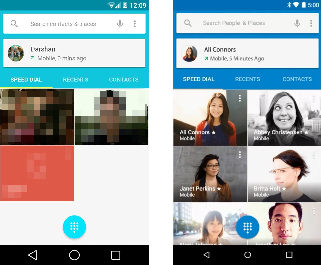
The new dialer in Android L dev preview was cool and probably the only thing in Android L that looked perfect, but it seems Google has made some changes to it in the Android 5.0 final release. As per the Material design color styles, the Cyan color scheme seems to have changed to the darker shades of Light Blue color and the Yellow highlight on tabs has changed to white. Also, the fonts are slightly smaller.
Left: Android L developer preview | Right: Android 5.0 Lollipop
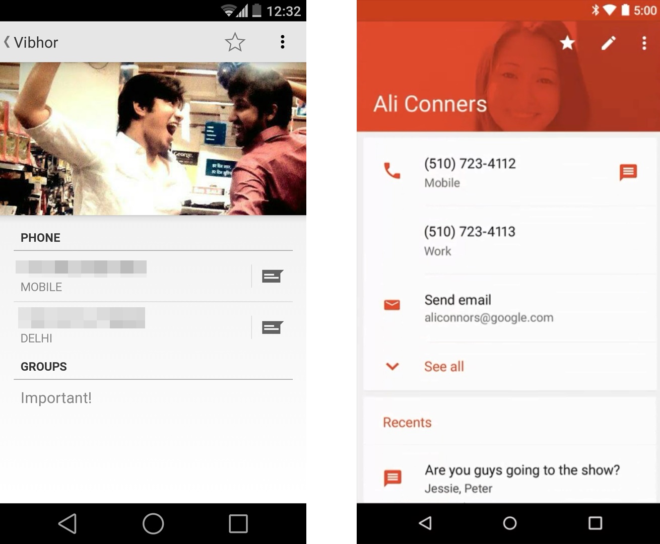
Also, when you open a contact from dialer, it doesn’t opens in a popup anymore like the KitKat and Android L release. On Android 5.0 when you select to open a contact from dialer, it directly opens in the People app, which itself is transformed drastically. The new People app now also shows recent conversations from Hangouts with the selected contact along with basic contact details.
Left: Android L developer preview | Right: Android 5.0 Lollipop
NEW RECENTS SCREEN
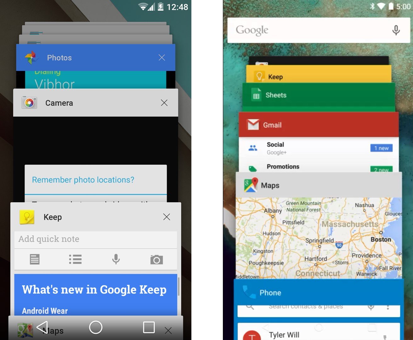
Recents screen now has a fixed Google Search bar at the top on Android 5.0. And there are colorful headers too for all apps in the recents screen, but we guess this feature is app dependent since the Photos app on L preview also shows a colorful header.
Left: Android L developer preview | Right: Android 5.0 Lollipop
NEW STATUS BAR ICONS AND SMALLER NAVIGATION BAR ICONS
You must have already noticed it in the screens above. The icons in status bar have updated to flat design and the navigation bar icons look smaller in the Android 5.0 Lollipop. However, the smaller navigation bar icons could also be the result of the higher display resolution of Nexus 6.
Left: Android L developer preview | Right: Android 5.0 Lollipop
PRIORITY RINGING RULES
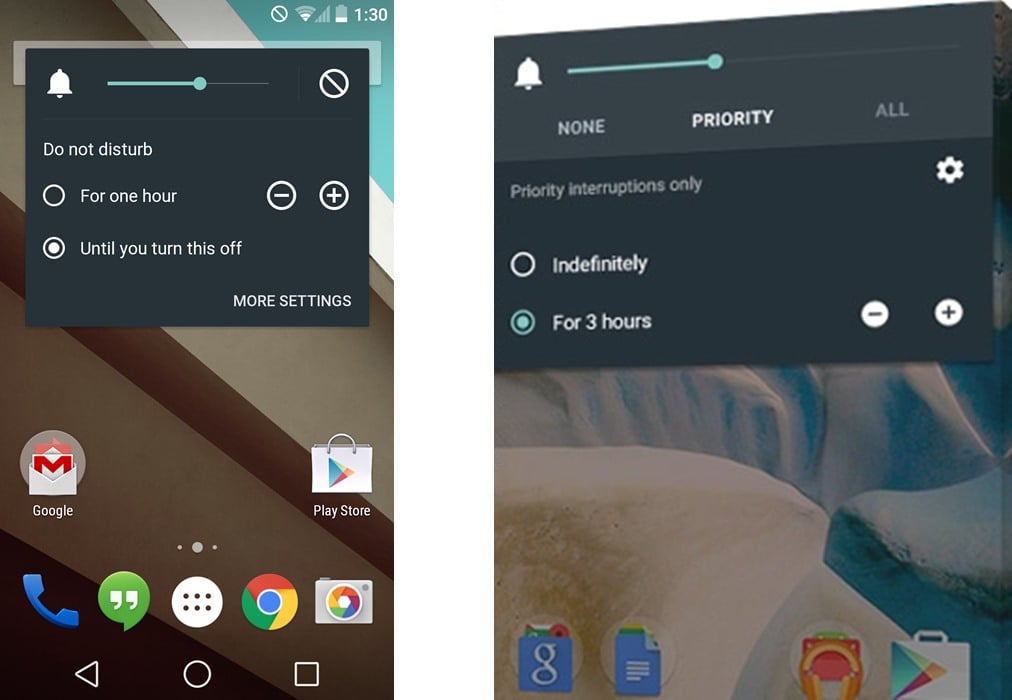
The Do not disturb feature on the Android L seems to have renamed to Priority mode with slight changes in UI and functionality now with the Android 5.0 final release. Here’s what google has to say about it:
For fewer disruptions, turn on Priority mode via your device’s volume button so only certain people and notifications get through. Or schedule recurring downtime like 10pm to 8am when only Priority notifications can get through.
Left: Android L developer preview | Right: Android 5.0 Lollipop
These are just the few things that we were able to spot from the Android 5.0 Lollipop features page. We’re sure there will be a ton of more changes since the developer preview release was incomplete in a lot areas. The SDK for Android 5.0 Lollipop is coming on Oct. 17th so we’ll have more details on the changes made in the final release, until then let’s just sit tight.





how to fix wlan-errors?
how to fix wlan-errors?
how to fix wlan-errors?