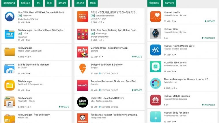
In what could be a shock to many app installers and download geeks, Google has removed the 3-dot menu from the search results screen in the Play Store. The 3-dot menu was a shortcut to download and install apps right from the results screen without actually having to open the product page.
The change was first reported by a user XyllonGryphon over at Reddit, where many users reported seeing the new UI on their phones.
It seemed at first that only the new users or those who format their phones and then log in to Play Store are getting the new UI from Google in their Play Store, but we were also seeing the new UI, void of the 3-dot menu on our Mate 20 Pro running Android 9 Pie. Which leads us to believe that the new UI is out of beta testing and maybe rolling out to the public.
Do you see the new UI?
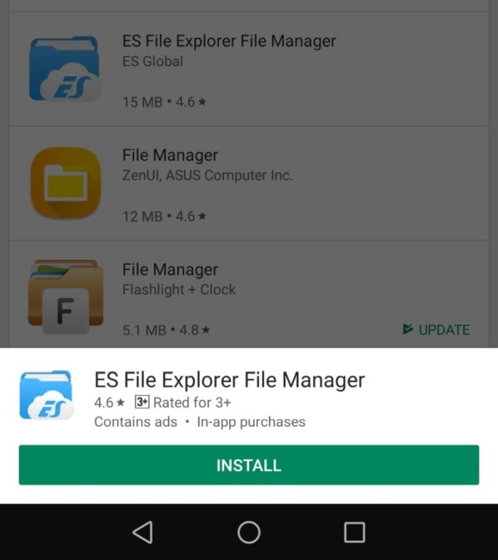
Though, it must be noted that you can still install an app from the results screen — all you need to do is ‘long press’ on the app you want to install. That will bring up a pop-up bar at the bottom with the app name, few details, and the big Install button. See the image below.
The only extra detail that the pop-up has, as compared to the info already available in the search result, is info on Ads and In-app purchases? So, when a user long press the app to install it, the pop-up bar gives info to the user whether the app contains Ads and in-app purchases or not.
Is this info the reason Google disabled the direct — and way easier — installation via 3-dot menu button?
Thoughts?


