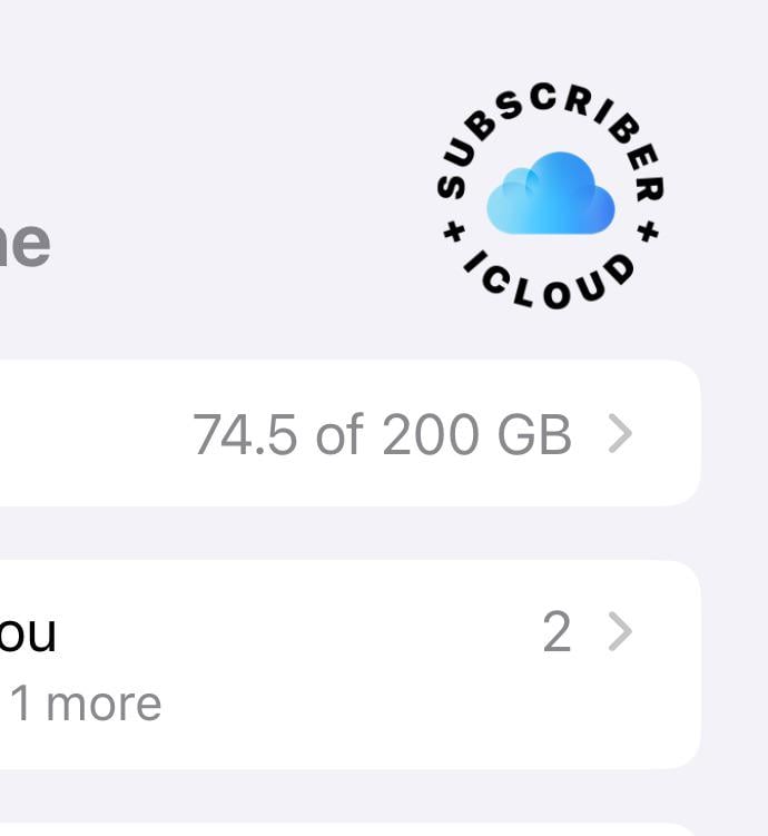
Some iPhone users who’ve recently updated to iOS 18 have stumbled upon an ugly iCloud design in the Apple Account section of the Settings app. It’s been called “the most UnApple design in iOS 18” and we agree.

For surely, it’s the ugliest looking thing Apple has ever put out, and Redditors, including myself, have decided to mete it with the same measure with which we criticize some adventurous Android design experiments, that is, fairly.
If we were to break down the monstrosity that is the iCloud Subscriber logo, here’s how we’d do it:
- Unoriginal design pattern: Having the iCloud icon in the center and the words iCloud+ Subscriber going round it is, in all honesty, lazy. This ‘wraparound text’ patterning is found everywhere, from Shopify to Apple’s own News+ logo. Perhaps the designer was underpaid, or Apple really wanted it to stick out, though perhaps not like a sore thumb, which it is.
- Misspelt iCloud: Design choice aside, one has to wonder why there’s a capital “I” instead of the usual lowercase “i” before ‘Cloud’. And why is the wraparound text “+Subscriber+ ICloud” I’ll never know.
- Color incongruity: Bold black text wrapping around the light blue iCloud icon might work in theory. But Apple’s implementation (if it’s that) just tells you why theory only takes you so far.
And it’s not an exception. Users have found all sorts of tacky design implementations all over iOS 18. This instance just cements the fact that Apple’s been asleep at the wheel and sending out buggy updates.
Comment
byu/LateDisaster1309 from discussion
inios
In all likelihood, the ugly monstrosity that is the iCloud+ Subscriber looks nothing more than a placeholder for the actual design that we can expect Apple to replace it with. But it’s not an issue that you’d expect Apple – a company known for its aesthetics, design language, and consistency – to have in the first place. Even an Android user like myself can’t help but cringe. And that’s saying something!


