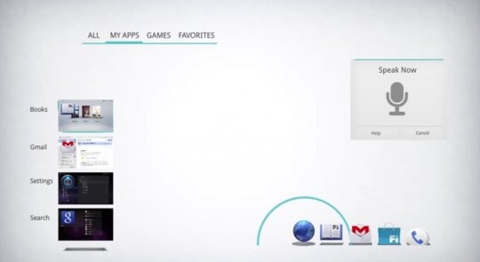
Google made a rather big decision to give Android a complete UI overhaul with Android 4.0 Ice Cream Sandwich, which was met with acclaim over its intuitiveness and improvements over previous iterations of Android, and was dubbed as the “Holo” UX (user experience).
Google’s hard work as paid off as they have won a gold award for User Experience at the Parsons School of Design. Awesome, right? And, in celebration, Google has released a video that shows off some of their most famous commercials, which also gives you a look at the inspiration for Holo.
[youtube video_id=”tZh9krcasoY” width=”620″ height=”400″ /]Google showed with Holo that you don’t need custom OEM skins to make Android look good (though that doesn’t stop OEMs from still messing it up). Google also provided guidelines for developers to make apps that follow the Holo design, but as not many developers have actually been using them, a site called Holo Everywhere has been put up, which showcases some of the apps using the Holo design.
Here’s a toast to Google’s win. Hopefully manufacturers will take a cue and try to keep Android 4.0 as pure-looking as possible, and app developers will take an even more active interest in using the Holo design in their apps.


