Google has been developing a new operating system called Fuchsia OS for a while now. We first heard about this OS in August last year, and it finally has a preview for all of us to see.
Fuchsia OS is completely different from Android and Chrome OS, it isn’t even based on a Linux kernel. Instead, Google has developed its own kernel called Magenta, which is what this OS is based on.
According to the official project document for Magenta, the kernel is made for modern smartphones and computers with fast processors and plenty of RAM. The apps and UI for Magenta are made using the Flutter SDK from Google. This SDK allows for cross-platform apps that will work on both iOS and Android.
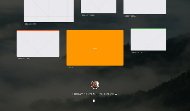
Now, it has been discovered that Fuchsia OS has a system UI called Armadillo. The UI is in very early stages of development, but it gives us an idea of what the OS would look like on smartphones and tablets.
The UI, by the looks of the preview video, is card-based, similar to Google Now. This system allows users to manage apps, which are all card-based, and move them around. There’s a split-screen mode as well, and the Home screen is a vertical list of cards(apps), with the User profile in the center.
Tapping on the User profile brings up a few toggles for Volume, Airplane Mode, Auto-rotate, etc. It’s pretty much like Quick Settings, and also shows the battery and SIM information. It looks very good, but nothing really works as of now. That’s because the OS is still under heavy development and should take a while to be available for a regular user. Check out the video showing the UI preview below;
via Droid-life, Hotfixit


