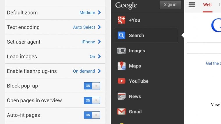
Looks like Google just redesigned its homepage for mobile phones. Have a look at the pic above if you haven’t already, it tells a lot about the newly worked out homepage by Google team. Not a new design actually, it’s the port of the same top bar we have already seen, used and loved on google.com on desktop browser.
Top bar on Google’s mobile homepage is now pretty similar to desktop’s, with Options tab (left-most in top bar) now home to most Google services with link to ‘All products’ at the bottom. You press the options tab to get the list of those services, and slide from right to left to hide it back.
Next to this options tab is what we can expect, a tab for Web search where you already are, and one for Images search, the third one. Tapping on Images tab opens up, actually it reloads itself to get you to search images.
Right to these 3 tabs is your Google+ pic (or Sign In tab, if you are not already), with a notification count from Google+ profile, just like it is on Google’s desktop homepage.
That’s all we know about it right now. We don’t know whether Google has already confirmed this via a blog post or something, or when it plans to launch it officially, but you can rightly be hopeful of this beautiful homepage popping up on your mobile’s google.com anytime now – and if you’ve already got it, do let us know.
Btw, we can confirm this is not limited to Android phones, as we were able to check out the new homepage on our Galaxy Nexus again, even after selecting the iPhone as ‘user agent’ under Boat browser’s settings. So, we think all mobile phones and tablets, especially those based on Android and iOS, if not all, are in line for a new and refreshed Google homepage.


not in Romania yet…
Not on pakistan yet
not in Romania yet…
Not on pakistan yet
Built-in browsers of cellphones only, not opera mini approves this change!
Opera Mini really works out things pretty differently to save data
and maximize speed, using its own Opera servers to first cache a webpage, and then load it quickly to your end. Maybe, that’s why, no update there. Try Boat browser, or Dolphin.
Had this for about a month now on my iPhone, when i surfed with the Google Chrome Brwoser. Also on YouTube there’s another design than i surf YouTube with Safari.
Had this for about a month now on my iPhone, when i surfed with the Google Chrome Brwoser. Also on YouTube there’s another design than i surf YouTube with Safari.