We all know of Google’s drive to make Android wear better by the day, not because of the pretty hard competition its been receiving from makers of other smatwatches — or lets say not only because of that — but also due to the fact that more and more people are increasingly being attracted to the notion of a device that lets them perform all the most important tasks of a smartphone without being as imposing.
Well, Google has put out an update that promises to take the ensuing battle to a whole new level. The features which came out only recently are important not only because how they will help Google win the smartwatch wars but also make them way more useful and convenient. Lets have a look at these features one by one.
Draw to send Emojis
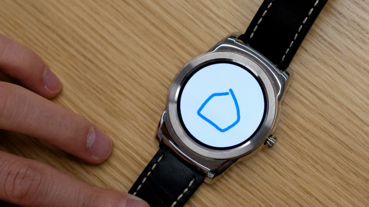
While not that significant from the point of view of relevance, the feature does add a lot of fun to the otherwise routine task of sending emoticons. As for how it works, its simplicity itself. Instead of how you needed to speak into your device to send a message to someone or go through the cumbersome process of trying to type on the diminutive screen, you can simply draw what you are trying to say and have google replace it by a suitable emoticon. And guess what? You don’t need to be an artist for others to understand what you have done.
The idea came up at the Hackathon event organized by the company and it lost no time in implementing it across the android wear. Jeff Chang, the lead product manager for Wear shared how the feature is so accurate at deciding what you have drawn and replacing it with a suitable emoji — “We had volunteer Googlers send us hundreds of thousands of drawing samples, We’d say ‘hey, draw a dog, draw it on the screen.’ They’d do that over and over, and eventually the result, was a reliable way to covertly reply to things in situations where you can’t talk, or when an emoji is a more appropriate response.”
This of course comes as an alternative to the generic emoticon selector that’s in use in most other smartwatches — including Apple — and smartphones and is not only more fun, but also way more fast.
In built wi-fi — Free the watch
The greatest issue with wear has always been the fact that it loses its usefulness once beyond a certain distance from the smartphone. The devices need to be connected at all times via bluetooth in order to function properly and as such a limit is imposed on how far you can go from your smartphone, unless of course you have it in your pocket at all times — which is one of the things the android wear set out to remove.
However, with Google’s latest update — which brings the hitherto unused wi-fi feature to the fore — the rope has finally been removed — with the stipulation that you have a good wi-fi connection. The feature allows the watch and the smartphone to stay connected via the Google cloud services, meaning that as long as both the devices are connected to the internet you could be far beyond the bluetooth range of your smartphone and still be able to get notifications, take phone calls, and search among other things. What’s more, you don’t have to worry about connecting your watch to the available wi-fi networks as Google automatically does that for you.
That being said, it should be understood that Android wear is still far from being self-sustained, the device will still need to be paired with a smartphone in order to function properly.
Easier screen interaction — Flick to click
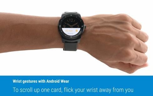
Google has also added a new feature that allows users to flick their wrists to access the notification cards instead of having to hold the watches up to their eyes and tapping it. The brand new feature allows users to move backward and forward between cards simply by flicking their wrists in outward and inward directions.
While that’s certainly good news for everyone and indeed great news for those who sport bezel-ed watches with relatively smaller screens, some were quick to point out that the feature could possibly miscarry in certain situations such as on the subway, while walking etc where a false motion of the hand could be taken as a gesture. However, the feature carries the day because of two point that are strongly in its favor.
First off, Google did a lot of testing to guard against just such an occurrence and the feature is optional — meaning you could turn it off anytime you feel bothered by it. Next, even if you do flick your wrist by mistake, all the watch will do is move the cards around which to be honest is not something that should cause much worry. As Jeff Chang said “We’ve certainly done a lot to reduce false positives, but the nice thing is, it’s not a destructive action. It’s just a way to scroll up and down.”
Apart from these three major features, Google has also added a low power mode to the device which allows applications to run in black and white and display minimal data unless your wrist is up and you are looking at the screen. The feature was already available for the watch face — which displayed only the time — and has been now extended to take other applications into its fold. Not only will that conserve power — which is of course, awesome — but also allow users to have only the data they need at a glance, without all the fuss and bother of having to sort through the things available on the screen. As for how much information gets updated in this mode, Google has decided to leave that to app developers.
Well, Google’s update will probably enable Android wear to compete on par and maybe even gain an edge over the Apple watch — which already has some of these features installed — and from what we think, may lead us to witness another brutal contest for the domination of the smartwear market.
For now, we wait for the upcoming LG Urbane, which comes with these features out of the box, while other compatible smartwatches are expected to receive them over an update sometime next month. We will be bringing you more interesting stuff very soon, for now do tell us how you find the latest additions to the arsenal of android wear features by commenting right below.


