Leaked screenshots, supposedly of Google’s upcoming Android 12, have surfaced online and they suggest a radically overhauled and thoroughly exciting new look to the UI. Accompanying the design changes are a few new functionality additions designed to enhance privacy and organize communications. Though little is yet certain, we’ll cover some of the new upcoming changes that get us excited.
What Makes the New UI Exciting?
A Softer Design
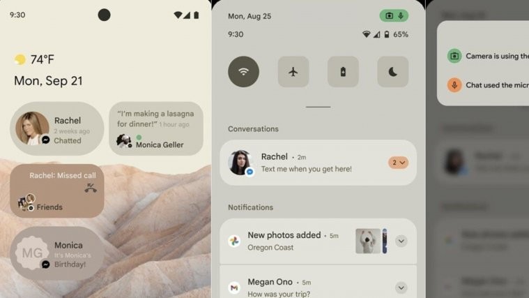
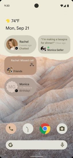
The new UI seems to focus on neutral colors and a more pleasing shape design, with rounded corners and less crowded quick tiles. The softer shapes and calm color palette seen in the screenshots show a selection of neutral greys, off whites and beige, and give the new UI a friendlier, more soothing aesthetic than previous iterations. The new notifications menu is now opaque though it seems likely that it’s color along with the rest of the UI, will be highly adjustable according to expanded theme controls.
More Theme Control
Furthermore, there is talk that the new UI will allow users to recolor their apps through more extensive theming options. This would constitute an exciting development in the aesthetic controls available to android users. While dark/light modes are nothing new, how apps actually respond to those system settings was up to the developers.
With the new update — possibly — users may be able to select their system colors and see apps have their own resource libraries reflect those settings. Indeed, the new UI feels to many like a breath of fresh air for an aspect of android that has for too long felt like something of an afterthought behind features and innovations in other functionalities.
Enhanced Privacy
As part of a renewed emphasis on privacy, Android 12 will see the unveiling of Google’s long-tested privacy chips that create readily visible alerts whenever an app is using your camera or microphone. These alerts will be displayed prominently at the top of your screen whenever your camera or microphone is being accessed and, when opened up, will list the apps doing so.
This UI change is likely related to an upcoming change to the Privacy Settings which will allow users to disable their camera and microphone in much the same way they can toggle other sensors like Location or Bluetooth – similar to the disable all sensors setting previously available only through Developer’s Options.
Revamped Widgets
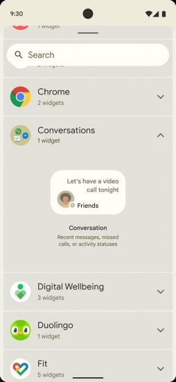
Google is also introducing a new conversations widget that groups communications and other information into a singular, contact-specific tab. Text messages, missed calls, even status updates will be contained within the new conversations widget waiting. in the status bar.
Decoupled Emojis
Another visual update set to accompany the new UI is actually more of a backend development: emojis out the day Unicode releases them. Ordinarily, you have to wait for a new OS update to get the latest batch of emojis, but new commits discovered over at the Android Open Source Project suggest that in the coming months possibly as a part of the new Android 12, users will have new emojis written into their phones as soon as they roll out.
It should be noted that Google has neither confirmed nor denied any of these updates, so whether they will be bundled together and pushed out as part of Android 12 or roll out piece by piece, we’ll have to wait and see.
Images Source: XDA


