What to know
- Fitbit has launched a major redesign of its Android app optimized for tablets and foldable phones.
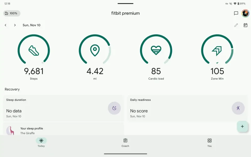
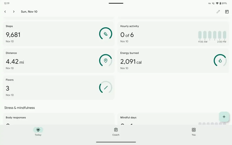
- The update features a new side-by-side layout for stat rings and a dual-column display for better space utilization.
- The redesign improves navigation with repositioned controls while maintaining functionality in both portrait and landscape modes.
Fitbit has rolled out an overhaul of its Android app, specifically targeting users with tablets and foldable phones. The app now sports a fresh look that makes smarter use of larger screens, moving away from its previous stretched-out phone interface.
As 9To5Google reports, the redesign introduces a more intuitive layout where four customizable stat rings now sit side-by-side, replacing the old format of one large ring with three smaller ones below it. This new arrangement works seamlessly whether you hold your device in portrait or landscape mode.

For users with foldable phones, the update brings special enhancements to improve their experience. The app now features a dual-column layout for stat cards in landscape mode, eliminating the need for excessive scrolling and making better use of the available screen space.

Navigation has also become more user-friendly with repositioned next and previous-day controls, making it easier to move between daily statistics. These changes particularly benefit users who own foldable devices, providing them with a more tailored experience.
The update comes as part of version 4.30 of Fitbit for Android, though some users might have noticed these changes rolling out earlier. While the app still awaits a dark theme option, these improvements mark a significant step forward in Fitbit’s commitment to enhancing user experience on larger Android devices.


